


Ask the Illustrator #1
Ask the Illustrator #1
Lettering for Picture Books (Explained)

Sometimes people ask me questions about my job working as a picturebook author/illustrator. I am starting up a weekly series where I share some of these queries!
Hi Anoosha! Do you have any resources for learning lettering for picture books/book covers?
I'll be honest, I am rarely 'allowed' by the publisher to design my own lettering for the books covers I illustrate! And with good reason too; I don’t have any background in typography/lettering and most cases I’d rather leave it to the professionals (ie: the amazing designers on my publishing team.)
The only times I've been given the opportunity is for the picture books:
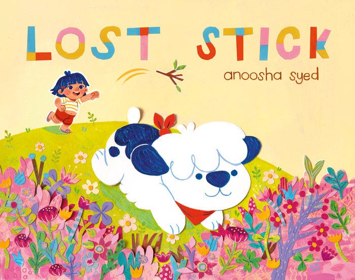
Lost Stick…
That's Not My Name!…


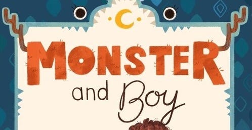
Monster & Boy…


…and for the MG book cover 'A Place at the Table'.

And while it's not cover art, I got to do a bit of lettering for some pages of Rise Up and Write It which featured a lot of handwritten elements in envelope & letter inserts.


Instead, the designer or art director will be in charge of the lettering. Sometimes during the concept stage, I'll offer a title design in my mock-up, but they aren’t always approved.
As an example, here are some concepts I offered versus the final approved lettering:


Because I'm probably not the best person to ask those questions to, I am going to share some resources that might be helpful.

My only personal advice as an artist is to think of your lettering as a character (and another crucial element in the art) and think of how you can seamlessly work my title into your illustration so that it feels like it is a part of the piece. This is done through thoughtful placement of the text, but also the font, color, texture, and any messaging added to it. When I say treat it like a character, I mean to try to see if you can give it any personality or reflect story's tone.
For example, in the Monster & Boy cover, which is an unlikely friendship story between two opposing personalities, I thought it would be fun to personify the text so it looks 'monstrous' with the added fur vs the more elegant 'Boy', and try to embed it within the border illustration.
For A Place at the Table, because the book is about Pakistani culture, I tried to incorporate henna-inspired elements into the calligraphic lettering.

Originally, I had provided a concept where it looked like the title was 'written' with a finger into spilled flour, although it didn't read as well as we wanted it to so we tossed that idea.

For Lost Stick, my main driving point was the medium itself; I illustrated this book with traditional paper-cut collage and wanted to take advantage of that for the title.

Finally, for That's Not My Name I wanted to give it a more juvenile feel since Mirha is the one proclaiming the title, so I went with the shouting all-caps and wobbly letters.

I usually draw whatever feels most natural to me, and Name and Monster both fit pretty closely to my handwriting with a bit of flair, but I had to do some research and collect references for Place’s more stylized calligraphy.
I love Pinterest for this and I try to collect as much interesting type/lettering as I can for inspiration.. If I have a certain look I have in mind, whether it's something elegant vs childlike, or evoking an aesthetic like steampunk or floral, I can try to gather up references to help me with my brainstorming.
Similarly, I will look to hand-lettering examples specifically done for book covers, since they would require a particular technique different from typography for other industries.
Pinterest Boards:
Speaking of other people's book covers, it's always a fun exercise to examine a successful piece of work from another artist to try to figure out what they are getting right and learn from it. Pulling up a few examples, take a look at these covers and reflect on these questions:
How have they fit the text within the illustration? Are they a part of the background, or has the background made room for the title?
What color/texture/font choices have they used here?
Do those choices reveal anything about the plot/character/story?
Does the text evoke any emotions?
Is the text legible, especially from a distance?
Could any improvements be made?


Finally, I wanted to share a few resources on where you can learn lettering skills!
A Tutorial on the Basics of Hand-Lettering
Basics of Lettering VIDEO SERIES
Practice Worksheets for Calligraphy
Although it is a daunting area, the good thing is that publishing is a team effort and you'll be working closely with your AD/designer; if you have any questions you can always ask them.
I hope this is helpful!
Sincerely,
Anoosha :)

I really appreciate you sharing your insights Anoosha! Looking forward to more Ask the Illustrator posts in the future~ :)
Thank you! This is so incredibly helpful Anoosha 🤩