


Ask the Illustrator #2
Ask the Illustrator #2
How much is TOO much detail?

Hi Anoosha! I was wondering how you decide when there is enough detail in a picture? Or how do you push yourself to think of more? When I am doing more elaborate settings I will finish and look at it a few days later and think it looks quite bland compared to other artists who push their images much further in terms of content. Not sure if that makes sense!
First, I think it’s important to remember that there is no such thing as ‘too much’ or ‘too little’ detail. It’s not a one-size-fits-all approach and might be based on your style and the situation.
Style:
This is largely dependent on your own choices as an artist. For example, do you draw lush scenes full of detail like Paola Escobar?

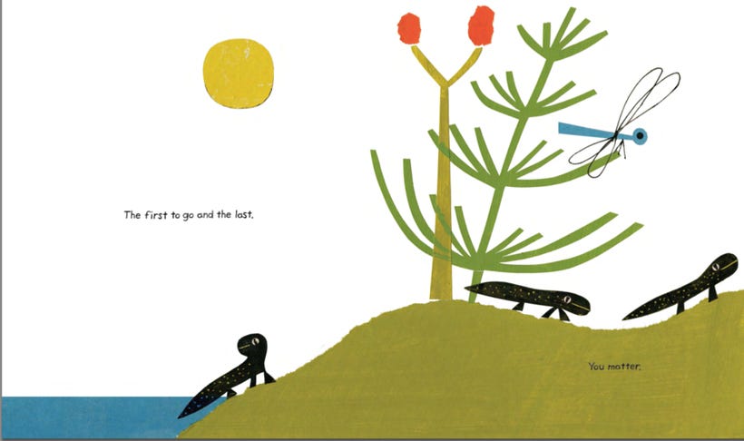
Pages that are brimming with new surprises you discover with each re-read, like this page from Marc Martin?

Or do you have a simpler style that focuses less on detail, but more on shape/form, color, and strong appeal like Todd Parr or Christian Robinson?

Situation:
The level of simplicity/detail is also dependent on the situation. Sometimes you need a spread with a lot of detail. For example:
An establishing shot
A character’s bedroom, a cityscape, the deep ocean. A spread that establishes where your book is taking place, maybe with the key characters or story elements.

A scene that needs that cinematic punch
This could be the key page in your story. Or a big IMPACT spread that has slowly been built up after a few quieter pages of spots.
 Can we read? An interview with Felicita Sala")
A page that requires a lot of detail for the sake of the plot
A character rummaging through a messy garage, lost in a crowd, overwhelmed by thoughts, etc.

Sometimes you need an illustration that is very simple with minimal detail. This could be because you want to focus on a specific element, to have a breather between pages, create a strong impact, or require simplicity for the story (for a punchline, emphasis on an emotion etc).
Take for example, these two spreads from Matthew Forsythe's book THE BAD MOOD AND THE STICK.

We have one spread with a lot of detail and another that is quite simple, and the choice is done intentionally to fit a specific purpose.
The above is a pretty story-heavy scene; a wedding is happening and we want to see a lot of characters, the lovely environment with a foreground and background, and call-backs to previous pages.

This spread is the punch-line to the whole book and doesn’t even have any text. The focus is entirely on the action and characters. Any additional details would lessen the joke, and much of the humor comes from how simple this page is.
Simplicity is Key
Sometimes illustrators can find themselves adding TOO much detail and end up weighing down the illustration. Less is more at times, and a lot of appeal can come from simplicity.
This is a big rule in effective character design. It can be tempting to design your character with all the bells and whistles, but a clean, strong silhouette and minimal palette is usually the best way to create a memorable design with a lot of appeal.
Consider the difference between Bumblebee’s design in Transformers (2007), versus Bumblebee (2018).


It might seem totally badass to cover a character’s outfits with a million colors, textures, patterns, and little accessories, but you can lose a lot of clarity in that process and make your design hard to read.
 - Wikipedia")
What you’re doing already is great! Sometimes we can get too focused on the illustration, so it’s a good idea to take a step back and look at the work for a bit. When you come back with fresh eyes you can see if you need to add more, take away, or leave it as is.
If you still feel like you need more detail, I would recommend looking into references. For example, if you are illustrating a children’s bedroom you might draw their room with a bed, some toys, and a desk.
Find as many references as you can (Google, Pinterest, looking at interiors magazines, catalogs, home bloggers, etc) for ideas of real bedrooms. See what elements could be missing (maybe a dresser, a lamp, a bookshelf or clothes) and how you can bring life to the setting you have already.
You might have a bed in the room, but what kind of sheets are on there?
Is it neatly folded, a huge mess, or did the character ‘attempt’ to fold it but did it poorly? Are the walls brick, wood, plaster, or wallpaper? Are there posters on the wall, crayon drawings, is the wallpaper ripped slightly?
When adding more detail, try to do it with intention. See if there is any way to push each of the elements in that environment (or in the character design!) if you think it can either help enhance the story, the theme, the appeal or the emotion.
I hope this was helpful!
Sincerely,
Anoosha

Nicely done, Annosha! The quick response would have been, "It depends...", but I like your answer better ;)
Aaaah so many favorites here. And a really thoughtful response. In the early days of my career, I got way too caught up with detail. I figured I needed to distinguish myself by doing more (and my then agent was super into decorative arts). But now I feel more inspired by negative space and balance, and your comparison of Matt Forsythe's spreads is a great example of how that balance can be achieved within the flow of a narrative, rather than just on a given page.