


Designing a Book Cover (hard mode)
Eighteen sketches and three rounds of revisions later...

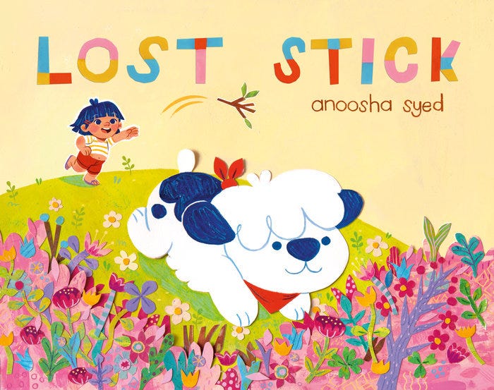
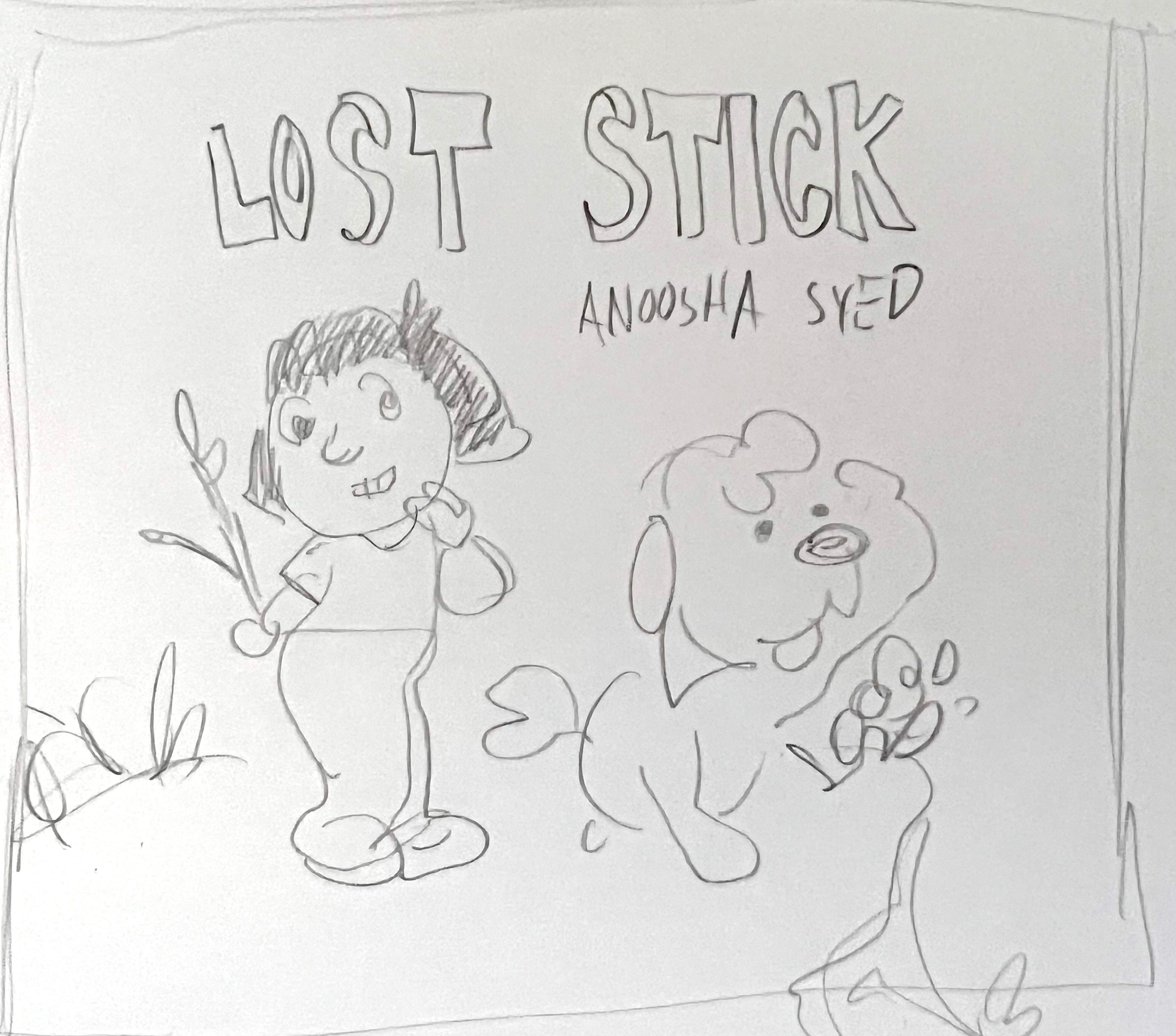
Did you know I have a new book coming out a month from now?
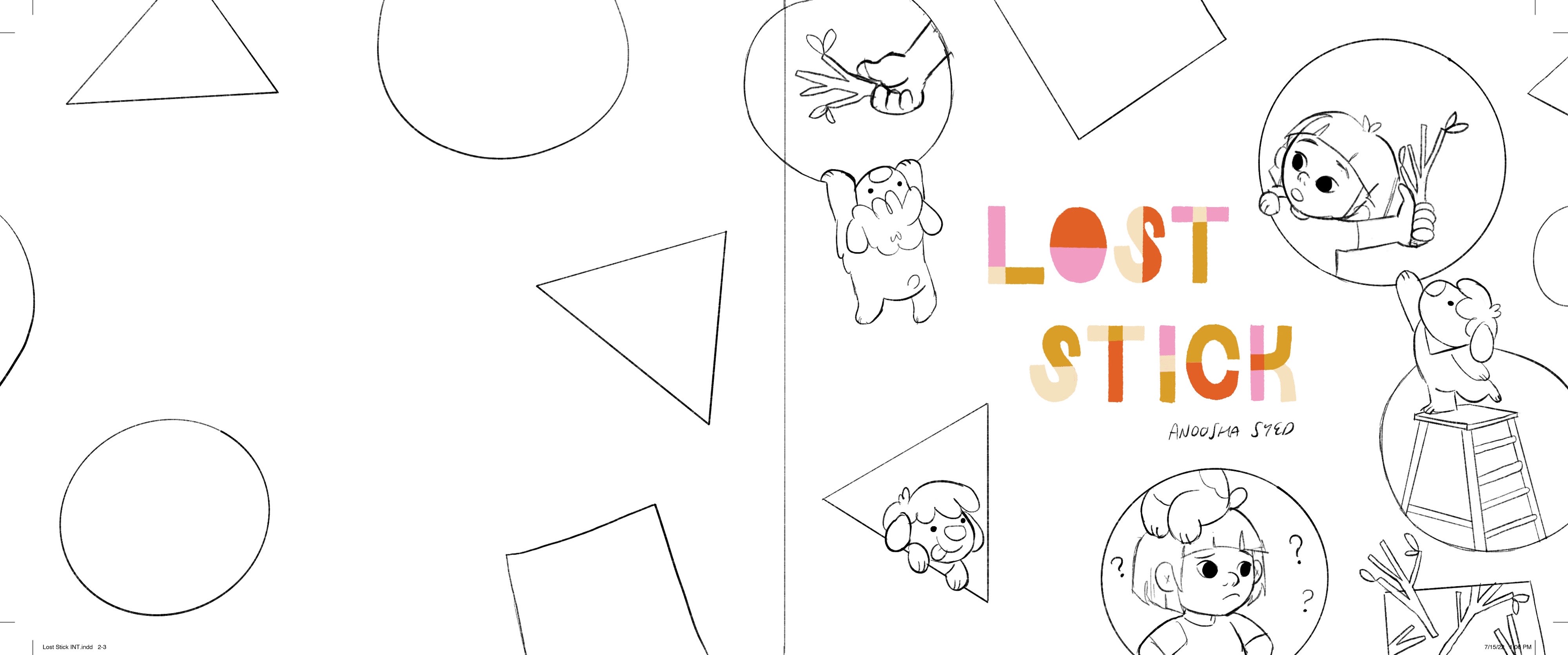
It’s called LOST STICK, and this is what the cover looks like:
By the way, if you preorder the book now, I’ll throw in a snazzy little print for you for free. Doesn’t that sound swell?

But enough shameless promotion, let’s get down to business.
Sometimes designing a cover is easy.
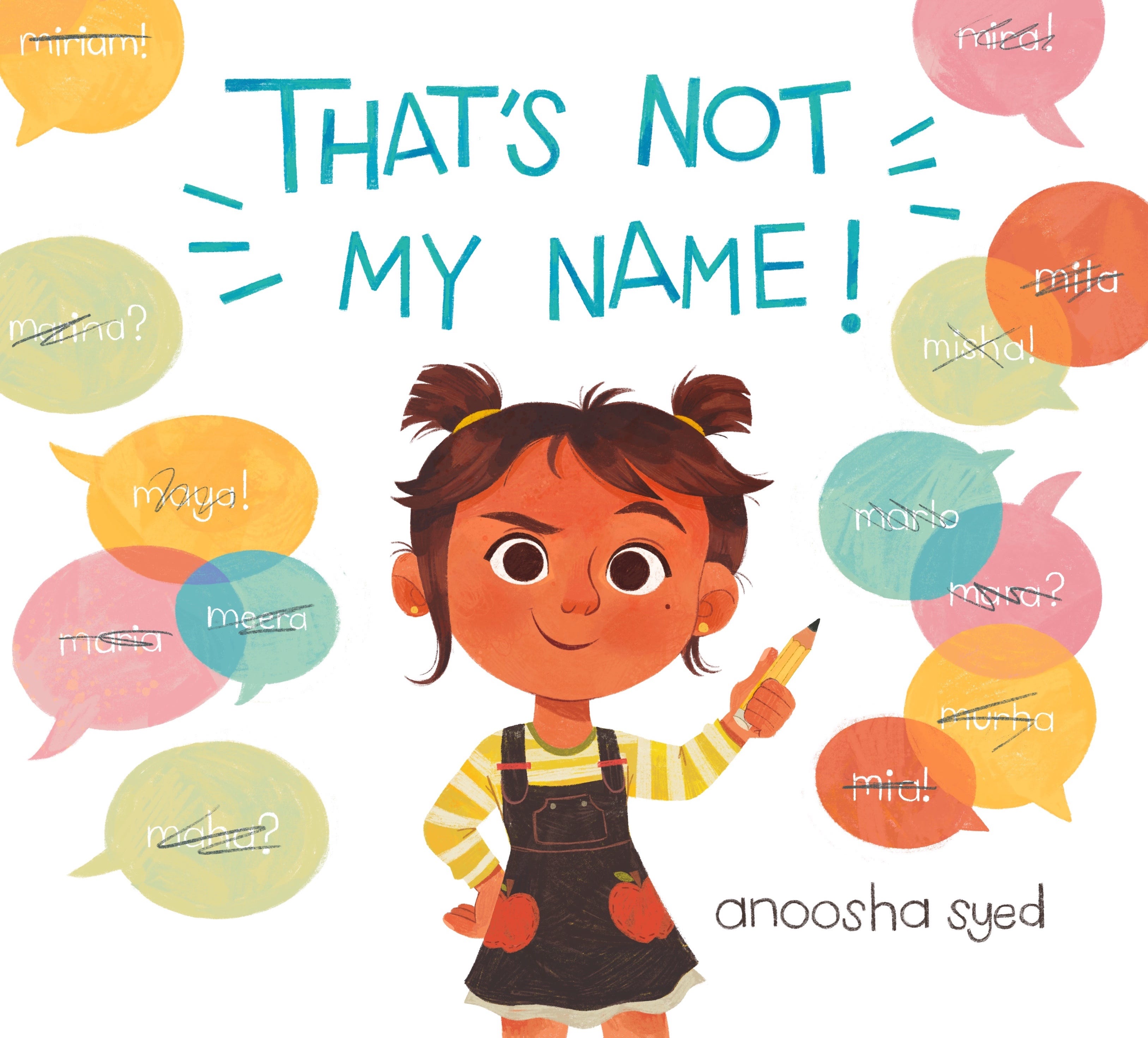
For That’s Not My Name, for example, I sent over three cover concepts and only had one round of revisions before finalizing the direction and moving on to the final art.


For Lost Stick, we went through three rounds of revisions and EIGHTEEN different sketches.
The problem was the book is about: That’s Not My Name is a pretty surface-level story and ended up being a very simple and easy cover to work on. Lost Stick was much more complicated.
Even explaining the book and trying to come up with a quick summary is difficult for me. The title is a play on the concept of a Lost Dog poster, but I was worried that out of context it doesn’t make any sense, so I had to make the plot absolutely clear on the cover.
It’s a comedy story where a girl called Louise is playing fetch with a Stick, but her puppy Milo doesn’t realize she only pretended to throw it. Milo runs off trying to find the Stick no matter the cost and ends up on a fun adventure that get more and more insane. Meanwhile, the puppy has no idea that his owner is back home, desperately trying to find him. There are all these near misses and crazy scenarios, and there’s a contrast between a fantastical high energy A plot, and a more grounded in reality, sadder B plot.
I had a really hard time trying to show this on the cover.
For the first round, I sent over eight concepts. They mostly focus on two different themes. Either poking fun at the imagery of a Lost Dog poster, which is what the title is referencing. Or showing Milo and Louise obliviously looking for each other, which is the book's plot.
I’ll go over each concept one by one:
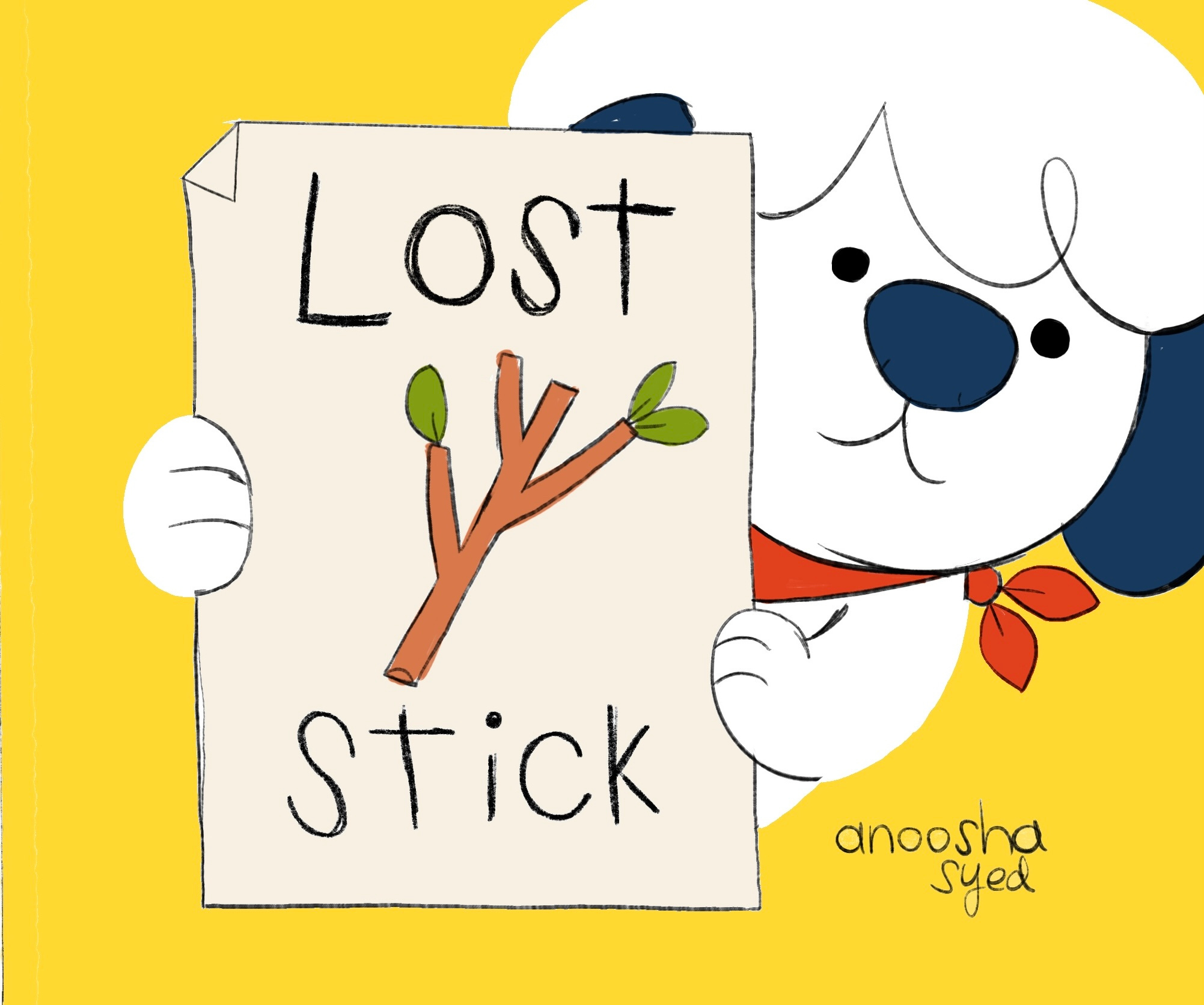
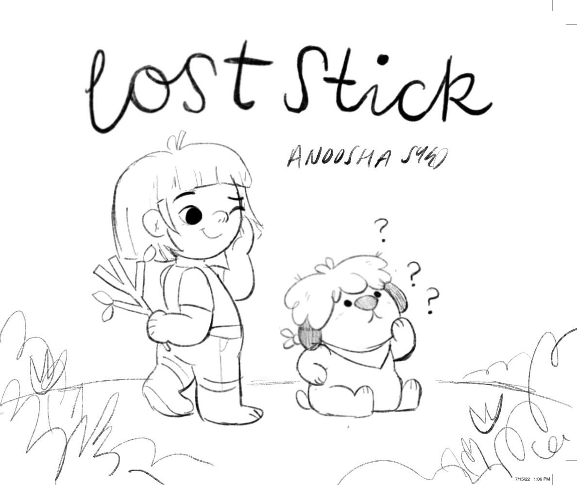
#1: I think this was one of my favourite cover options from this round. It directly references the Lost Dog type of poster and you get to see cute little Milo’s face too. Very simple, but I think explains the overall concept well. My only issue was that the title would end up being a little small in comparison because it had to fit on the poster.
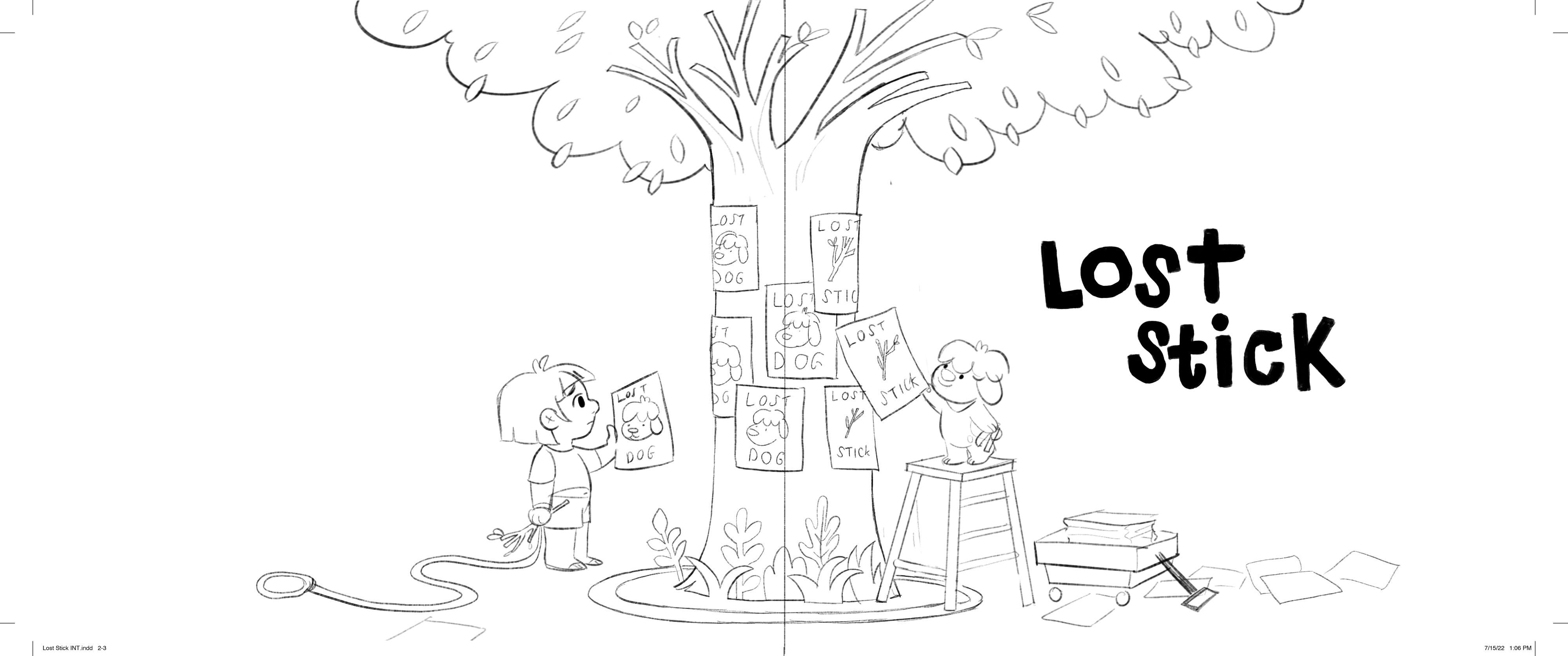
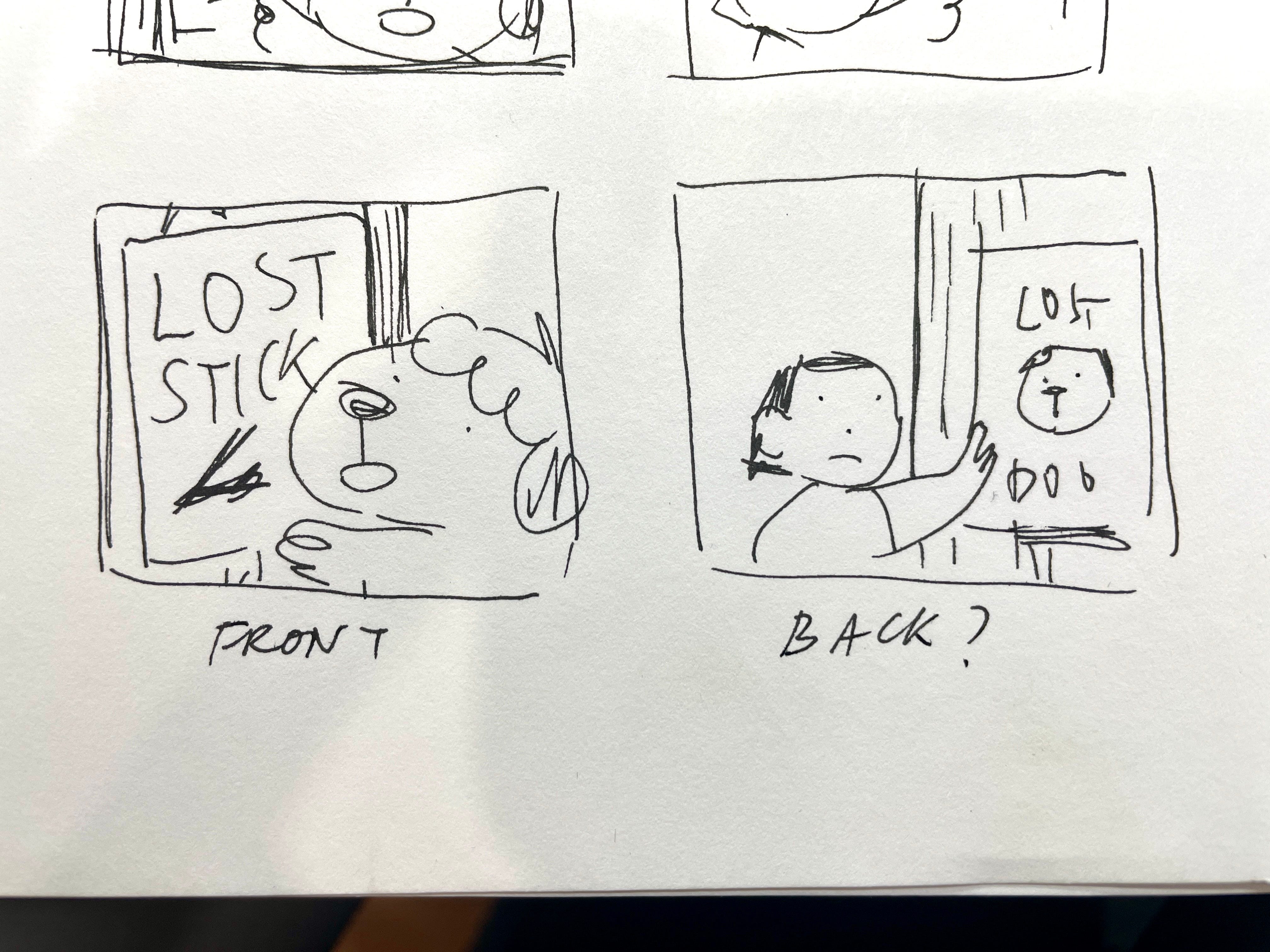
#2: This was an option for a wrap-around cover. On the front cover, you see Milo putting up Lost Stick posters, but when you flip the book over, you see that Louise is sadly hanging her Lost Dog posters. I thought that this would be a pretty interactive idea for a cover, and also show the ‘two stories happening at once’ concept in the book.
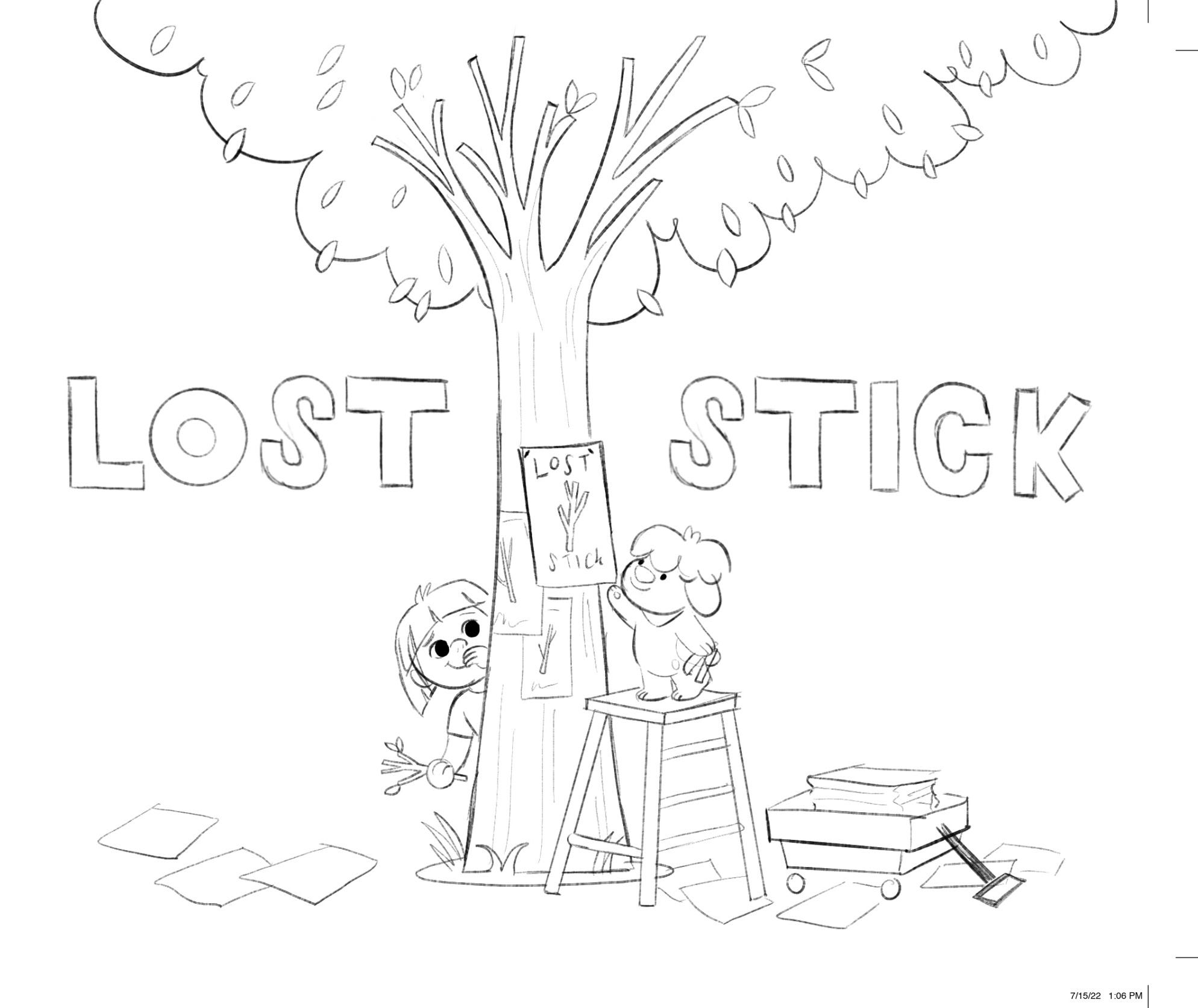
#3: This is similar to the previous sketch but as a single image. Milo hangs up a Lost Stick poster, and Louise is hiding behind the tree holding Stick. In my experience, publishers generally avoid cover art that looks too sad, so this was a more upbeat alternative.
#4: I loved this one too; I adore covers that play with the typography. Here I have Milo and Louise chasing each other, with some fun interaction with the title.
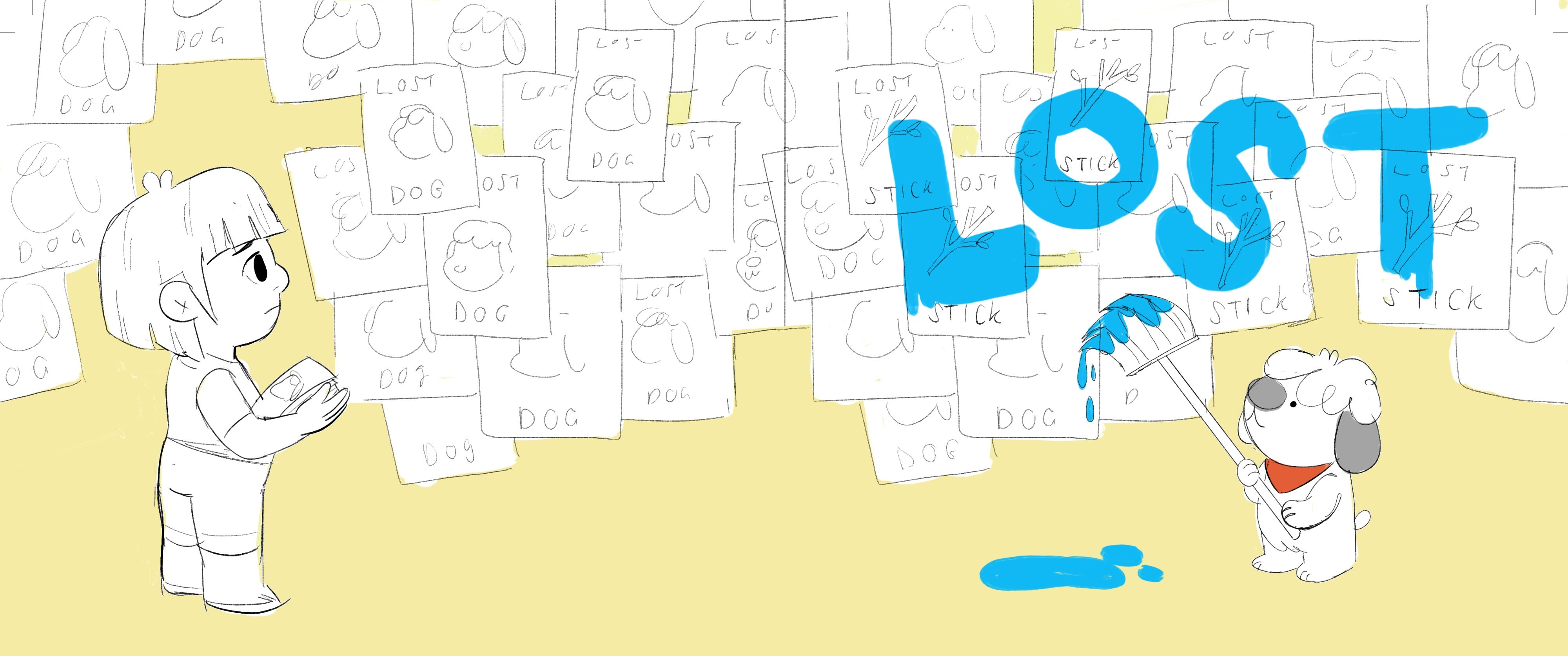
#5: Another wrap-around cover option. The team suggested trying a different title instead like just LOST, and so I tried a sketch using that option. Again, we see Milo and Louise hanging up their own posters but this time, we also see MIlo paint over the title of the book.

#6: In the book, Milo and Louise have a bunch of near misses where they almost run into each other and this makes the audience want to yell WAIT JUST TURN AROUND HE’S RIGHT THERE. I wanted to play with that idea for this wrap-around cover and do an MC Escher-style cover that feels fun and silly. Although we rejected this for the cover, I did end up using it for the title page instead.
#7: One more similar concept, but instead of MC Escher environments, I kept it simple with some graphic shapes.

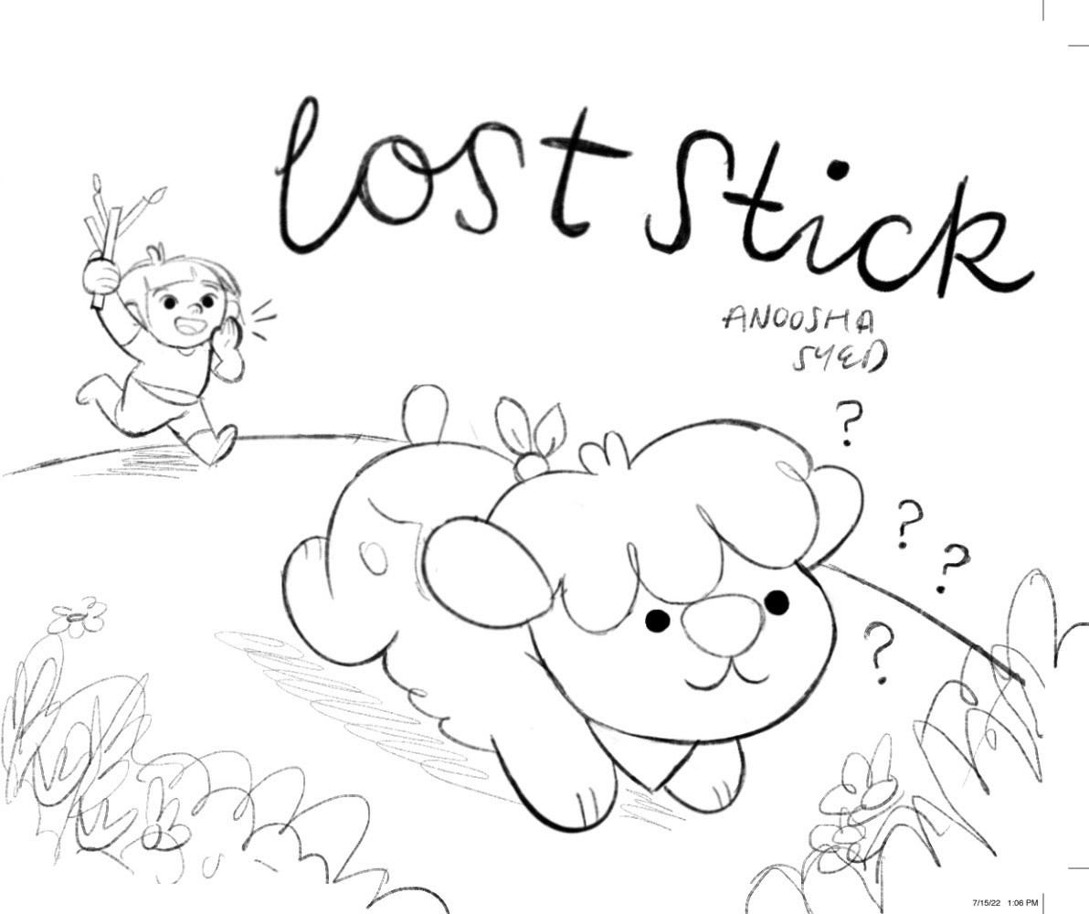
#8: And finally, my most beloved concept. As I’ve said in the past, I love a weird cover and I felt that this combined some of my favourite elements from my other sketches; The focus on typography and the wacky chase. I liked that you could see that Louise was chasing after Milo, who was chasing after Stick, and on and on and on.
From these sketches, my team liked #1 and #2 the most. They said:
We’re hoping to get the conceit of the book across on the cover (Milo runs away looking for Stick while Louise is simultaneously looking for Milo) and we think having both characters displaying their “lost” posters on the cover is a fun and clear way to do that. We’d also love to keep Milo front and center on the cover because he’s so adorable.
So I got to work trying to find a way to mesh those two cover concepts together.
I then sent over two more sketches, although I’ll admit that I honestly don’t like these ones. I had a really hard time combining those two concepts.

#9 If I used the LOST STICK poster as the book cover title, the poster needed to be large enough so that it’s clear this is the title. However, because the cover is square, I wasn’t left with enough space to include Louise and her LOST DOG posters and it looks a bit cramped.
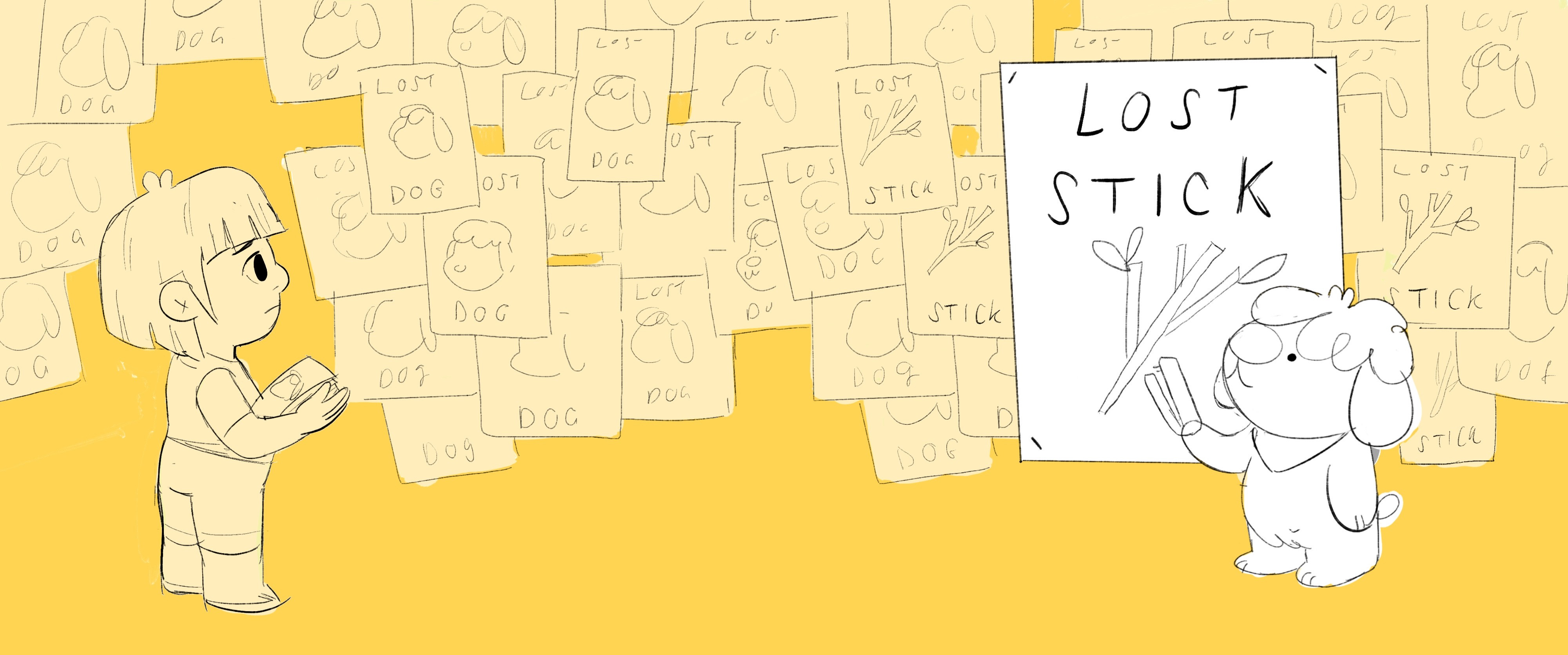
#10 The other issue I had with the posters was that it ended up being too much text on the page. Very busy.
The team agreed this wasn’t working, so suggested a different approach.
Maybe instead of trying to explain the plot, just focus on a really appealing action pose. Milo is such a cute little puppy, and maybe we just needed to make him the star to draw readers in.
So I sent four more concepts!
I asked my friend
for some input and she made a beautiful drawing to help me out with the composition.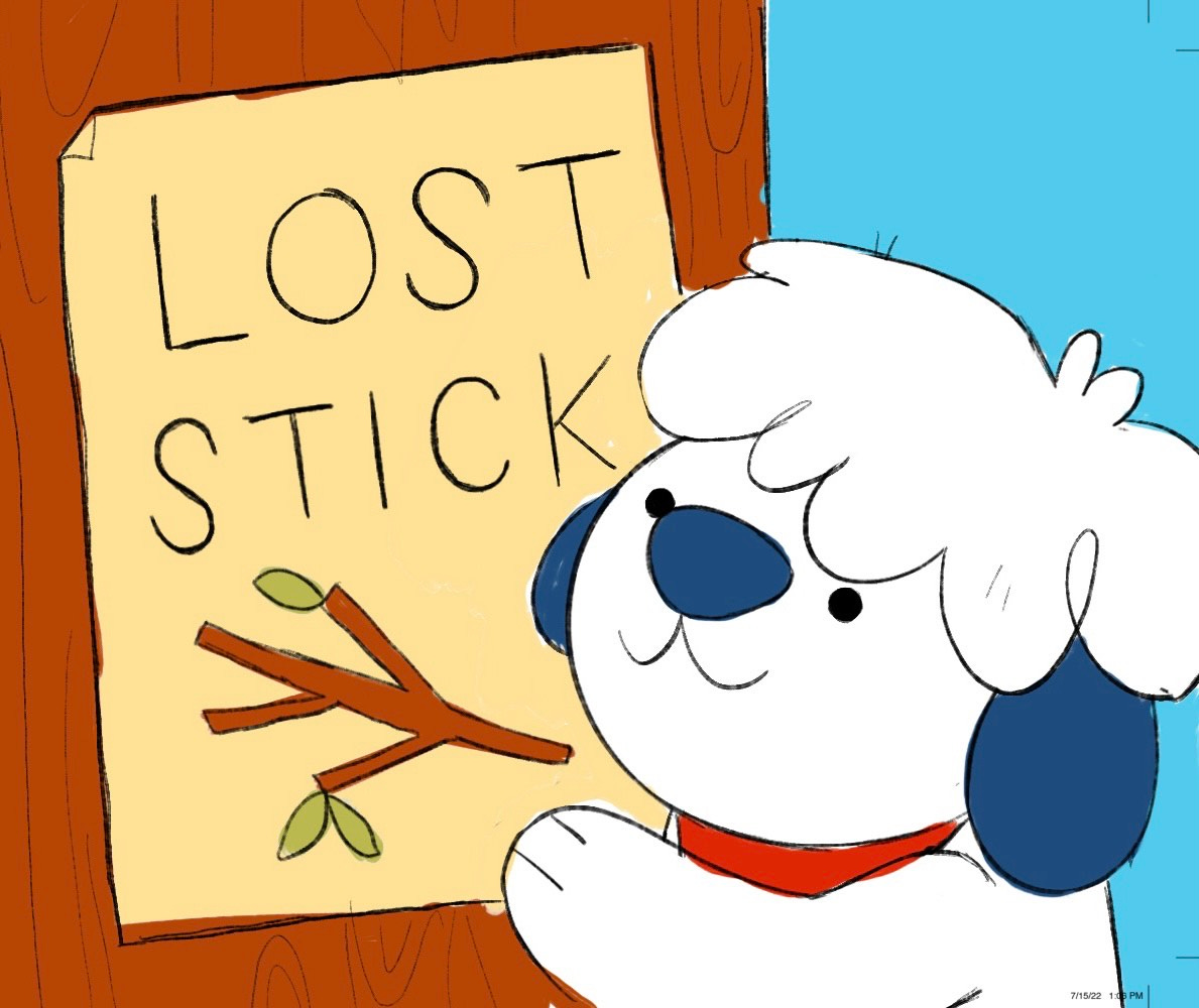
#11 Another LOST STICK poster concept, with a closer shot of Milo.
#12 The same cover, but with a wrap-around back cover that includes Louise and her poster.
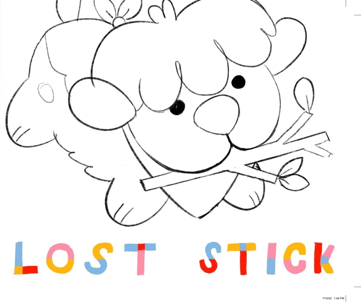
#13 I pulled a really cute pose I did of Milo from one of the pages of the book, and just used that for the cover along with my fun typography.
#14 Same concept, but this time there’s a bit more movement with Milo jumping in the air.
We were getting somewhere! My team felt like #1 could be the winning cover, but they were going to check in with Sales and Marketing and everyone else, so we took a pause.
In the meantime, I asked if we could use this cover concept for the Case Cover. This was still my very favourite option, and I wanted to use it in some way, so they gave me the go-ahead to start illustrating this while we waiting for cover feedback.
After a few weeks, the team came back with their thoughts. Sales & Marketing loved the final art interiors that I had sent recently, and they wanted to try to put some of the plot back into the cover. They suggested:
Louise does the fake out and Milo looking off into the wild wonders wondering what happened to said stick and making the decision to embark on his adventure.
They can be standing on a grassy hill with some flowers and detail around them—sales LOVES all the careful detail you’ve done in the interior art and hopes to pull a bit of that into the cover as well.
Jim, my lovely Art Director, offered this sketch as a helpful interpretation.
The team was still waiting to hear back from the publisher, so I had to hold off on the cover for a little while longer. I worked on the case cover and endpapers in the meantime.
Finally, we got this feedback.
What if the cover was the two of them in the park, the girl behind the dog as if they were playing fetch but the dog is up close, running toward us with the stick in his mouth. That way you get the big bold dog, but it’s also showing the relationship and the active part of playing fetch?
Or, if the stick in the mouth is confusing with the title . . . What if it was a riff on the first spot in red, but with them facing us and the dog up close and cute?
The spot that they’re referring to, is this page in the book, where Louise pretends to throw Stick, but Milo runs after it anyway.

Now we were getting somewhere! I sent three more sketches.
#15 Milo and Louise in the park. Louise is giggling, hiding Stick behind her, and Milo is absolutely confused.
#16 Louise calling after him, holding the Stick, while Milo runs into the bushes.
#17 Louise calling after Milo who is holding Stick in his mouth
The team really liked this direction and we were almost there. Their only suggestion was that we change it so that Louise is throwing Stick.
They also thought that we could reuse one of the older sketches for the back cover as well.
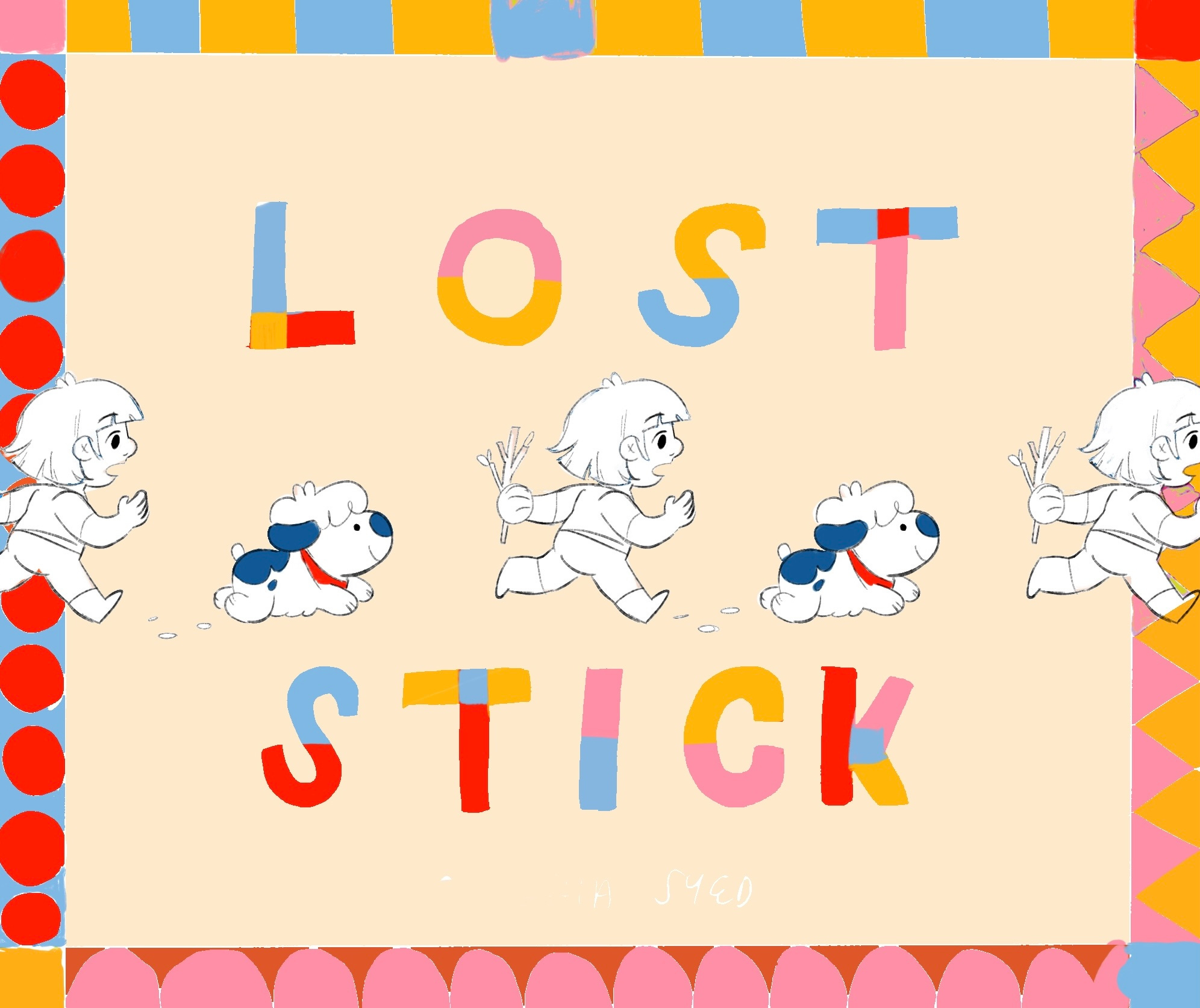
So after weeks of back and forth, we finally landed on our cover concept!
Our front cover, as well as our back.
This post is an excerpt from a video I am working on about how I illustrated this book cover. Keep an eye out for that as I will be posting it later this week!
That’s all for now BYE
As someone who gets the chance to work with illustrators regularly I appreciate your willingness to share your ideas - the ones that stick, the ones you loved but didn't get chosen, and the final selection. Thank you for taking us behind the scenes on the book cover creation experience. I truly loved the journey you took us on!
Lovely! I love all of them and that’s why I’m not a book designer or art director 😂…