Development in Picture Books
Figuring out character design, style, and medium
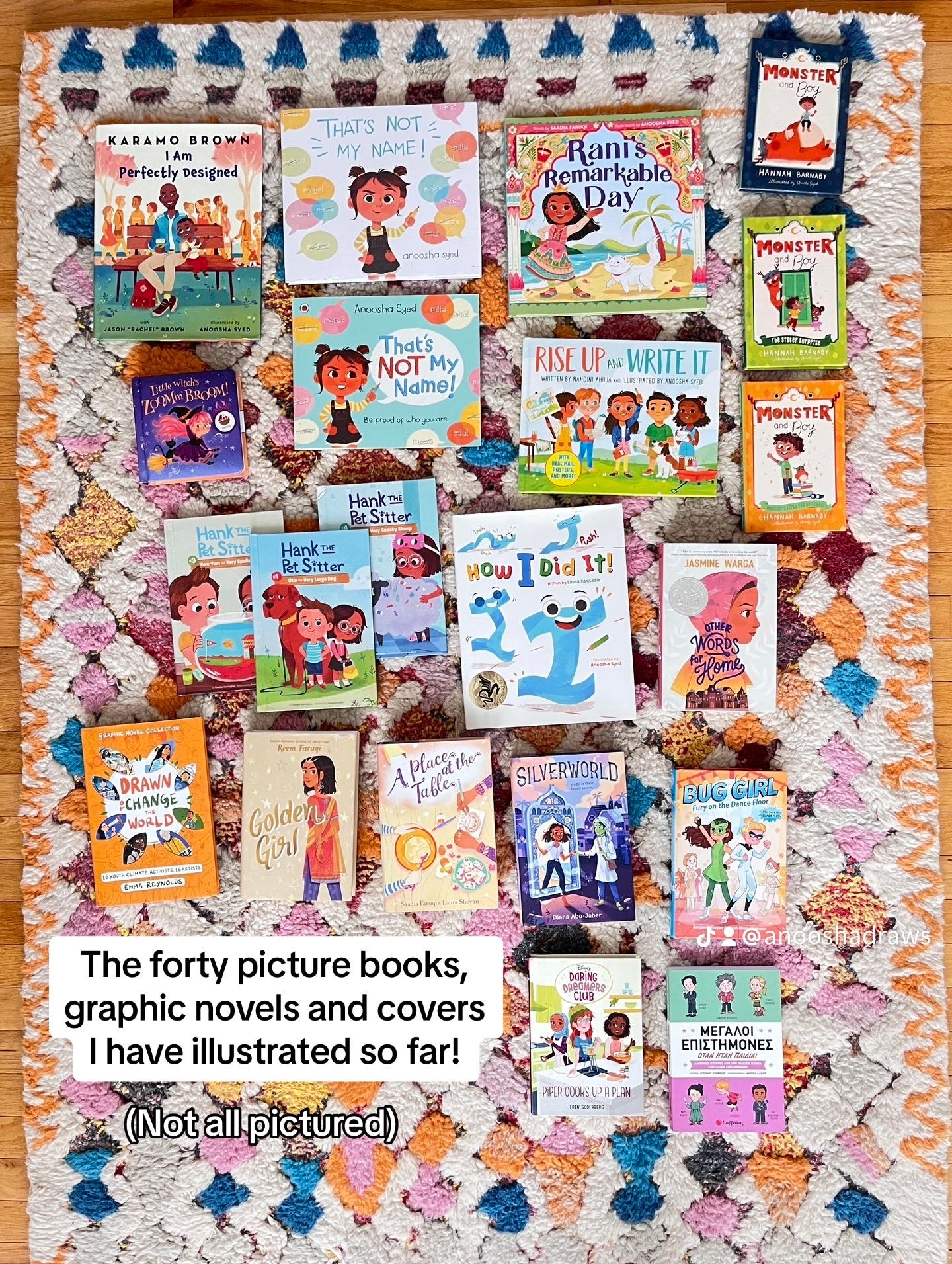
I have worked on forty picture books in my nine-year career as a children’s illustrator. People are usually shocked when I share this number, but I have to give some context.
In my early career, I would illustrate up to five books in a year and usually work on two simultaneously (or even three if I was unlucky and my schedules somehow lined up).
These contracts were for three months max; where I had thirty days to sketch, thirty days for final art, and a sprinkling of time for revisions and waiting on feedback. Basically illustrating one page a day.
Oh… and the pay was abysmal.
Though fresh-grad Anoosha had no way of knowing that at the time, so thought it was completely normal and necessary to say yes to every inquiry no matter how bad the terms were.
Obviously, this leads to severe burnout. I am really unhappy with my early books because it’s clear that I was churning them out, sticking to my comfort zone, and illustrating on auto-pilot. How could I explore my craft and be creative if I didn’t have the time?
In contrast, for my more recent projects, I have been given 8 months to a year to illustrate a book. This consists of a few major deadlines (sketches, cleans, and finals) that are flexible and determined by myself and my speed. I usually allot some time at the beginning for development to figure out my style, medium and gather my resources and references. I work on a maximum of two books in a year, and now that I have switched to traditional media, I physically can’t work on more than one book at a time because of how creatively draining and time-consuming the medium is.
I am grateful for the knowledge I have gained about the industry over the years to better equip me to know my worth and make good business decisions and the immense help that a great agent can bring to an illustrator’s career in terms of negotiating better pay and fighting for my needs.
Because of this change, I actually enjoy making books again! I have time to challenge myself and explore, and am so proud of my current books.
So on that note, let’s talk about my development process for my latest picture book, Lost Stick.
Back in 2020, I pitched two picture book concepts as part of my debut author-illustrator submission, and subsequently got a two-book deal with Viking Childrens @ Penguin Random House.
One of them ended up being That’s Not My Name!, which is also the first of the two books I worked on, and the other was an early version of Lost Stick.
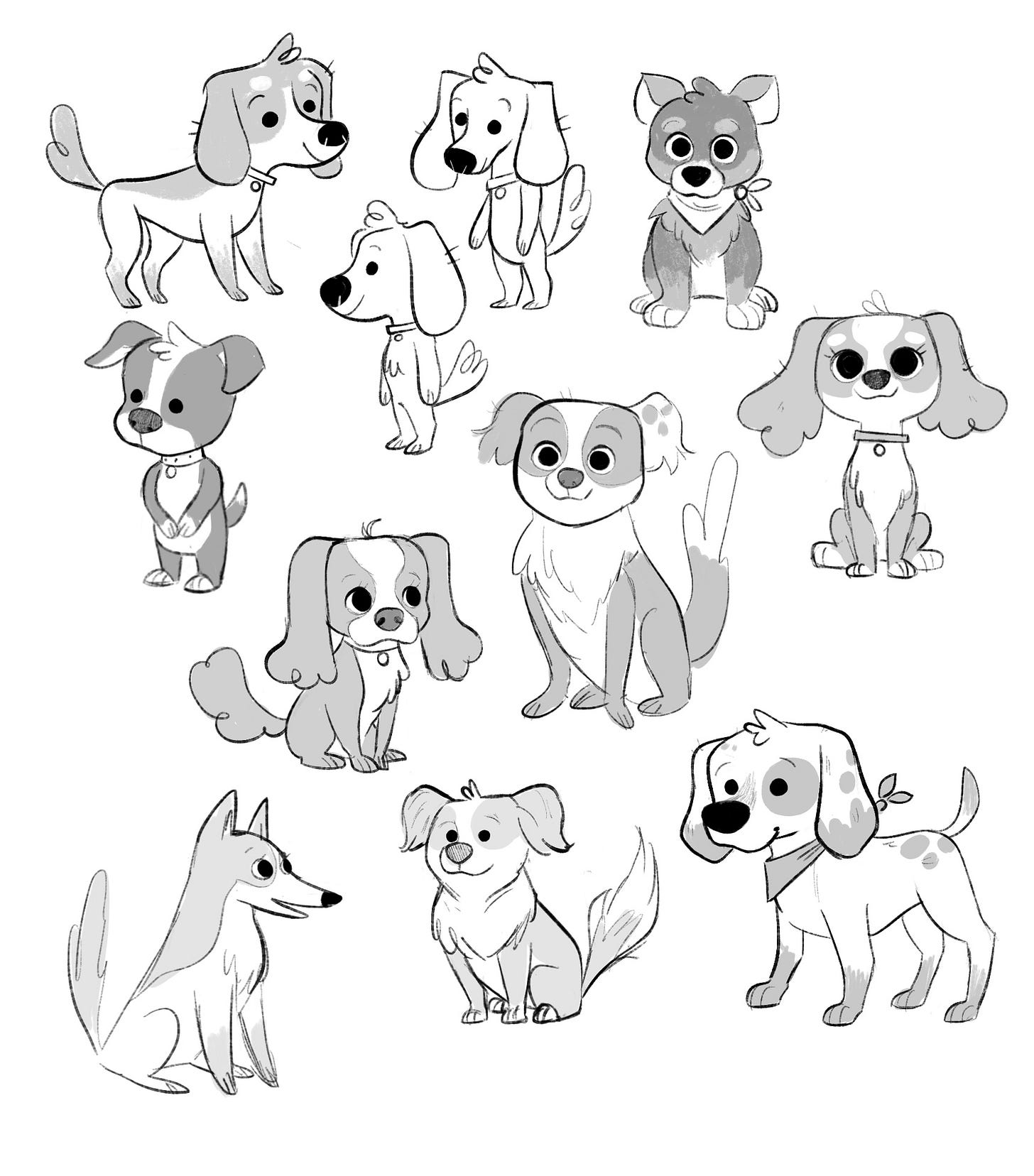
We are going to be talking about the development I did for this submission. I started with a page of dog exploration sketches that varied between realistic and stylized.
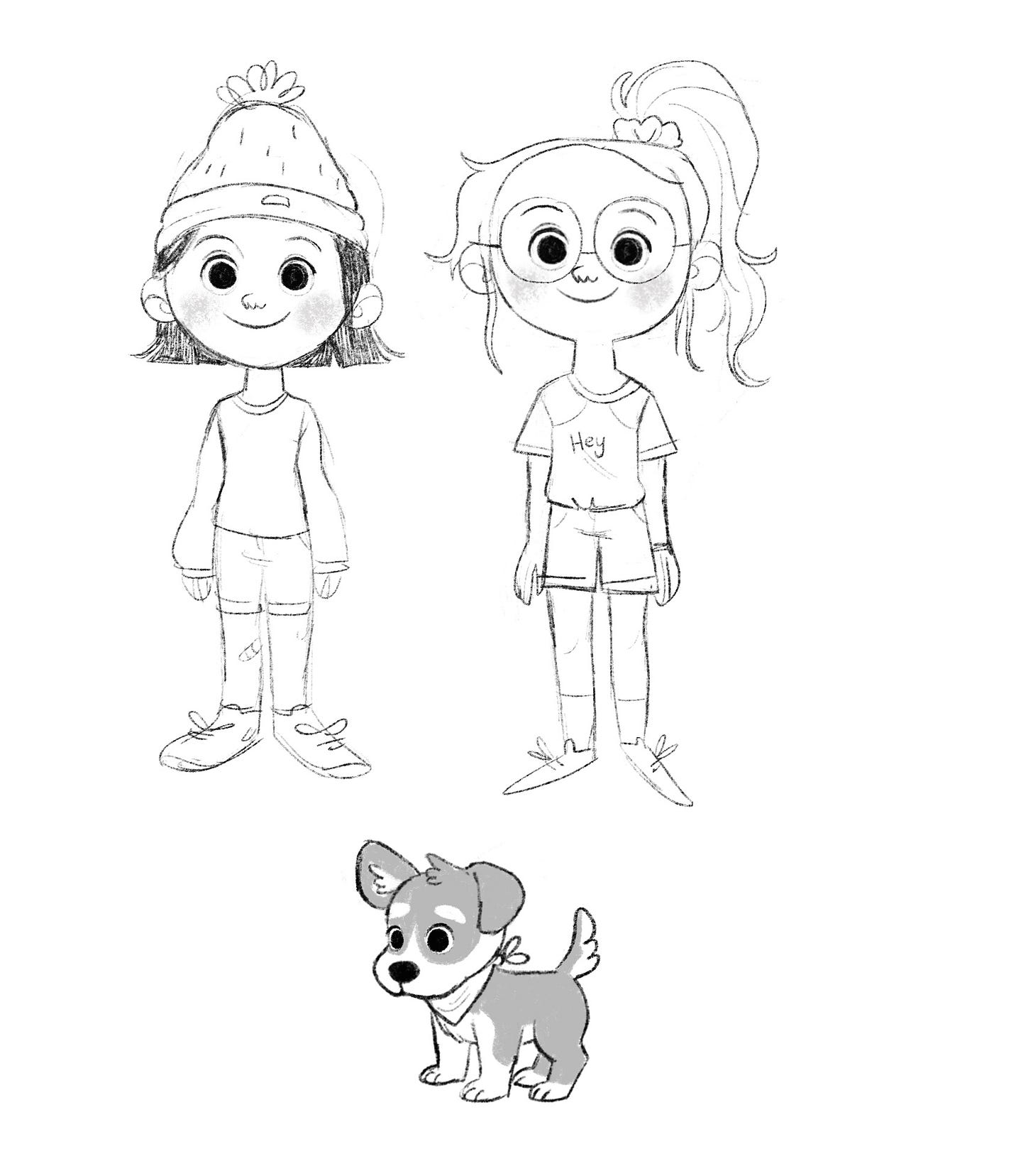
Then I tried some human sketches to match my favorite dogs.
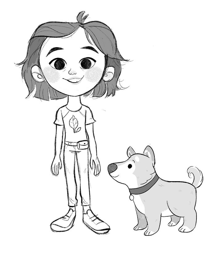
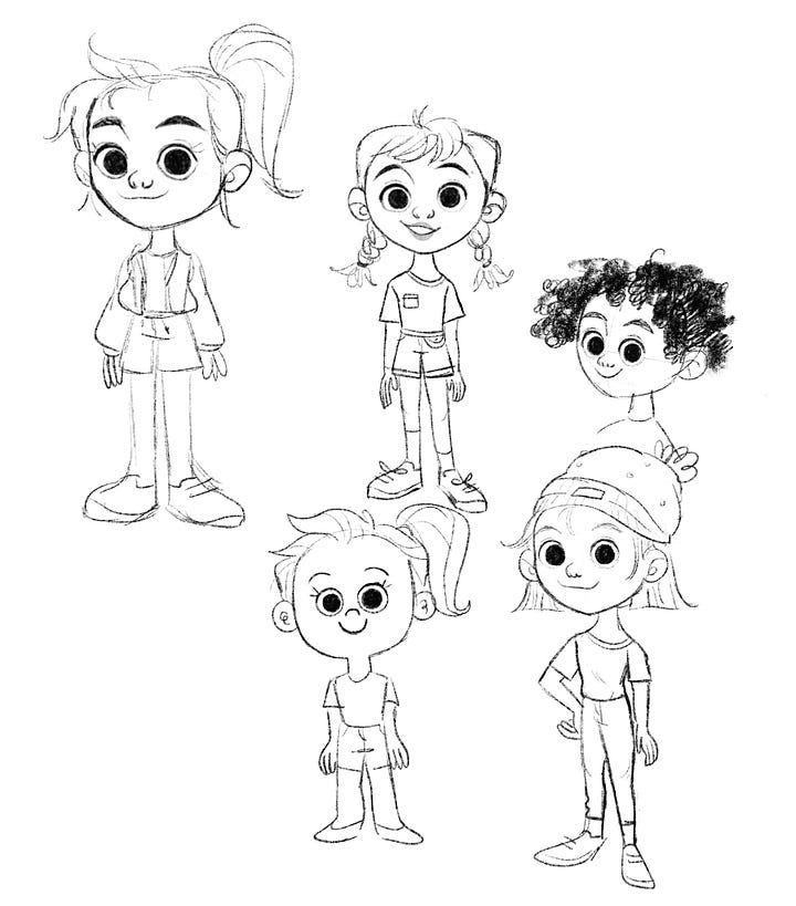
While I didn’t have a clear design in mind, I knew I wanted a tomboy-ish tween girl to be my main character.
I settled on a very classic beagle puppy and the girl on the left, and used these designs in my 2020 dummy submission.
In early 2022, after I had completed That’s Not My Name!, my Penguin Random House team shifted focus to my other concept.
However, two years had passed since my original pitch! I had grown and evolved as an artist, and clearly, the manuscript and dummy needed some reworking. We spent a few months editing it to perfection, and around this time my characters also got a makeover.
With the new manuscript edits, we decided to age down the text for a younger audience, which meant a younger protagonist.
And as much as I loved my old Milo design, I thought that maybe a beagle was a little too classic of a dog, even a bit bland. I didn’t feel like it captured any of his personality. I also wanted something a little more unique that could set my book apart and have Milo be more recognizable.
So it was time for another round of exploration!
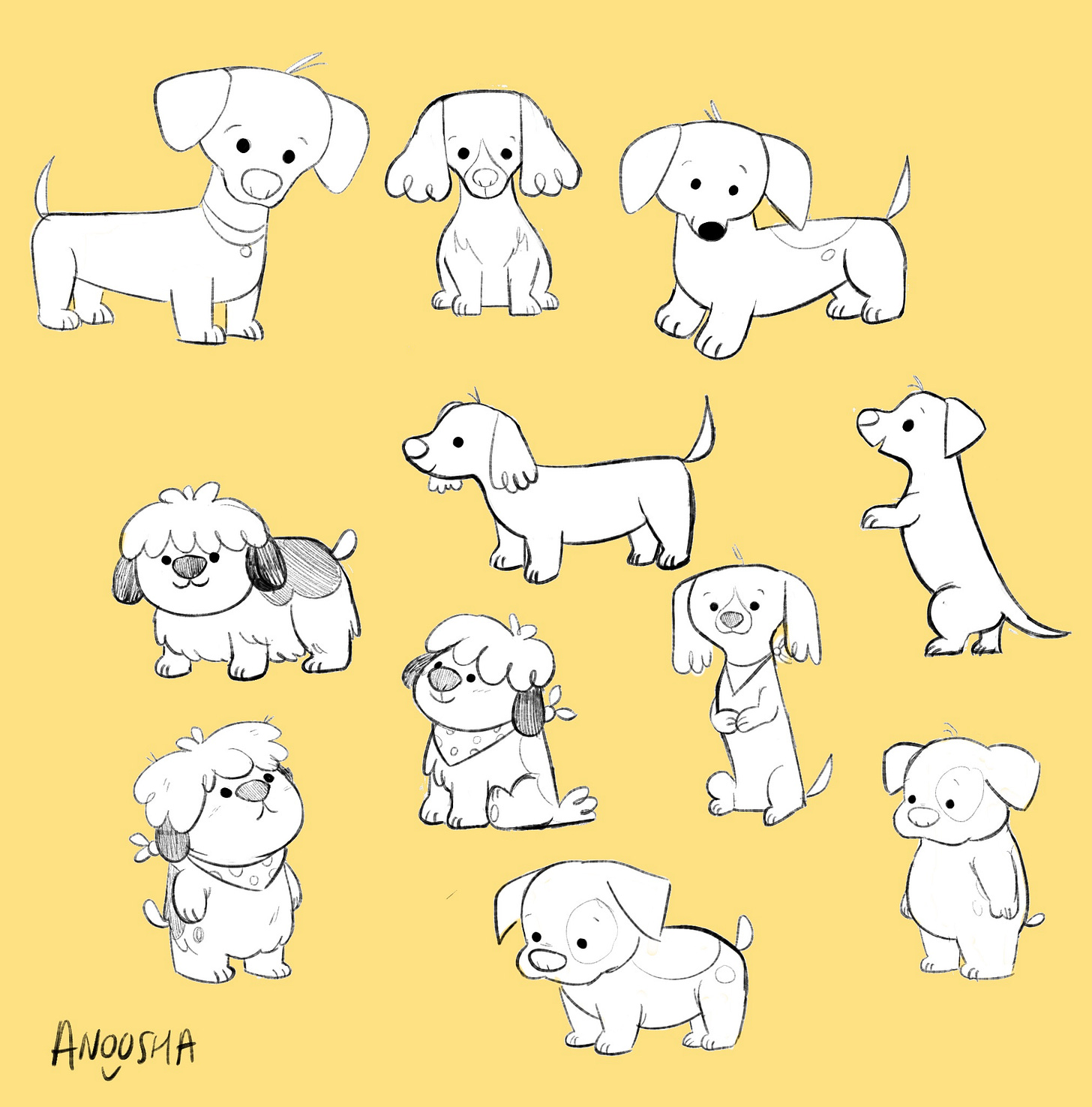
Here I focused on three dog breeds; a weiner dog, a pitbull, and a sheepdog. Milo is an extremely cute puppy without a thought in his little brain, and I wanted to reflect that in his design. I played with exaggerated proportions and maximizing the cute factor. I also thought that the dot eyes worked better to convey the ‘vacant brain’ aspect of his personality haha.
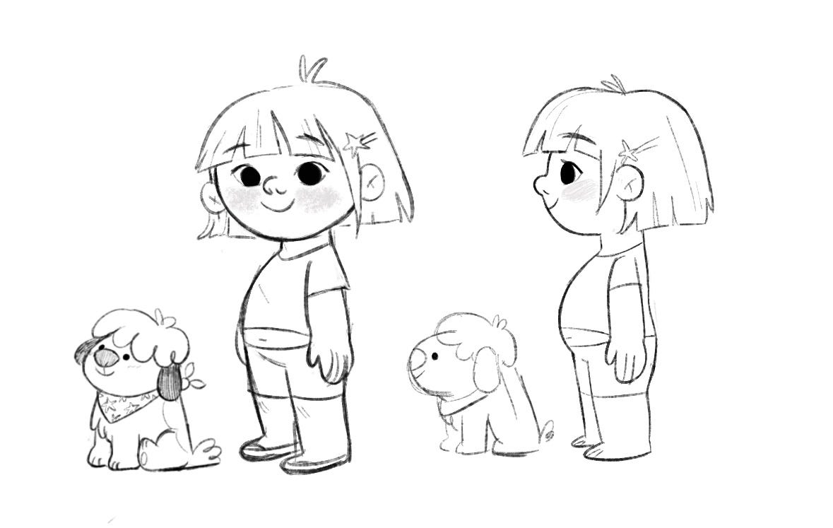
In the end I decided on the sheep dog design! They are my favourite dog breed, and I felt I could get a lot of humor and expressive personality from his mop-like fur.
I adore the design trope of having a pet and its owner looking the same, so now I had to make a matching human design.
I pulled from Milo’s key features (the big bangs, button nose, overall roundness, monotone color palette and a chubby tummy) and made Louise!
Although I had initially planned for this book to be illustrated digitally, I had a sudden urge to attempt my first traditionally illustrated picture book.
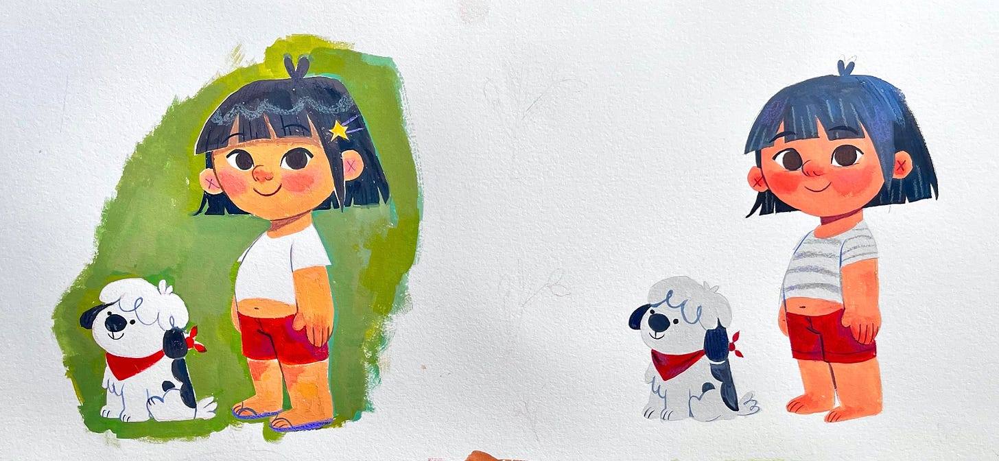
To see if this was even possible, I began with a sample page to test out my paints and palette.
I made two versions; one with a painted background and one plain. A big part of Milo’s design is his bright white fur, and I loved the idea of him always standing out in a busy background. However, if he needed to be in a spot illustration, I also needed a version of him in a very light grey.
I recently posted a real-time video I recorded of my process when painting my tests!
It’s quite interesting to see how much Lost Stick evolved over three years. When making my dummy, a lot of the content was overhauled but I do have an interesting tidbit to share!
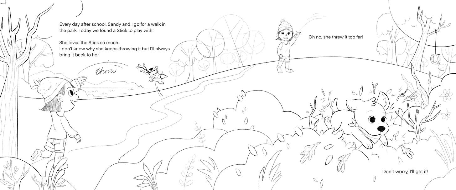
As part of my 2020 submission, I had fully illustrated one of the spreads in my dummy. Funny enough, that page ended up staying somewhat intact in my final book but with a starkly different look since I had changed my medium and character design.
Is there one version you prefer more? How bizarre would it have been if I kept my initial 20202 style for my book?!


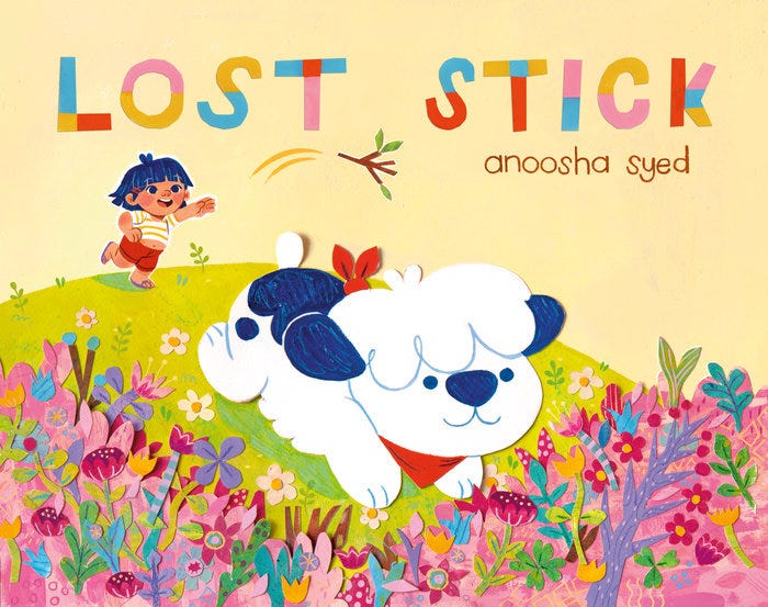

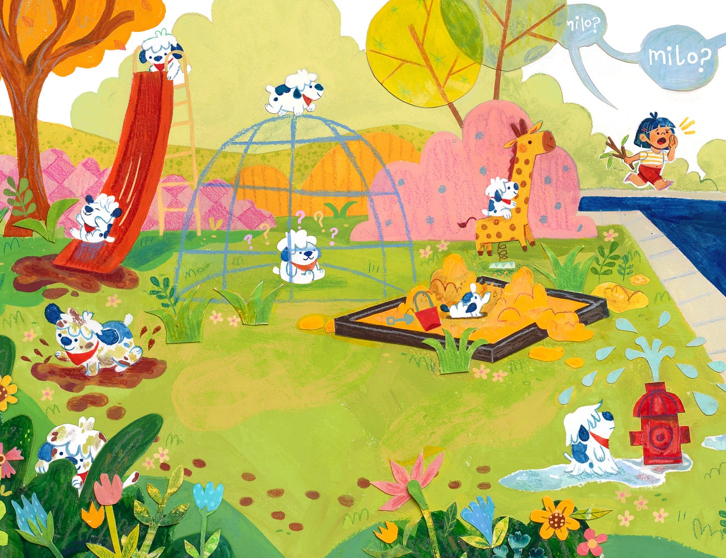

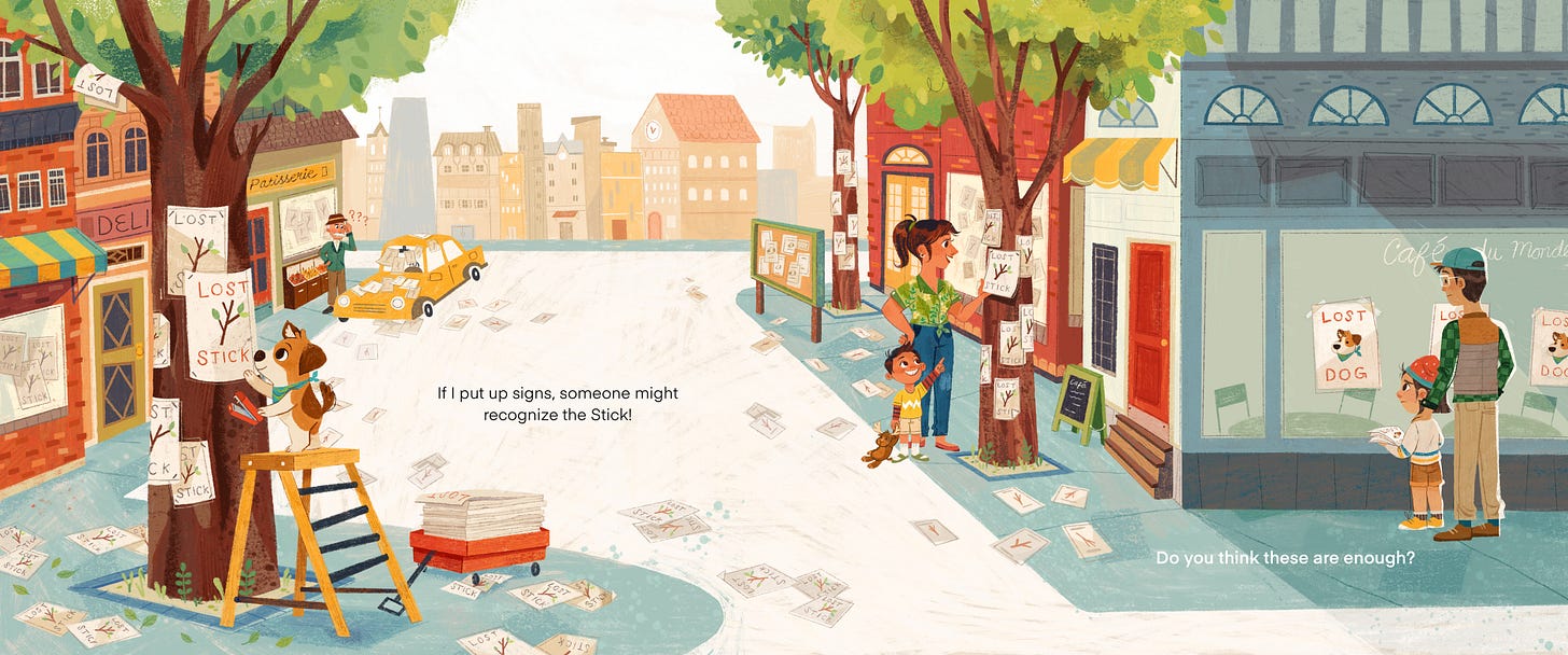
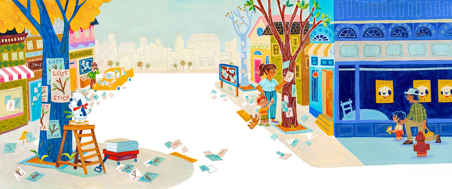
I can't imagine this book with a different Milo or Louise! So crazy to see the 2020 version and the finished version side by side, I'm happy it took the two years for it to rest and become what it is today!
How cool to end up with almost the same image after all that! I definitely prefer the new one: the vibrancy and contrast are so effective, plus that little kid's face is priceless! 😄