How I Illustrated 'Rise Up And Write it'
Behind the scenes of a Picture Book!
Hello art friends! Today I’m going to show you guys how I illustrate my picture books. Specifically, RISE UP AND WRITE IT.
I get a lot of questions asking about what the picture book publishing process is like and how I illustrate my books, so I wanted to go over it all in a very lengthy post and video.
Today I’m going to talk about
how I got this job offer
the timeline
the schedule
and what it’s like working with the publisher
AND I’ll be going into detail about each step of the illustration process from
concepts
to character design
to sketches
to feedback
to final art
Which, by the way, I did entirely on my iPad Pro with the app Procreate.
NOTE: This is a repost of an older video so I sound very cringe and still have a baby illustrator brain. The views of dumbass 2021 Anoosha do not reflect the fully mature and realized genius of 2023 Anoosha
ABOUT THE BOOK
Rise Up and Write It is a 32-page picture book, written by Nandini Ahuja and published by HarperCollins on January 5th, 2021.
The story is about a little girl called Farah Patel living in a neighborhood with very few green spaces, who petitions to make an empty lot next to her home into a community garden. But, a Gravel Company has proposed to buy the land to make it into a parking lot. So, Farah with the help of her family, friends, and the entire community take action to make the garden a reality thru lettering writing, planning, and activism.
I’m really happy I had the chance to work on this book because I feel like it sends an important message to children and encourages them to be the change they want to see in the world. 🎶
I also love that we have four South Asian main characters! Farah, her parents, and Mayor Khan. I feel a lot of pride in helping create books that I would’ve loved to read as a kid and see myself in since as a Pakistani kid, there weren’t any of those books out there. I felt a lot of responsibility in making sure the characters in the book were as diverse and inclusive as the world that we all live in.
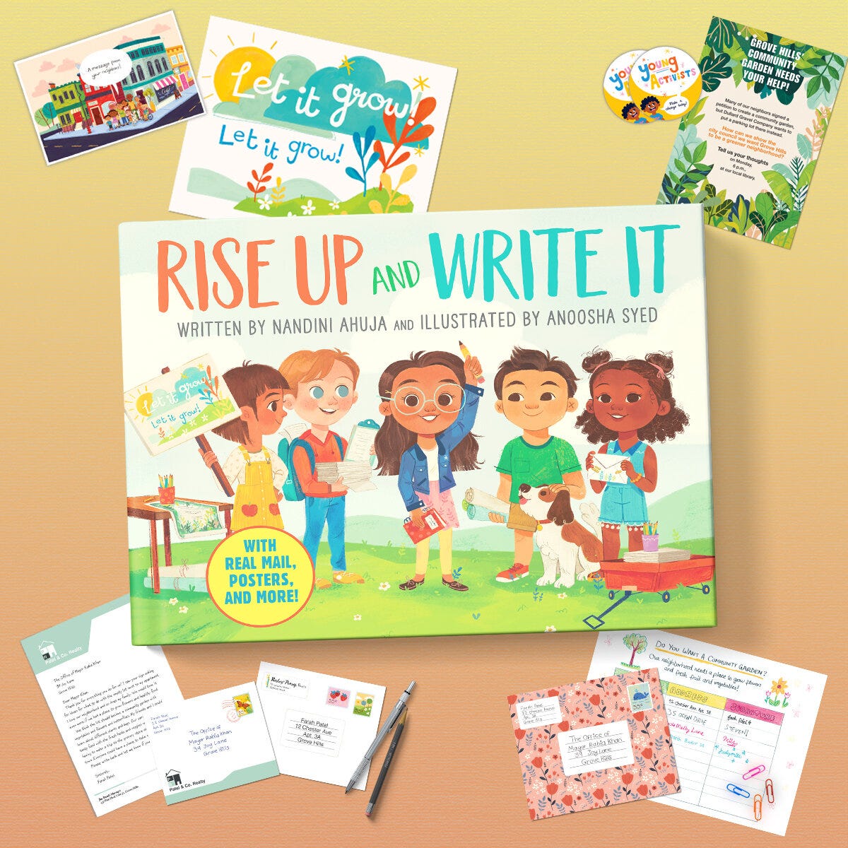
This book is also a novelty book! Since it has a strong focus on activism and letter writing, you have six pages in the book that are designed to look like ‘envelopes.’ Inside each of them is a fun insert, like a letter, a poster, a sticker, or a postcard. It’s a really fun interactive element that was so cool to design since I’ve never worked on anything like this before.
HOW I GOT THE JOB
There are several ways to get picture book offers from traditional publishers. Some of them include submitting to publishers or contacting art directors directly, which is something I covered in my Contacting Art Directors video from a few years back. Or your agent might source a project for you. But if you have a strong portfolio and online presence, or you are an established illustrator, someone from the publisher might get in contact with you (which is what usually happens for me).
An art director from HarperCollins, who likely saw my portfolio online, emailed my agent with a proposal for the book saying they were interested in hiring me for this project. If you remember from my How to Get an Agent video, I actually don’t communicate with the client at this point; my agent handles all the discussions to keep things professional.
When an editor or art director gets in touch, in their initial email they’d ask for your availability and send over basic information about the project like:
Who the author is and what the book is about
When it’s releasing
How many pages it is
What the budget is going to be (and general offer)
The proposed schedule
And including the manuscript for you to read
If you’re interested in the project, the publisher will then send over a contract for you to review and eventually sign.
The contract will cover what you’re being paid, and in how many instalments. (Which, by the way, the fee is always going to be a flat fee which includes all the interiors and cover art.)
Who owns the rights to the artwork, in which territories, for how long, as well as the sub-rights
What the distribution would be like
The schedule and when things must be delivered
What percentage of royalties you receive (if any)
Whether you are allowed to create competing works
Illustrator credit
Whether you can consult on the final art (which you should)
How they plan to promote the book
However, if you feel like the contract terms could be better, you don’t have to immediately accept it. You always have the option to negotiate!!!
Since I have a literary agent who fights to get me better deals, she and the publisher will discuss back and forth on these terms until both parties come to an agreement. Sometimes this process can take days, sometimes it takes weeks.
Obviously, negotiation can be a tricky subject and definitely intimidating because you might feel like you don’t want to scare off a client, but it’s also important that you are being compensated fairly. I go way more in-depth about negotiation in my previous post!
Anyway, after all that discussion is done, I sign off on the contracts and finalize all the paperwork.
At this point, my agent finally introduced me to the person I’d be working with at HarperCollins, in this case, the art director, and we got to work!
TIMELINE
Let’s briefly go over the timeline and schedule:
HarperCollins first got in contact with me on Jan 30 2020 with their proposal.
Discussions and negotiations took about two weeks, and I was introduced to the Art Director on Feb 14, 2020.
For the interior art, they wanted to see the sketches due between March 15 - April 1st, and the final art was due on June 1.
This means around 1 month for sketches and around 2 months for the final art. The cover they wanted to see earlier.
The sketches for that were due on March 15, and the final art on April 15, one month each. Remember, this wouldn’t be the exact amount of time I’m given, since you also have to subtract time where the art director would review the work and give feedback.
So in total, I would finish the book on June 1, working on the book for about 3.5 months.
This is actually a pretty short schedule and something the client mentioned when they first proposed the project to me. In my experience, 6 months-1 year is usually the timeline picture book projects of this length are given. I’ve had other books, like I Am Perfectly Designed, that was on a tight schedule.
Sometimes that's just how the project goes and it’s up to you to decide whether you’re able to get the work done in that time and if the advance makes sense for the extra stress. I’m actually a very fast digital artist, so it wasn’t a problem for me, but if I had other books going at the same time, it would be more difficult. (Oh, speaking of, I usually work on two books at a time, three max!
CHARACTER DESIGN
Before we start on interior art, we have to develop the world and the characters that live in it. As a professional character designer for animation, this is actually one of my favorite parts of the whole picture book process!
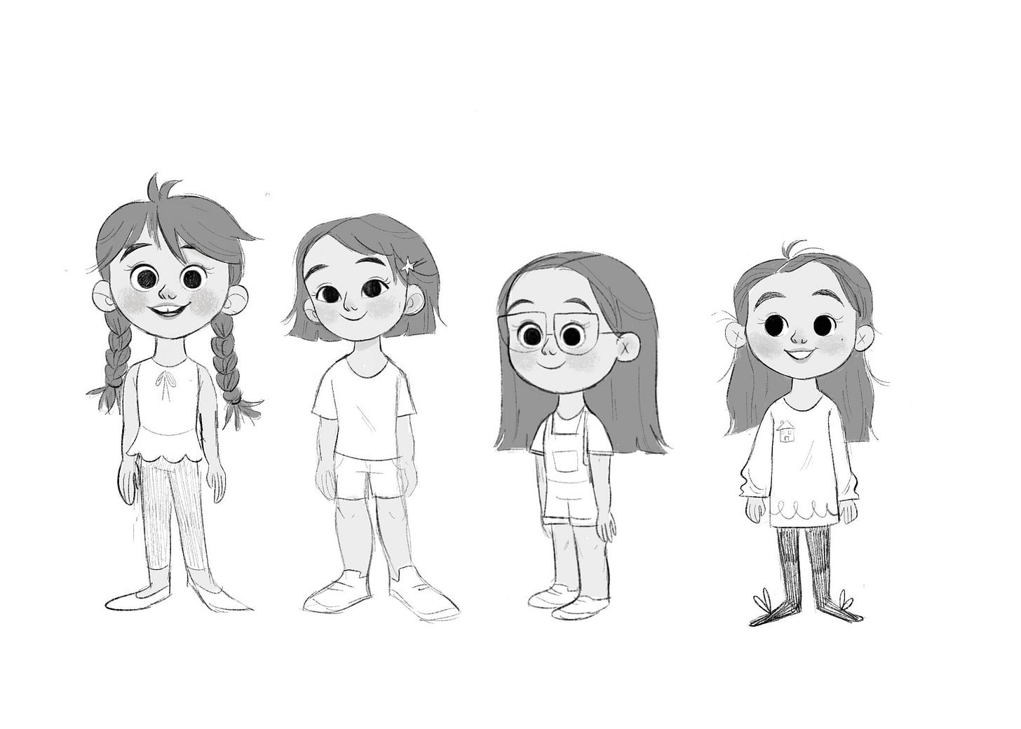
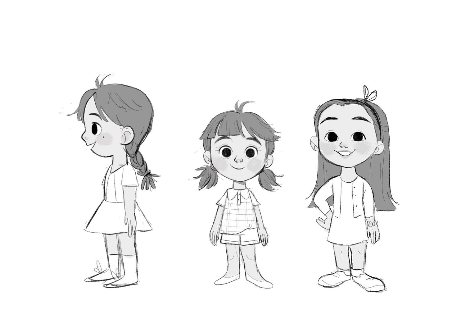
The art director first wanted to see some exploration for our main character, Farah. There isn’t any description of Farah in the book apart from the fact that she is a South-Asian girl, so I had a lot of creative freedom to determine what she could look like.
I came up with seven initial designs. Submitting 3-4 options is usually good enough but I felt like because there was no description of her, there were a lot of directions we could go. When coming up with this design, I tried to focus on her personality. This was an optimistic, upbeat girl on a mission. She’s smart, determined and ready to fight for a cause, and I tried to reflect that in my designs. The publisher liked #4 best but had a few minor changes, things like changing the outfit, adding glasses and so on.
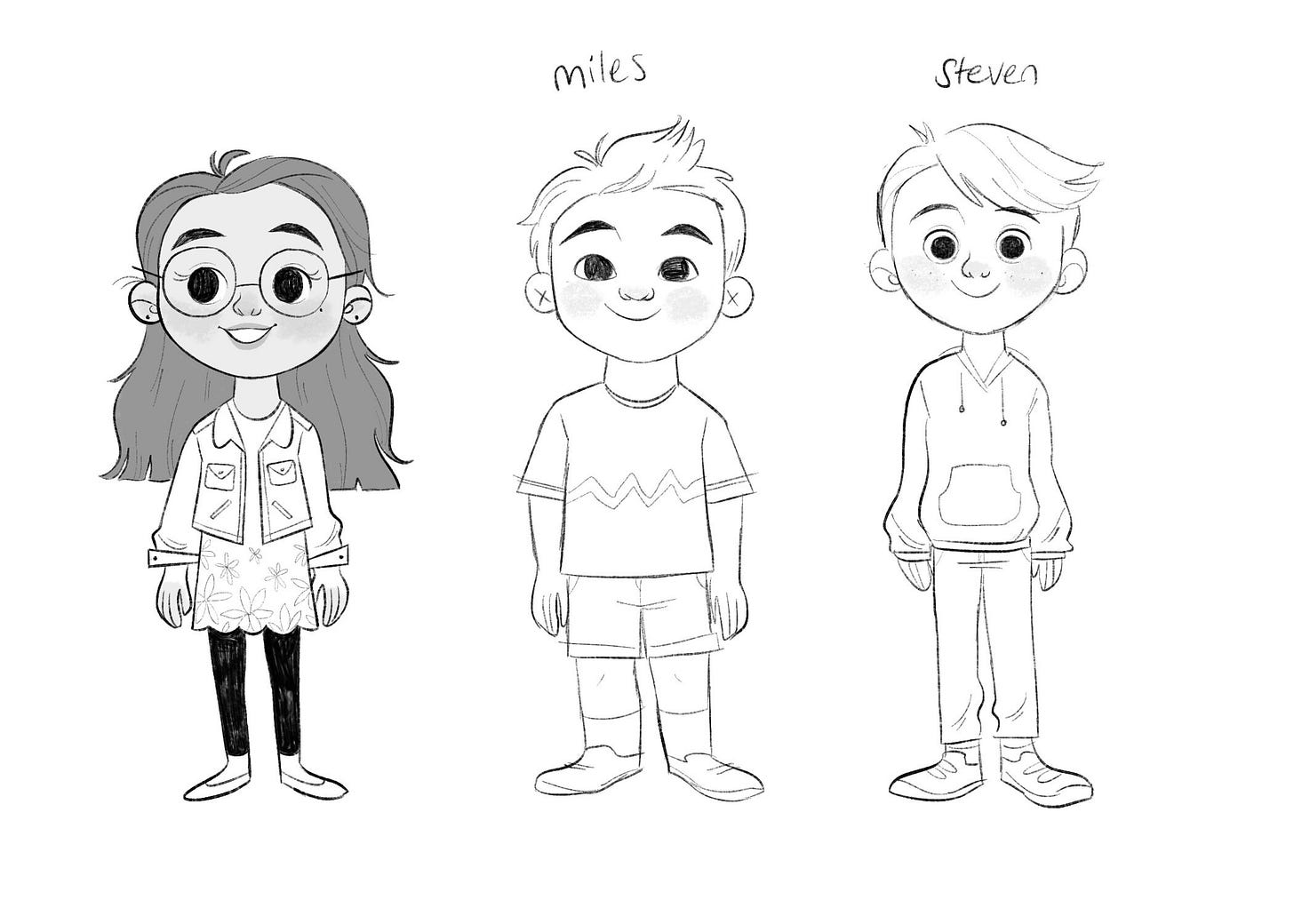
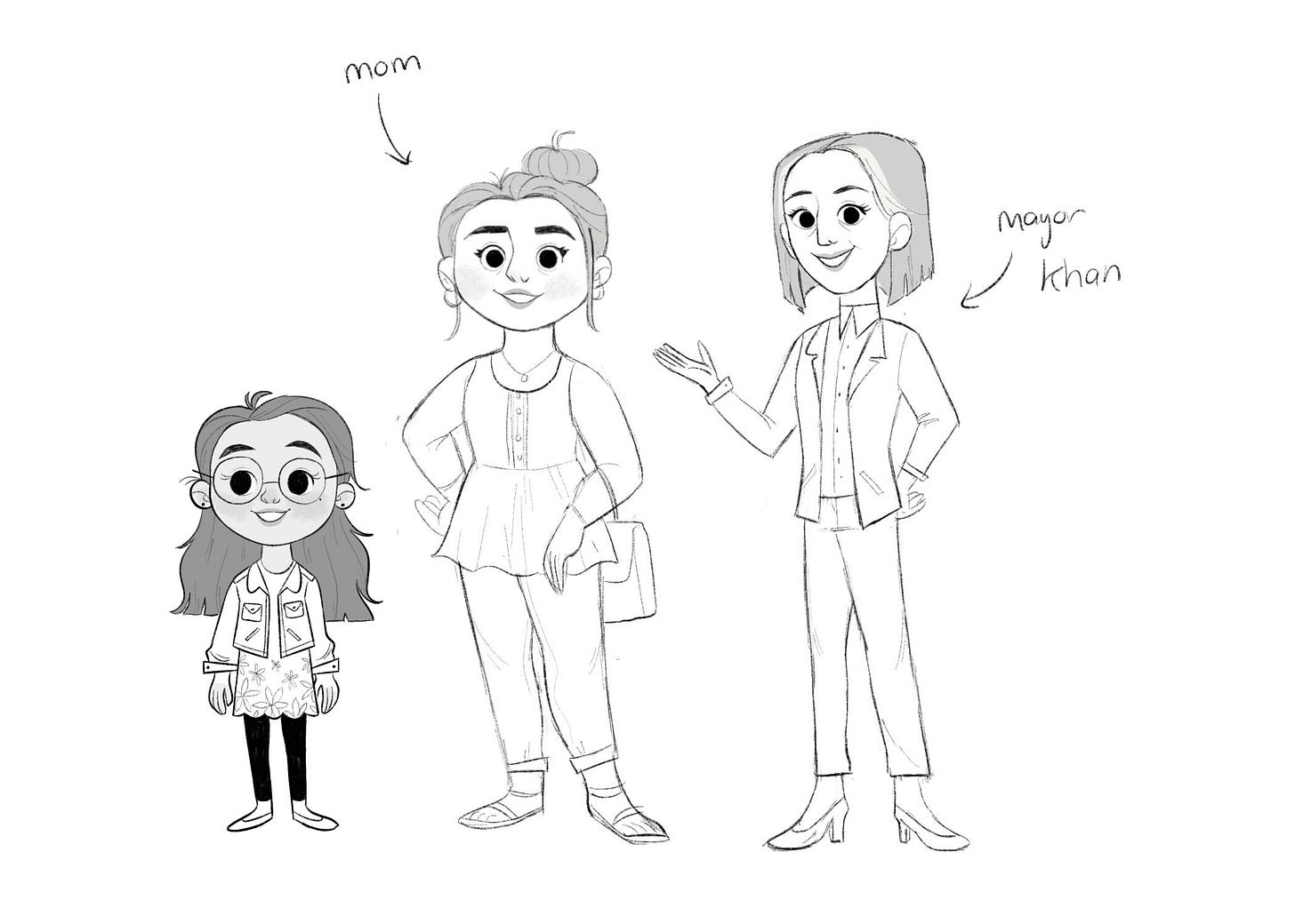
When the revision was approved, I had to design some of the other characters in the book. Namely, Farah’s mom, Mayor Khan, and two of Farah’s friends. Since they’re not major characters, I didn’t have to do multiple variations of them and got them right on the first try.
When designing characters, it’s important to have some variance in your designs. Farah and her friends all look different from each other; not just in features but in shape design as well. Each of the kids is ‘based’ on a shape. Farah is round and circles are a big part of her design, while Steven is triangular and Miles is square.
For Farah’s mom and The Mayor, it was especially important to differentiate them, since they’re both South Asian women, and it can be easy to have them look too similar and end up with same-face syndrome. I made sure the Mom looked like she was related to Farah, and shared her round, soft shapes. In contrast, the Mayor has a more angular design, in her sharp suit, pointed face and geometric hairstyle.
In effective character design, you can immediately get a sense of personality just from their design. You can tell that Mom is going to be sweet and bubbly, and the Mayor is professional but still kind.
In terms of environment, the story takes place in an urban city neighborhood, where mostly working-class families would be living. While it isn’t an affluent neighborhood, it’s warm and welcoming, The publisher sent over some reference images which is always super helpful.
The funny thing is that I had just prior to this worked on another picture book that took place in an urban setting; I Am Perfectly Designed.
So I had plenty of experience illustrating dense cities, brownstones, and diverse neighborhoods, but since this was a new book I definitely wanted to differentiate this city from my last book. While my previous city had lots of autumnal colors and realistic looking red and brown buildings, I thought it would be fun to go a more colorful route with Farah’s neighborhood.


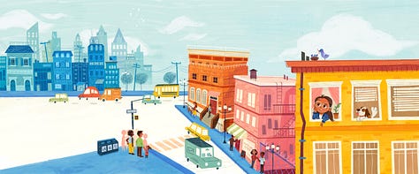
I wanted the buildings to look super stylized with all sorts of colors, and really have it feel like a warm and welcoming place. Just a lovely community vibe in this type of city, with apartments squished into each other and we could see kids playing on the sidewalk, and maybe some shops under some of the houses.
If you guys have trouble with environments as I do, treat it like how you would design a character! Try to embed as much story and personality as you can with lots of these little details to make the environment feel more alive.
Anyway, once the character designs have been approved, we move on to the interior art.
INTERIORS
At this point, the publisher will send over all the details I need to get to work on the interior sketches. This would be the manuscript, the dimensions, maybe a template to follow, and a PDF file of the book with the text laid out and sometimes descriptions that give me a direction of what would go on each page.
In some book projects, I get to decide where the text goes, but in this one, the publisher arranged it for me beforehand and I would draw around it.
(I don’t know why people always ask about what dimensions I’m working in; every book I’ve worked on has been different so I don’t know how helpful that information is, but I’ll share it just in case!)
For this book, the book trim size was 7.75 x 10 inches.
I think including bleed it ended up being something like 8.53 x 10.3. I also worked in CMYK, at 300dpi.
I’m always really bad at figuring out the bleed and dimensions and all that math stuff and usually I’ll just bring the PDF template file onto Procreate and work directly off of it so I don’t get the measurements wrong.
This book also has 6 inserts that go inside those fake envelopes. We had postcards, letters, stickers, and so on, so each of those had a different dimension as well.
Now let’s actually start sketching.
Using the art notes given for each page, I started to loosely sketch out the interior illustrations. These notes aren’t very detailed and just a hint of what action could be happening in the scene. There was a lot of creative freedom here, and I was free to interpret the text how I wanted.
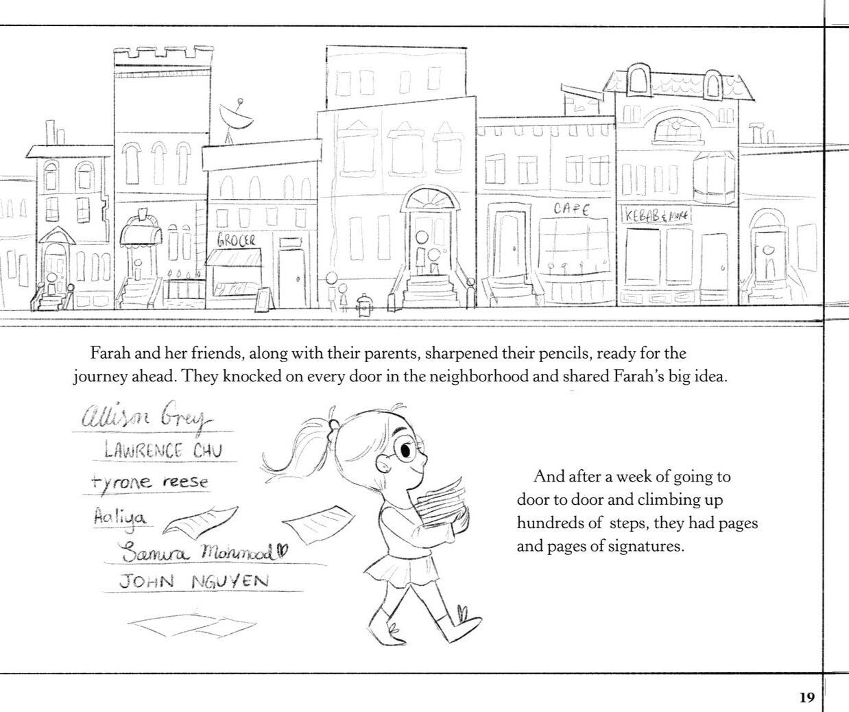
Here is one example of how I interpreted the description for the sketch.
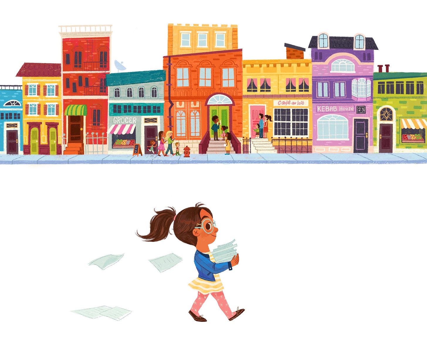
On this page, we have two spots.
SPOT of knocking on doors-- maybe a row of brownstones? and SPOT Farah holding pages -- fanned out to see there are many pages
There are immediately lots of ways you can draw these concepts out. For the first spot, you could have it as a close-up on a doorstep, or have a bunch of mini spots of people knocking on doors. I liked the idea of focusing on the houses themselves and the colorful neighborhood and making that the emphasis rather than the characters in that scene.
I did this so we have a strong contrast against the second spot, which is totally character-focused. Even this spot has room for interpretation. I could’ve had her standing facing the viewer, beaming as she struggled to hold a tall stack of papers. But I wanted this to be a bit of an action shot that tells a story. I have Farah in mid-walk, papers flying behind her like she’s in a hurry, with a determined expression on her face like she’s going to get the job done.
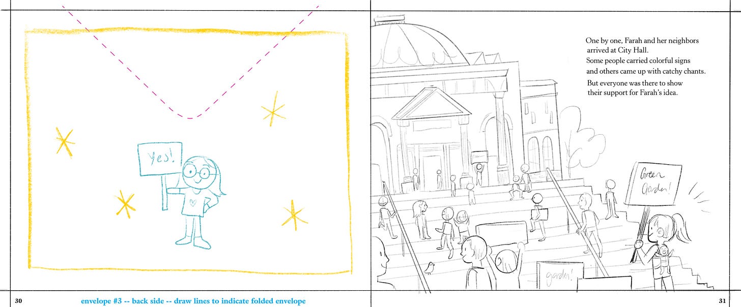
Sometimes as the artist, you might decide to go in a different direction away from the AD’s art notes.
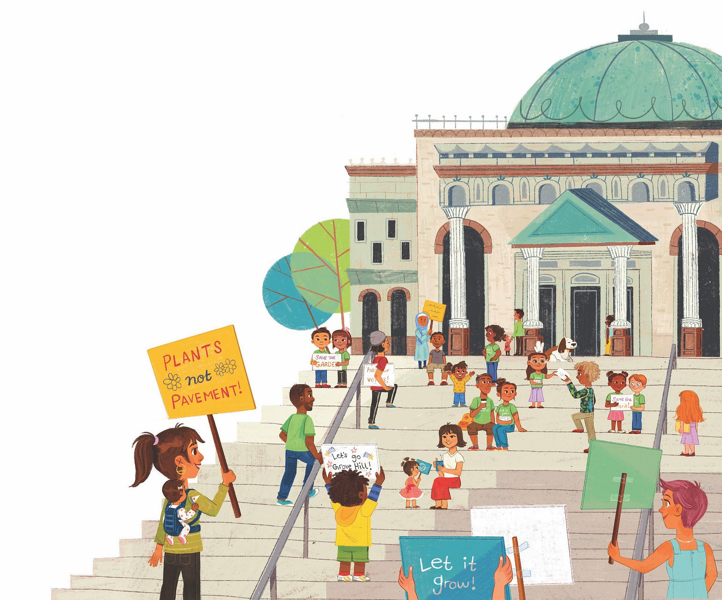
In this example, the description and text implied that all the townspeople are already gathered at the city hall for the big meeting. I thought instead it would be interesting to see them on their way to city hall, kind of all marching down the street together. I felt that this would help build up the momentum for the next scenes and really show that the whole community is coming together.
When people ask how I come up with my ideas, I think the main thing I try to focus on is a sense of storytelling.
The author of a picture book is a bit limited in how much story they’re able to tell through the text because picture books generally have a limit to 500 words. They have to be conscious of their word choices, which leads to economical storytelling. A lot of people think that being a children’s book writer is easy, but it takes great skill to create a beautiful story in just a few concise words.
That’s why it’s up to the illustrator to add as much additional storytelling as they can with the artwork.
We have a scene in Farah’s room but we don’t have any descriptions of it in the text. As the illustrator, I can use that opportunity to really make Farah’s personality shine through her room, giving hints to her character. Like having posters of female role models on the wall, lots of plants around, and a butterfly mural, because I wanted butterflies to keep showing up throughout the book like a motif.
After I complete all the interior sketches, I send them over to the publisher for review.
While I wait for feedback (which is something that happens quite a bit on picturebook projects) I usually just work on other books or short-term projects. Since it can sometimes take a few weeks for feedback, it’s why I tend to work on 2-3 projects at a time so I don’t have any ‘wasted’ time.
You do have to be careful about this though, because once in a while all the projects magically align so you’re working on all of them at the same time, and all the waiting time coincides as well. Oops.
ENVELOPES AND INSERTS
In this book, we also have six envelopes to design, as well as six inserts inside of them.
Originally I was really confused when designing these, but the publisher was kind enough to send over two picture books that also use this kind of ‘envelope insert’ style.
This was really helpful so I could understand what this concept would end up looking like when it is printed out. I was also able to pick out things I liked about the format and things to change when I had to design my own inserts.
For example, one thing I really enjoyed was the kind of ‘realistic’ quality the letters had. They looked like they were handwritten by actual people with actual pens and pencils. I illustrate digitally, but I thought it would be cool to do the inserts traditionally. The envelopes are sent and mailed to different people, and I wanted each envelope design to reflect the person sending it, or have some kind of unique design for each of them so they weren’t all just plain white envelopes. I had a lot of fun changing up the typography and designing details like stamps and patterns.
I either painted them digitally or drew them out by hand, using things like crayons, ballpoint pens, and colored pencils. I also added elements like the texture from a cardboard mailer and some glittery washi tape.
These are each of the envelopes and inserts.
#1 A letter from Farah to the Mayor, written on her dad’s office stationary.
#2 A petition drawn out by Farah. I had so much fun pretending to draw like a little kid.
#3 A professional envelope from a print shop, with a poster inside announcing a meeting.
#4 A protest sign
#5 An afterschool club envelope with a club member sticker inside
#6 A postcard sent from Farah to the Mayor
COVER
Before I get to work on painting the final art for the interiors, let’s work on the cover.
Sometimes the cover is done at the very end of the project since by then you’ve completed all the spreads and have a stronger grasp on the style of the book and the characters can refer to any story elements featured in the book on the cover.
Sometimes you do the cover art first; which is what happened here.

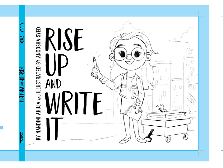
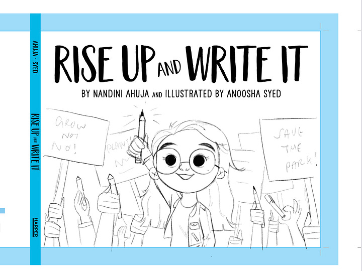

The Art Director gave some ideas of what could be on the cover, along with three possible templates to follow with the title laid out.
They wanted to see Farah as the focus of the cover, maybe along with her friends. They wanted to see options where they might have their hands raised holding onto pencils, or ones carrying protest signs.
I ended up sketching out four concepts!
#1 Farah holding a pencil and leading a march with her friends. I kind of liked this horizontal composition here
#2 Farah as the focus and a bunch of hands raised with pencils and protest signs. This was my favourite of the bunch.
#3 Another verison of just Farah, but with a city background behind her
#4 And finally one of Farah and her friends with all their protest material. This was the design that ended up being selected, and I think also the most child friendly design of the bunch.
And now we move to color!
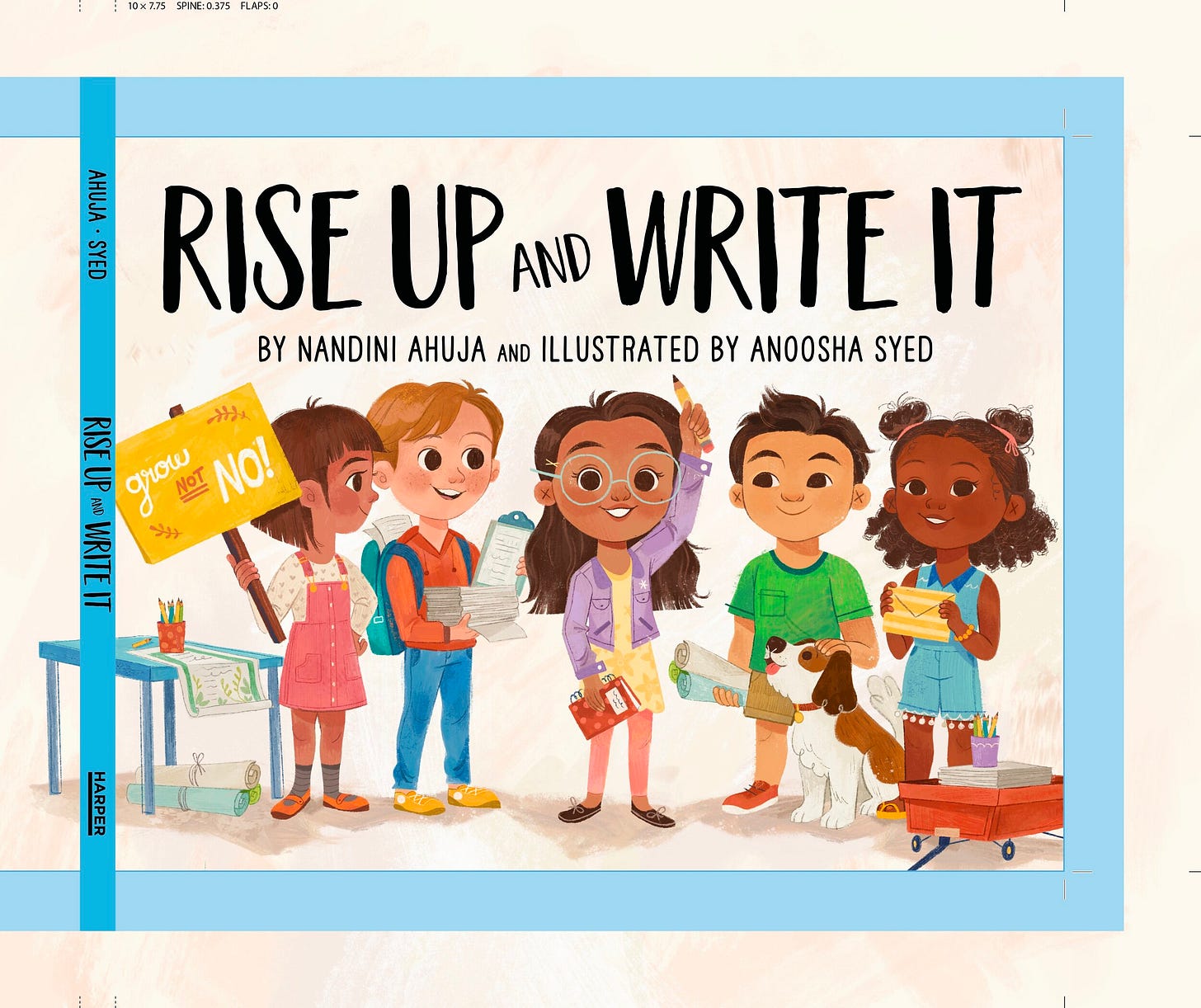
This is the first pass I ended up with:
The funny thing is, is that the art director replied politely saying, “uhhh the color palette seems a little… sophisticated??? Not sure whats going on here…”
And I was like, huh what are they talking about it looks fine to me. And then I opened up the file on Photoshop on my computer and my face just fell. It looked like a MESS and I was so embarrassed! In my head I thought, wow the publisher must think I don’t know how to color AT ALL.
It turns out that I had accidentally put the color profile of the procreate file as a weird CMYK variant and that lead to some bizarre results.
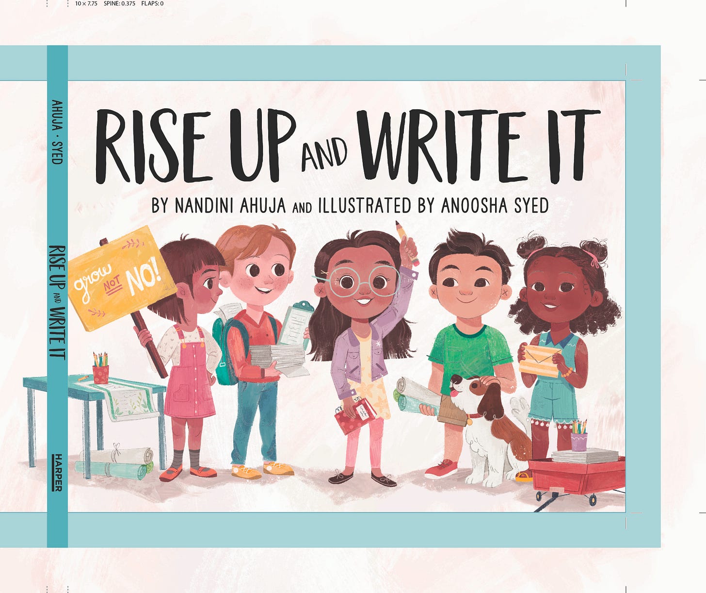
Anyway I sent over the correct file and it was mostly good, I just had a few revisions, mainly adding a background and changing Farah’s clothes.
In the end, this was the cover we decided on!
INTERIOR ART (FINAL)
Since we had the cover art finalized, we now have an established color palette to work with. Onto the final art!
TIME MANAGEMENT
Let’s talk about time management for a quick second as well.
I had 2 months to complete the final art (which isn’t a lot) and as the artist, it’s up to you to determine how to distribute your time.
Time management is super important as a freelancer, and if you don’t have a plan set up, it can be super easy to end up rushing at the end because you didn’t plan properly. Especially if you have multiple other projects going on at the same time.
8 weeks for 30 pages and 6 inserts means that I would have:
56 days divided by 36 files of art, which gives us:1.5 days for each page.
Not taking out any days for weekend.
I told you this was a rushed schedule
The good thing is that not all the pages are going to take me 1.5 days. Twelve of these pages are going to be the front and back of the envelopes, which shouldn’t take that long, which leaves us 24 pages of actual illustration.
Some pages will take less time, like the simpler spots or an insert like a sticker, but some pages will take much longer like my first spread. That’s why planning this out at the beginning is so important. You might not have a clear idea of how long each illustration will take, but you can make a guess and try to work in that schedule.
Anyway, that’s it! How I illustrate picture books from start to finish. Of course, my process for each book changes a little, so if you check out my other videos you can see what my process is like over there.
If you think I missed anything or have any questions, let me know in the comments below.
I think that’s all I have for today. If you see Rise Up and Write It in a local bookstore or if you buy it, please tag me in a photo! I love to see it.
As always thank you for reading, and I’ll see you again soon. Bye!











Phew!! I can’t believe you did this book on such a short schedule!! It came out beautifully
Another amazing post! Thank you for sharing your wonderful art and all of this extremely valuable BTS/WIP information!
One quick question about the cover section. I’m viewing this on the Substack App on an iPhone and what the text says is the first color pass, looks nicely saturated and very nice to me. The second image which is the “corrected” version looks to be a more muted sophisticated palette. The final looks to be a beautiful mesh of the two. My question is whether I’m seeing the images in the incorrect order, or am I misunderstanding the text?