

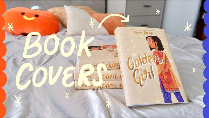
Illustrating a Book Cover - Golden Girl
Illustrating a Book Cover - Golden Girl
A deep-dive into Middle-Grade book cover art

Today I wanted to share with you my process of how I illustrated a book cover!
This is a middle grade book called Golden Girl, it was written by Reem Faruqi, and was published by Harper Collins last February.

Although I’m mostly a picture book illustrator, I do get to work on a lot of book covers like these, and working on Golden Girl was such a delight and I’m really happy with how it came out.
So as always, in this blog I’m going to go over how I got this job offer, the schedule, what it’s like working with the publisher, planning the concepts and character design, and my process in sketching and painting the cover itself.
With that out of the way, let’s go!
THE BOOK
Golden Girl tells the story of a kleptomaniac middle school girl called Aafiyah who’s dad is falsely accused of a crime he didn’t do and is held in custody when her family is traveling back to the US from Pakistan. Back home, she tries to come up with a plan to save her dad, but it might have to involve her bad habit of stealing pretty things.
This is a really great book written in verse, and I love that we have this complicated and imperfect girl for our main character. As always, it’s also really fun to work on books with Pakistani Muslim characters, since I love seeing my culture represented in books today.
INTROS + HOW I GOT THE JOB
In the past I’ve mentioned that sometimes I’ll get a book project because the art director had seen my work through social media or from a specific event or gallery show. In this case, most likely the HarperCollins team had seen my portfolio, either because I’ve worked with them on other books in the past and because the book features a south-asian character. They had likely seen my other book covers and illustrations I had done with the same theme and thought I’d be a good fit.
Molly Fehr was the art director who reached out to my agent to let her know that she was working on Golden Girl, thought I’d be a good fit for the cover, and wanted to know if I was available and interested.
In the intro email, publishers vary in how much information they share in that first contact. Some will be a bit vague and only mention that they have a possible project and want to know about availability first before talking further, and some art director will share everything up front, which is what Molly did.
In the email, she sent over the planned schedule, a summary of the book, the budget, and a detailed packet of information. This included the full manuscript of the book, a detailed description of the main character Aafiyah, and some ideas the team had in mind for the cover which I’ll share later on in the video.
I know it’s not always possible to send out a thorough info packet like this in an intro email and there are a lot of reasons to send a short email instead, but personally, I really appreciate it when I get a long intro like this one. This way I have all the information upfront about the project and discuss it with my agent, and also pretty quickly make my decision of whether I want to take on the project or not. With a vague email, it can lead to a lot of slow back-and-forth answering questions sometimes.
My agent and I discussed the project and whether I should take it on. I’ve mentioned before that I am trying to avoid taking on too many south-asian themed stories, just because it does feel like I’m being typecast and I want to avoid being pigeon-holed into a specific genre. However, I really loved reading the manuscript and connected with the story a lot.
My agent contacted the Art Director to let her know that I was interested in working on it but that the original budget that they had planned was a little bit lower than what I would usually see for book covers and asked if they were able to bring it up a little bit higher because I had decided that I would only take this project on if they were able to meet my usual rate. Thankfully they were able to increase the fee to what I had wanted with the provision that I would also do a back cover as well since initially they had only wanted me to do a front cover but because the back cover concept is usually quite minimal compared to the front and less of a workload I thought that this was a fair compromise and agreed to the terms. I believe there were a couple other things that my agent wanted changed in the contract as well and so her and the publisher kind of went back-and-forth until the new contract was finalized we signed it and then I finally made my first contact with a publisher and then it was time to work.
SCHEDULE
Let’s go over the schedule!
I was first contacted by HarperCollins on November 6th 2020 where my future Art Director contacted my agent with the proposal for the book.
Like I said, me and my agent discussed the proposal, negotiated the contract and fee, and once it was all finalized, I had my first contact with the art director on November 16, ten days later.
The team had asked for the initial sketches to be delivered on December 15, giving me one full month to work on them.
Initially they asked for final art to be delivered on February 1st, so about a month and a half of work. However, this ended up being a pretty relaxed schedule, and because we ended up having quite a few revisions and changes during the process the date kept getting pushed back.
So instead of final art, my sketch revisions and color concepts were due on February 1st, using the feedback I got in at the beginning of January.
After a series of back and forth with tiny tweaks, I was able to hand in the absolute final art on April 16, so five months in total on this book cover.
However! A little while later after I had wrapped up, the publisher got in touch and asked if I would be available to create a few small black and white illustrations that would be used for the beginning of each chapter. I did have other projects taking up my time but since it was a small assignment I got to work and this timeline was pretty quick; I got the request on June 2nd, due on June 22nd, so twenty days to work five little spots. Easy peasy, and NOW I was done!
I don’t know if anyone is actually interested in this breakdown, but I think personally it is helpful knowing how long illustrators are given to work on a project, especially since this can change depending on so many different factors. For example, for most of my early career I would be given 3 months to work on a full 32-page picture book, and at the time I had no idea that it was a really short and pretty unreasonable amount of time. It wasn’t later on that I would get projects that gave me 12 months for the same amount of work! Isn’t that crazy? Ideally you should be getting a full year to work on a book, but things like quick turnarounds, delayed schedules and exploitation, can unfortunately get in the way, but it’s important to share this kind of information so that artists can try to negotiate for more fair hours.
REFERENCE
Before we get started on the actual drawing part of the job, I had some research and preparation to do first.
As I mentioned before, the Art Director and author already had some possible concepts that they thought would be great for the cover, and personally I always find it really helpful to have a little bit of a starting point to go off of, instead of a completely blue sky approach, and I appreciate having some guidance at the beginning. I was also able to read through the whole manuscript to see if I could pull up any details from the story that would be interesting to incorporate into the cover because it’s always nice to have some foreshadowing elements as a sneak peek to what the reader will expect from the book.
These are the initial thoughts the Art Director shared with me in the intro packet:
As far as cover ideas go, the team is looking to focus on our main character, Aafiyah, who suffers from Kleptomania, and jewelry which Aafiyah is very drawn to. One idea the author had was to see a portrait of Aafiyah from the lips down and to focus on her wearing Pakistani jewelry. We also thought an alternate version of this same idea, only seeing Aafiyah’s full face would be a good comparison to consider as well. We are also open to any ideas you may have!
I also got some ideas from the Author, who sent over a couple of inspiration photos which I won’t share over here because they include personal photos of her family members. But basically she had sent over this gorgeous vintage photo of her grandmother it’s black and white and not showing her eyes it’s just her lower face like her mouth as well as details of her jewelry and outfit, and then a bunch of examples of really heavy traditional Pakistani gold and jewelry and wedding style outfits.
The author notes:
An image that popped in my head from when I was first writing this book with the suggested title GOLDEN GIRL is a girl’s face from the lips down to neck up with jewelry. This is my grandmother's photo below, but a zoom in on the girl's lips and earrings and neck with jewelry around it and maybe a red shalwar kameez. The focus would be the jewelry. The eyes wouldn't show.
And then lastly I was also sent over character descriptions for our main character Aafiyah as well as her best friend. So this character description is the author‘s direct description of her but there are also some descriptions that are pulled from the book itself.
Sometimes when I’m working on a cover I don’t really get any description on what the main character looks like and I have full reign to just draw whatever I want, which can be really fun. In this case, I had more specific direction, but I think it’s great because I really want to re-create the authors’ vision as closely as possible because I really respect their work.
Character descriptions:
Aafiyah Qamar is the main character and Pakistani-American. She is a seventh-grader that struggles with a terrible secret—she is a thief, and she often steals from her best friend (12). She loves National Geographic’s Weird But True facts. (13). She is on the tennis team (39). She is caring, and babysits her 2 yr old brother Ibrahim (7). She has mild hearing loss (23).
Reference For Aafiyah:
Physical Description (17-18). “I wasn’t always pretty. My nose too big like a samosa. My cheeks too round like gulab jamuns. But then I turned 13 and the aunties stopped squeezing my cheeks. My face grew to match my nose. My cheekbones sucked up the baby fat and even though people still call me cute, they’re wrong.”
You’ll note that the publisher included the page numbers that indicate where that description is in the book. It’s always really helpful to have that written out before hand so you don’t waste too much time and you have all of that information ready for you to go.
SKETCHES
Let’s get to work on the art!
The first round of sketches were due on December 15, giving me about a month to come up with my initial concepts. For the first round, I typically like to send between 3-5 different ideas to the publisher, though in this case I sent over only three because the concept was quite simple.
Because I was doing a wrap cover, meaning the front and back of the cover, I was working in the following dimensions.
WITHOUT BLEED: 12.25 X 8.5 INCHES.
BLEED: 0.375” ON LEFT AND RIGHT, 0.25” ON TOP AND BOTTOM.
JACKET DIMENSIONS, WITH BLEED: 13 X 9 (ACCOUNTING FOR A 1 INCH SPINE).
I get a lot of people asking me what dimensions I work on for my books; and while I understand it can be useful information, I would also stress that my dimensions change for every project because it totally depends on the type of book I’m working on, and it’s not really a one-size-fits-all approach.
If you’re working in traditional publishing, your art director will let you know what size to work in, and if you’re self-publishing, you would need to see what the requirements are from the place you’re printing at, since they’re likely going to be totally different than what I’m doing.
Here are the three concept sketches that I came up with! My initial sketches are always pretty rough, although I’ll sometimes add a bit of tone for depth and in this case, gold to highlight the jewelry and title.
You’ll see that they all play upon the same theme; because the book is about a kleptomaniac who likes stealing jewelry and her father has been arrested, I wanted to see if I could combine those elements together. Bangles are a big part of Pakistani jewelry and I became fixated on the idea of having golden bangles as a metaphor for handcuffs, and how interesting that contrast of luxury vs crime could be.

In this first image I have Aafiyah’s full face showing, with her hands cuffed in-front of her. I tried to make her look shocked and guilty in her pose and expression, like she’s just been caught. I really like how I drew her face in this concept, you’ll see it’s much more innocent and juvenile as compared to the others. You know I love drawing big eyes haha.

This one is a bit more subtle, and I followed the author’s request of not showing Aafiyah’s eyes here. The pose in this is also discreet, where it almost feels like she’s all glammed up and showing off her jewels, but because she’s not smiling it also appears like she is hiding something, or at least that’s my interpretation. Here I placed the title right in the middle.

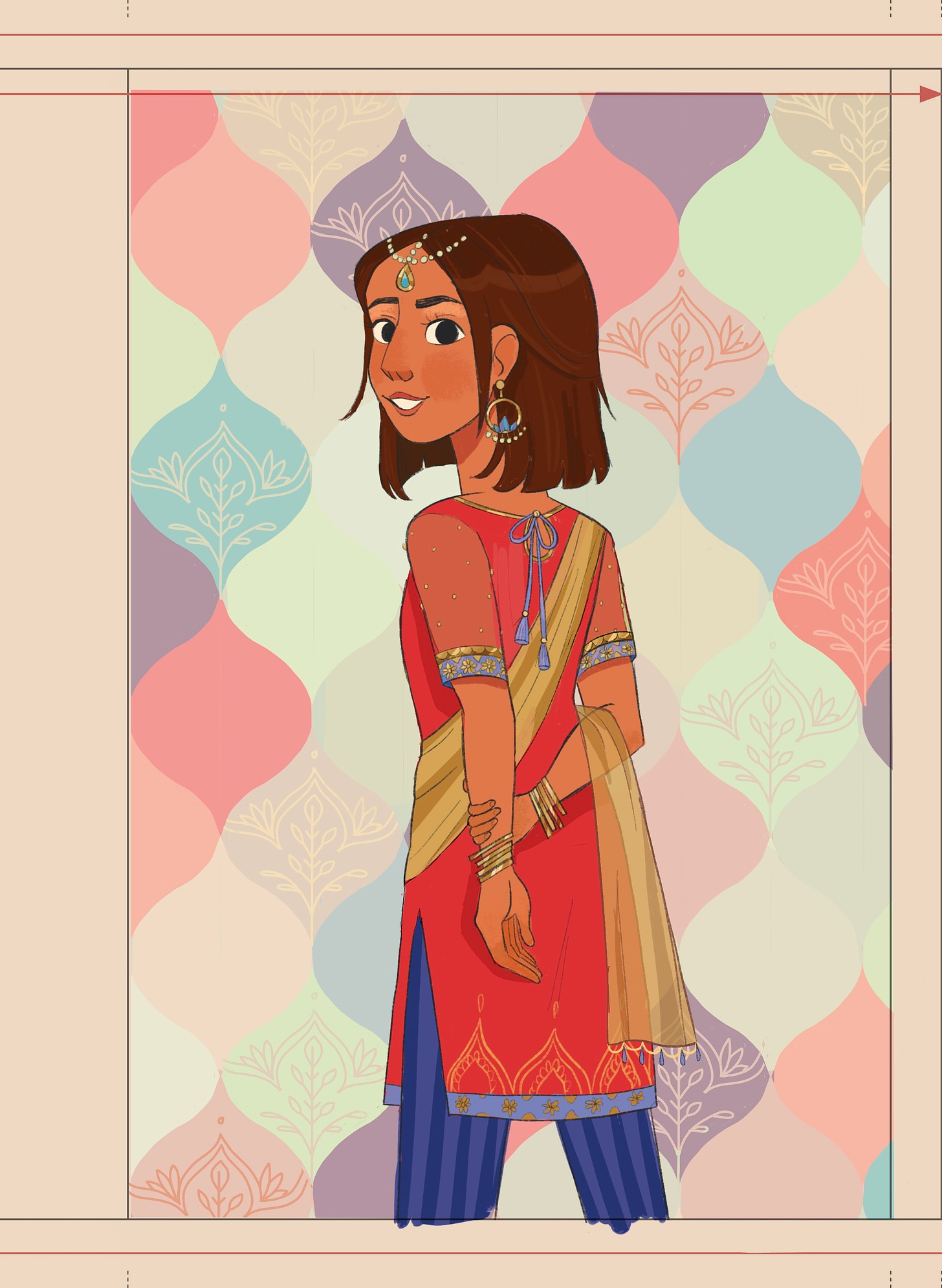
And finally, a full body pose of Aafiyah, with her back turned but face towards us. I kept the background empty here because I was thinking of doing a pattern around her, but at this stage I just wanted to play around with the posing. This one is the most on-the-nose of all three covers, where it’s very clearly a girl who is caught and trapped. In this case, I didn’t use the subtle bangles as handcuffs, but a corded necklace instead. Looking back I think this cover is too heavy for a middle grade cover, especially since her expression isn’t happy here as well, but I did want to give this option because I thought it could be a cool option and I liked the pose.
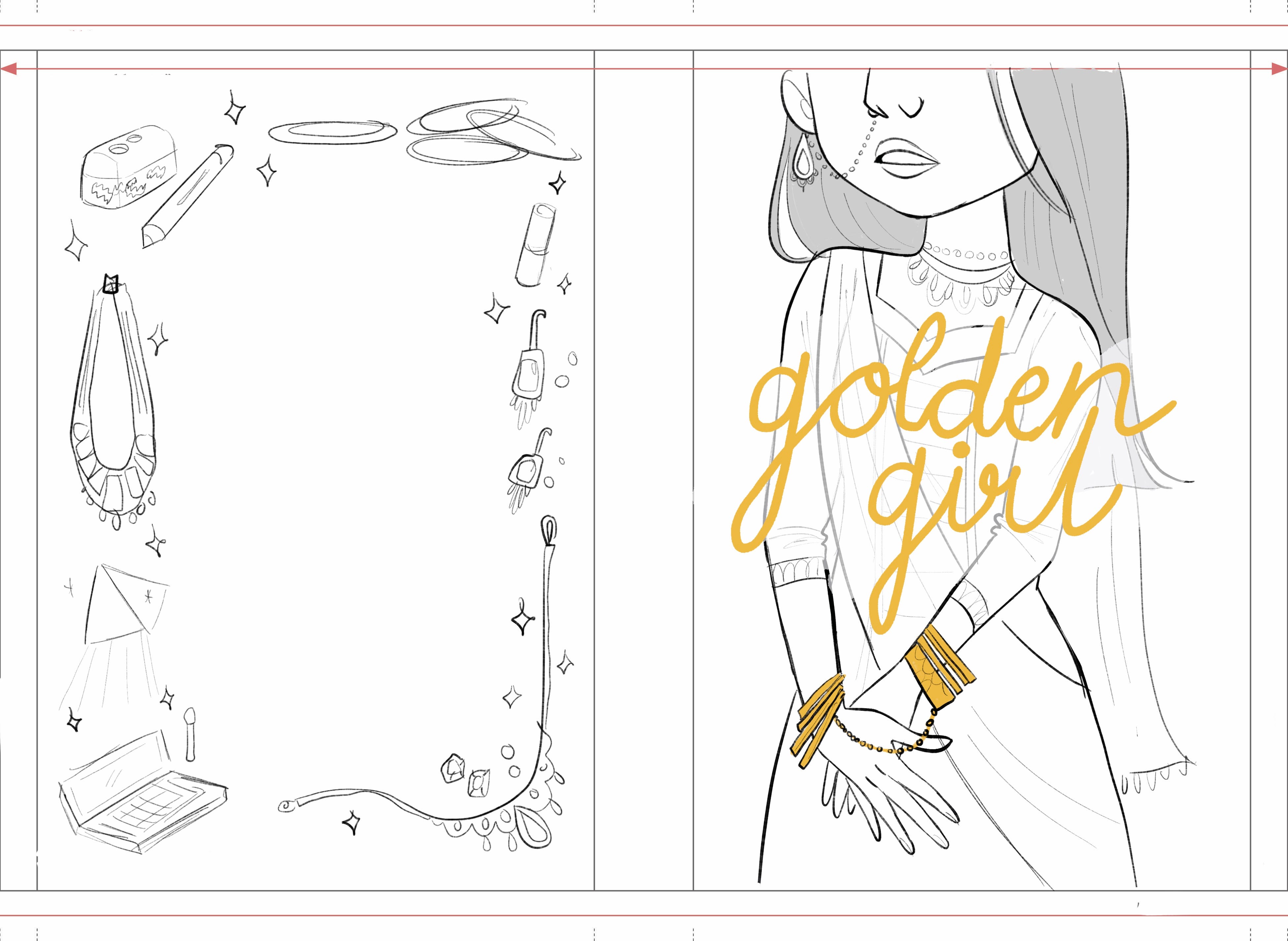

For the back cover I kept it pretty simple. We would have the blurb in the middle, and I created a frame around it that is filled with all the different objects in the books that Aafiyah has stolen. I thought it would be a great detail that readers could pick up on. This includes things like necklaces and bangles, but also other knickknacks like eyeshadow, a prism and a pencil sharpener.
FEEDBACK
After submitting my sketches, these were the notes I got back from the author and art director:
1. Could the expressions on all 3 sketches look a little happier? (we don’t want the cover to look super serious!)
2. Shoulder length hair was preferred by the author, could you please adjust?
3. The imagery of her bracelets as handcuffs was a clever and interesting way to tie in the story line, but the author and editor thought it might be too much for the cover. Please remove the connections on all 3 sketches.
4. To keep the character looking younger, the author asked to remove the nose ring on #2 and the eyeliner on #3
5. The team loves your cover for Other Words for Home. Could you possibly try adding a subtle texture or pattern to the backgrounds?
6. The author likes the simple Pakistani clothing you did. If you’re already thinking about color, she suggested trying red-colored outfits (could be Pakistani or American), as that would tie in to Aafiyah’s red shalwar kameez she had growing up.
7. The author also wanted to hint at her interests, like tennis and photography. The team thought an easy way to do this would be on the back cover, to replace a few of that jewelry with a tennis racket, sports jewelry, or camera. We’re open to your ideas too, if you had any. Let me know what you think!
The team was a little torn over the three options and couldn’t decide on the final one just yet, so asked if I could make the tweaks first and play around with color options before they make their final decision.
Normally I would want a firm confirmation on the sketch direction before getting started on color; the color exploration would be dependant on what idea we go with since that would effect the mood and location. And I would normally submit three color options for this round.
However, because these three covers were pretty similar in concept anyway, I did feel like whatever color palette we chose could probably be applied to all three concepts, and also speed up the whole process. Instead of creating three color options for each cover, which would equal 9 options in total and a lot of work for myself, I could just do one different color option for each sketch, with the understanding that we could mix and match the palettes around.
Does that make sense?
COLOR
You’ll see that I made the tweaks to all three covers, namely getting rid of the handcuff imagery and making all the expressions happier.
Let’s go over the covers one by one:

I wanted a lot of focus on the gold jewelry, so in contrast I kept the palette pretty muted so that the gold could really pop off. The author wanted a red kameez shirt, so I made sure to include that in all the designs, though in this design the red is quite warm toned and I have a lovely teal as the accent color. I wanted this cover to be really sparkly so I added tons of sparkle on the jewlery and stars on the background. I wasn’t sure if we were able to get gold foil detail on the cover, but in this cover concept I envisioned having the background stars be foil.
This is a more cool toned red shirt, almost magenta. If the first option was more mature and neutral, I wanted this option to be very feminine with lots of florals and pinks. I didn’t want to focus on the background pattern too heavily at this stage especially if we weren’t going forward with this design, but you can kind of see what I’m going for. Something very much inspired by south asian patterns, and all lovely and pastel.
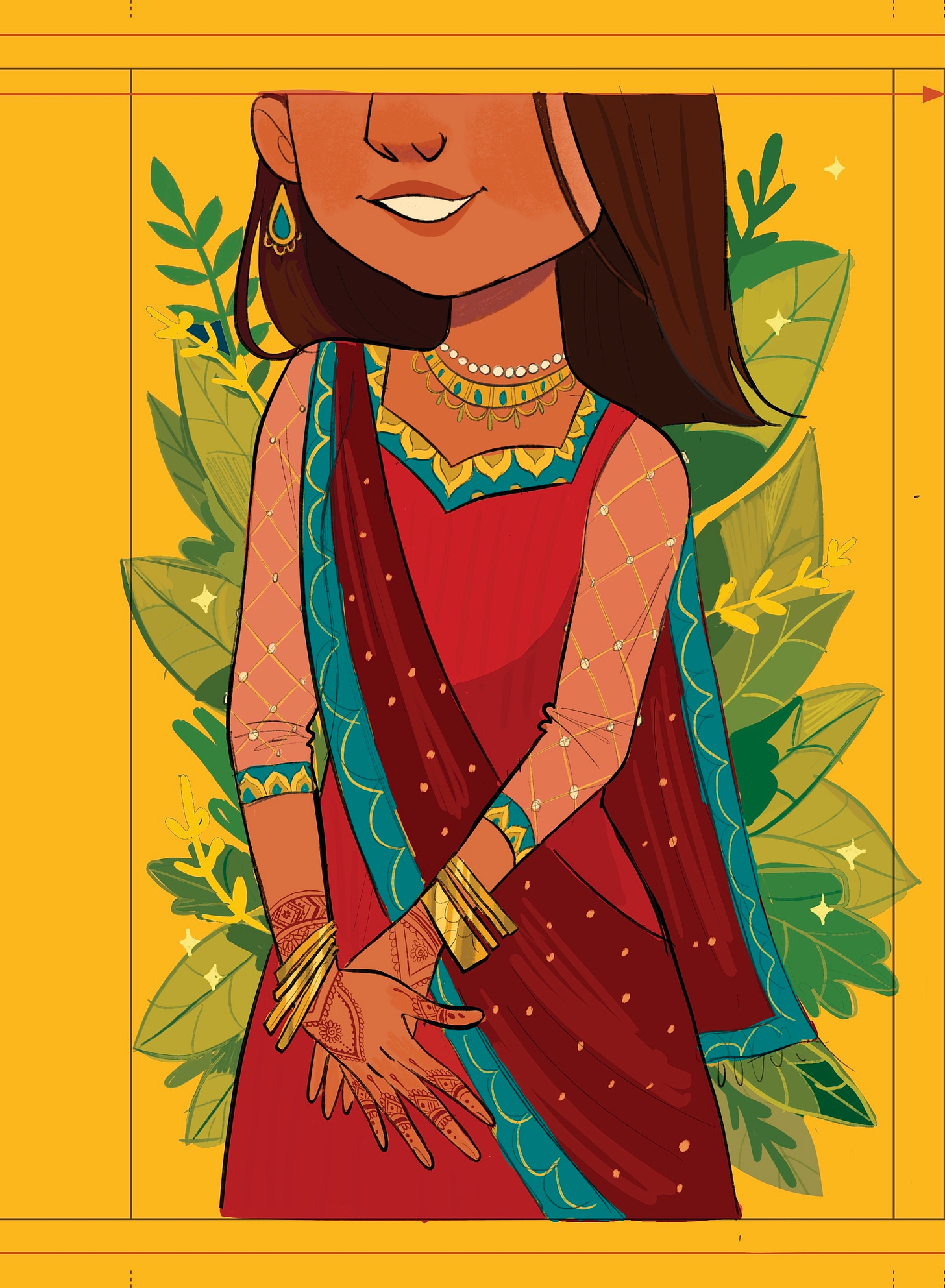
And finally, a very glam option. This one is giving jungle tropical vibes, with jewel tones and deep colors. The other background colors are quite soft so for this option I wanted it to be quite deep and bright, with a stunning marigold yellow for the back, and lush greenery around Aafiyah. This is also the only option where you get to see henna, since there is so much focus on her hands.


I didn’t share color concepts for the backcover at this point, since that would be dependant on what direction we go with for the front cover, and in any case it’s not urgent at this point. However, I did send over the revision that included the tennis racket.
FINAL ART
After submitting my concepts, I waited for feedback! It’s normal to wait for a month or more for picturebooks because there are a lot of pages to go through, but it can take just as long for a simple assignment like a cover as well. In this case, I waited a month for feedback because the Art Director needed to share the concept with the author as well as the Sales and Marketing teams.
The team had decided on this cover concept but with a few adjustments.
They really liked the beige starry background from Cover #1, and also wanted me to give her a closed smile.
My art director sent over a rough concept of what she was going for, as well as the placement of the title. Sometimes I get to design the cover title especially if we are going for an illustrated look, but as you can see, the title was designed in house for this one.
So now we get to work on painting! Because I already had my colors planned out, painting was pretty simple since I mostly color-picked my way through it. As always, I’m mostly using the default Procreate 6B pencil brush here.
At this point, the cover was almost good to go but just had to go back and forth a little bit until we got it just right. I was asked to reduce the amount of makeup, make her skin less red, and we kind of went back and forth on whether her mouth should be open or closed. I find that covers tend to get way more notes that my picture books do; this is mostly because so many people are weighing in including the art director, editor, the author and then sales and marketing and something everyone has different opinions. But thankfully these were all little fixes and otherwise, we were pretty much good to go!


INTERIOR ART
As I mentioned, a few months after I submit my final cover art, my art director came back to me and asked if I had some time to illustrate a few interior spot illustrations (for an additional fee, of course). They had ended up pulling a couple of the backcover objects to use for the beginning of each chapter and wanted to see if I could illustrate five more.
This was a really easy task especially since these were going to be quite small and in black and white only.
These were the objects they asked me to illustrate, and keeping in mind that I don’t draw anything copyrighted.


Part 3: Gut – candy (twizzlers, airheads, rainbow bears, or anything that is sweet, gummy, and chewy). (Please be careful of brand copyrights)
Part 5: Hair— a barrette? or even a pony tail rubber band holder
Part 6: Tongue—spicy food like a kabab roll or Balach ice cream
Part 10: Bladder-- 1 can of coke, 1 water bottle, or 1 orange soda. (Again, can of coke will have copyright infringement issues, but I love the orange soda idea! That would be fun and easy to steer clear of copyrights)
Part 11: Mouth—lipstick or gum wrappers
These were a really quick job, that I believe lasted another month, and that’s it!
If you guys have any questions, let me know :)