


New Look, Same Me
I was tired of my old logo so I did a huge illustrator rebrand

Ten years ago, during my last year of art school, I launched my first website.
It was clean and functional and essentially just a place to show my animation + illustration work.
When I started freelancing a few years later, I whipped up a little logo and called it a day. And over the years, as my career grew and evolved, my ‘branding’ stayed basically the same.
Well, I finally changed that!
For the past few months, while on my maternity leave, I’ve been working on a full rebrand including:
✸ a new logo
✸ a colour palette
✸ new custom fonts
✸ illustrated elements
✸ a brand spankin’ new website…
I basically rebuilt everything from the ground up.
I am going to share my new site later this week, but first I want to unveil my new branding/visual language and share a little behind-the-scenes of what that process looked like.
OK LET’S GO!!

✸ A Little Logo History
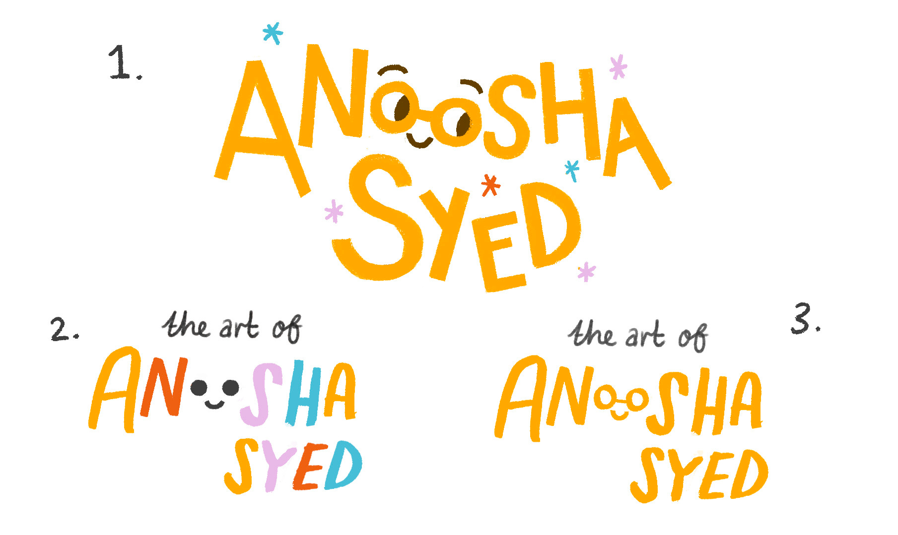
My first logo was something I threw together in 2015, right out of art school. I liked the idea of turning the double “oo” in my name into a pair of eyes. It was clever, simple, (and a little creepy haha) and it stuck around for a few years. Not super readable though!

Then in 2018, when I switched career tracks going full-time freelance and officially incorporated, I figured it was time for an upgrade. I was heading to CTN Expo to sell my art and needed a new banner for my table and new business cards, and realized I needed a logo to go on it.
So I sat down one afternoon and mocked up three designs.
Because I’m incapable on making any decision by myself, I posted them on Twitter and let people vote. The glasses won! (even though I got LASIK a few years earlier and don’t wear specs anymore.)
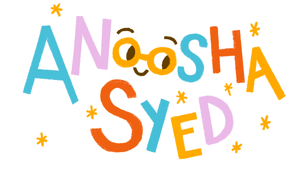
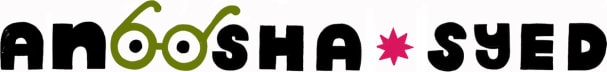
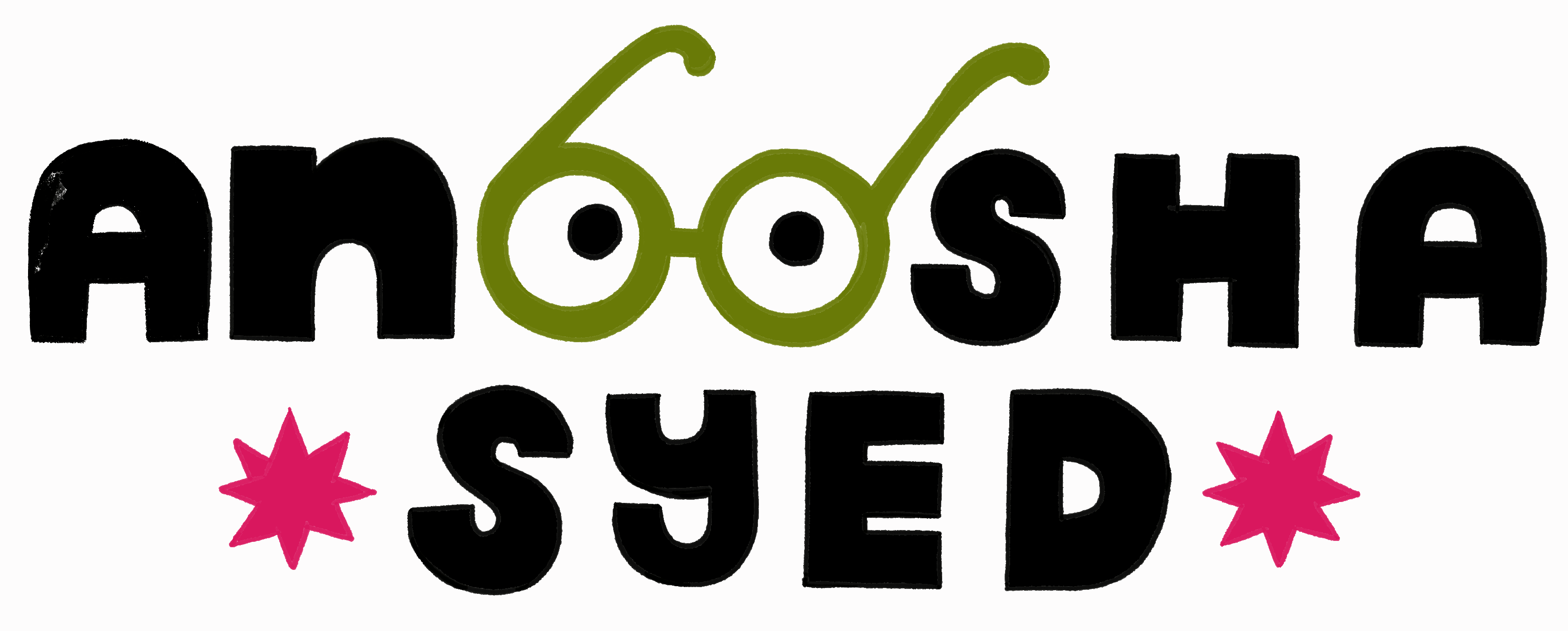
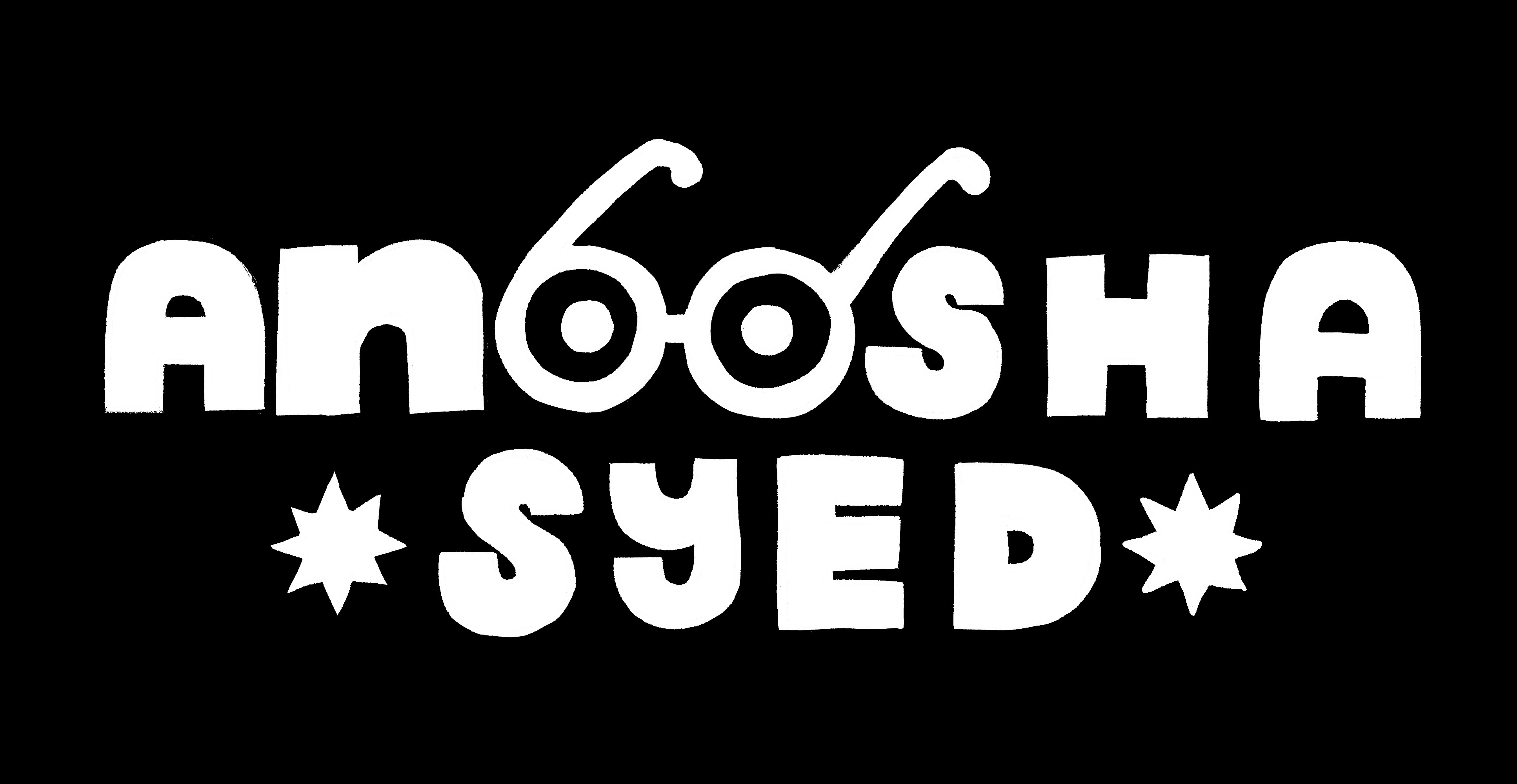
And this was the logo I landed on! Made pretty spontaneously within an afternoon (honestly without thinking about it too much), it represented me pretty well at the time: bold, playful, and very much kidlit-focused with the rainbow palette and little sparkles.

✸ Why am I Changing it?
Back in November, while I was updating my portfolio with new work and was getting super frustrated by the website builder, I saw
’s Substack post announcing her new website, created by Milk Parlor Design, and I absolutely loved how it turned out and reached out for her services.As I started working on my new website, my designer asked me a bunch of Big Reflective questions like:
✸ Why does your business exist?
✸ What are your values?
✸ Why do clients/customers choose you?
✸ What sets you apart?
✸ Which creatives do you admire most? What sets you apart from them?
It was a lot of stuff I had never thought to consider, but were BIG IMPORTANT QUESTIONS! It made me realize a lot of stuff about myself, my services and what I hope to achieve in the coming years, and knew this was a great opportunity to not just do a small website refresh, but an entire rebrand. What was supposed to be a month long collaboration ended up taking five months.
I’ll speak more on my website design process in the next post, but for now let’s continue on with my rebranding
I thought of some of my creative idols;
, Jessica Hische, The House That Lars Built; multi-disciplinary creative jack-of-all-trades like what I hope to be one day. A common thread I noticed was that their work, branding, and websites all speak in the same strong, unmistakable creative voice. Every aspect of their work (from the art to the ‘boring bits’) is unmistakably them.And I realized that… I want that, too!
I’m still a children’s illustrator. That will always be a part of my identity (and argueably my biggest slice of pie in my pie graph). But I’m also an author. A speaker. A content creator. An educator. I work with publishing clients, but also licensing companies, nonprofits, subscription boxes and retail brands; this was a new audience that I wanted to tap further into but I needed my image to catch up to it.


I wear a lot of hats and I wanted my branding to reflect that since my old logo was too fixed on a singular ‘label’. I wanted something playful but mature, decorative but clean.
Within the kidlit community, I also noticed how much my old logo was starting to blend in. I started to notice that rainbow letters, wobbly type, even the little sparkles are everywhere now. I don’t claim to be the sole owner of this style lol, but I didn’t want to be unmemorable; I wanted to be distinctly me.

✸ Development!
The biggest thing about this rebrand was that I wanted it to be intentional. I whipped something with zero background knowledge on good design up for my first one, but this time I really wanted to make sure I was doing it right.
Since I was starting from scratch, I began by gathering images for my trusty Pinterest board. Illustrations, logos, packaging design, color palettes, websites, even photos of fabric and architecture. Anything that spoke to me, even if nothing actually went together. It was all based on vibes at this point.

Then I started analyzing the patterns. What do I keep saving? What feels like me?
Here’s what I came up with:
✸ I love color
✸ I love details
✸ I’m a maximalist
✸ I love a blend of graphic shapes, but with organic touches
I started with the logo.
I kept going back and forth. Did I want something totally new? Did I want to ditch the glasses? Did I want something cleaner, more abstract, more “studio brand”? I wanted it to be something you could see on a clothing tag, or a totebag.

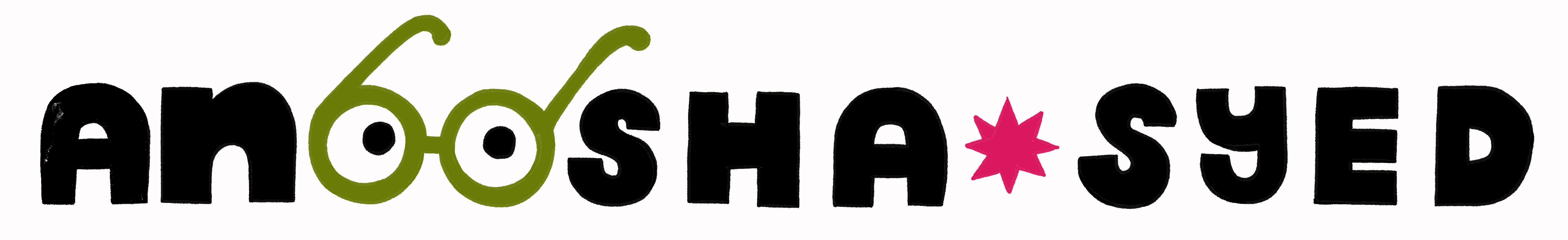
I came up with 11 different concepts; some that played closely off my old design and some that were entirely new. I had such a hard time choosing and I went back and forth and conferred a lot with my friends. And in the end, because I knew a lot of people still loved it, I landed on something that simply elevated my old logo. The glasses stayed (I need glasses again to drive now, so I don’t feel like a total poser). But the type got more polished and balanced, and I put in the work to create a whole logo suite to work with every occasion.


Side note,
insisted my glasses looked a lot like a bra, so I ended up panic-animating the design so it would be clearly interpreted as eyes. But if they still look like boobs, please I beg you to keep it to yourself 😩
✸ Building the Visual Language
Once the logo and general vibe was set, everything else came together more easily.
Colors
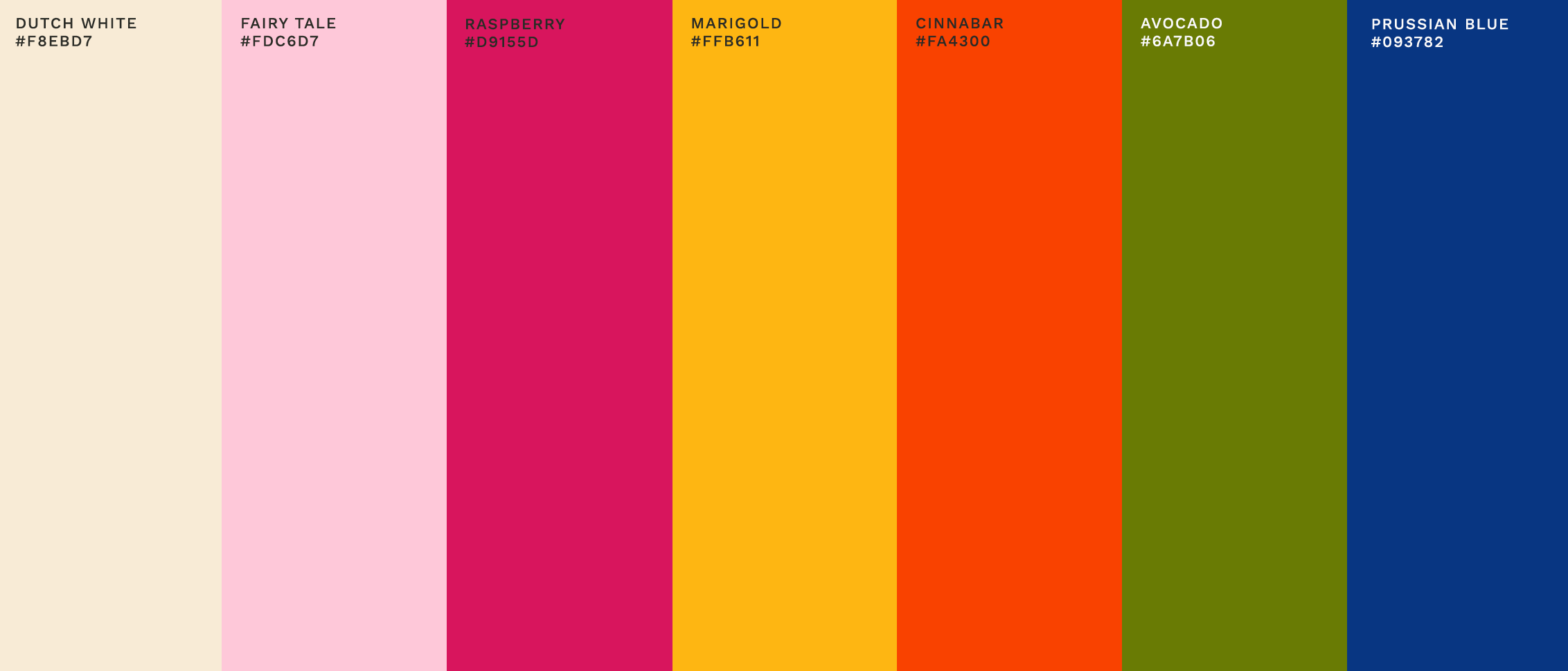
I wanted my color palette to be true to who I was, so I literally color-picked my own paintings to build the palette, again seeing if I could find a pattern.


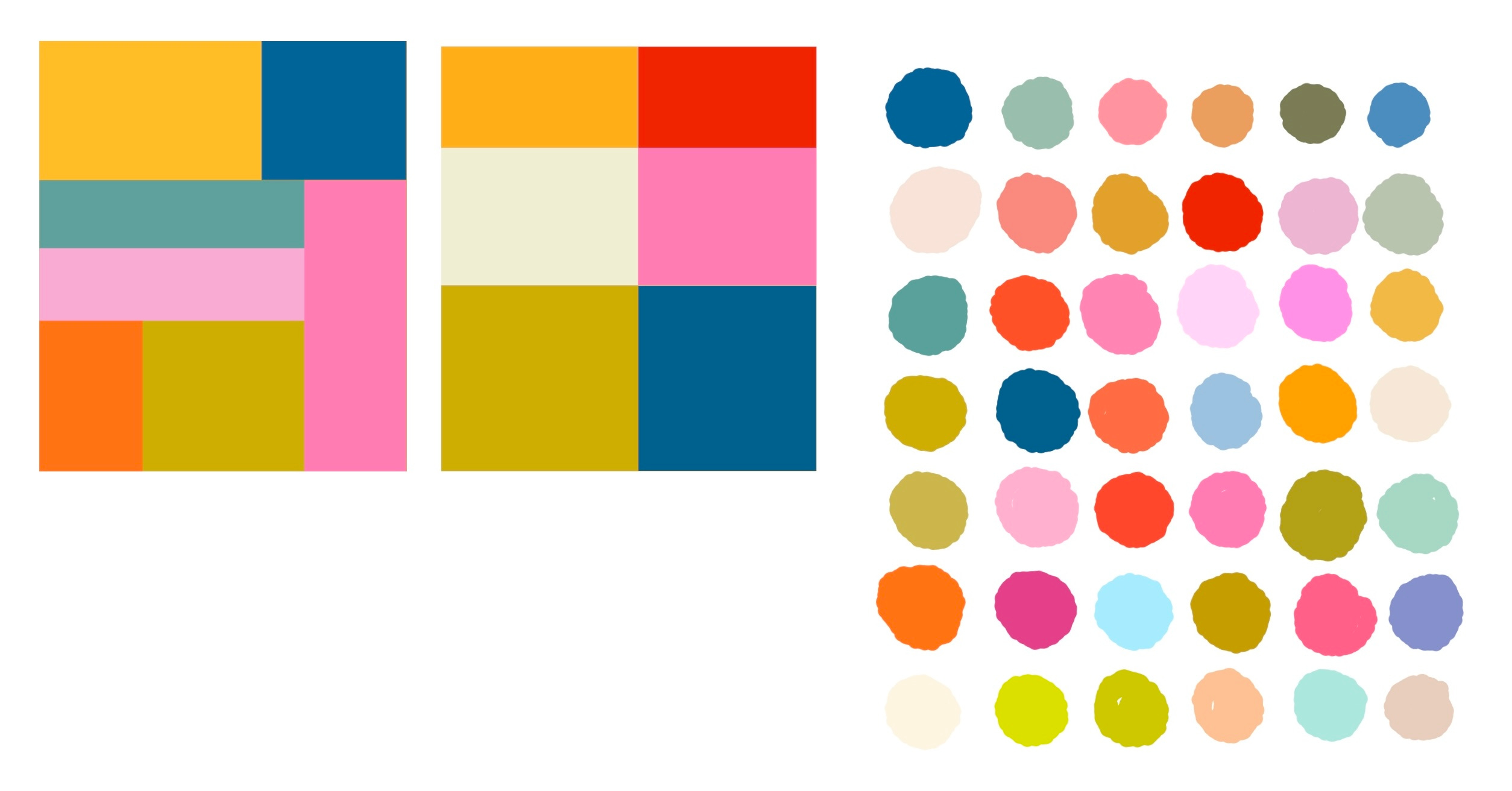
Again, this was really difficult to narrow down because I LOVE so many colours and it was hard to pick just six, but my designer was incredibly helpful into putting together a palette that would work well for accessibility/readability.
Fonts
I made my own!!!
One is bold and blocky and a little bit wonky and matches my logo font:

And the other is pulled from my actual handwriting.
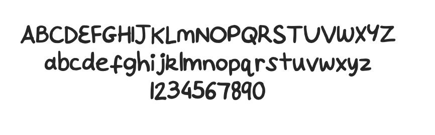
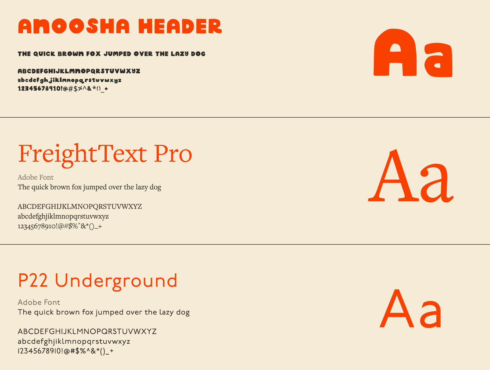
Then my designer built the rest of my font library, adding in an elegant serif to contrast the wonky font.
Patterns & Illustrated Elements
My work is heavily inspired by my Pakistani heritage and I love sprinkling in little elements like florals, miniatures, embroidery and traditional textiles into my work. I wanted that to show up in subtle ways throughout my brand.
So I combed through old artwork and pulled little motifs like flowers, vines, shapes, stars, borders, etc and I redrew and reworked them into decorative assets that I can use for my website, invoices, business cards and anything else!

✸ So here we are!
I both put off my redesign, and then stalled my launch because this branding journey feels like a tattoo. Once it’s out in the world, you’re stuck with it (at least for a few years). And I am the kind of person who changes her mind a lot!!! I was so nervous I’d pick a direction and hate it in two weeks. Case in point; I’m still iffy about my color palette and even now am considering changing it entirely.
Early on, I also considered hiring a graphic designer; an actual professional who could do this way better than I could. But I’m extremely hands-on, and couldn’t bring myself to give up creative control. (My poor web designer dealt with all of my nitpicking and revisions, and was an absolute saint to work with.)
I also know I’m my own worst critic, so I’ll leave it alone… for now.
But hurray! We have launched!
You’ll see my new branding all my new website in a few days. But over the next few weeks, you’ll start to see it roll out across my socials, my business cards, invoices, educational materials, convention signage (and maybe next… the world???)

✸ The Website Launches THIS Week (!!)

As a final sneak peek, I wanted to share a little glimpse of what to expect for my site launch. This new folio will be a hub for all my little hats:
✸ My books
✸ My services
✸ Artist resources
✸ Free content + future downloads
✸ SOMETHING VERY NEW AND EXCITING
Whether you're a fan of my stories, a client looking to collaborate, or a fellow creative looking for guidance—I hope it feels like a home base you’ll want to come back to.
Will share more soon!
OK BYE! <3
Wow I enjoyed this post so much! It inspired me to really update my own website! I saw it as a place to just showcase my work, but seeing how much thought and effort you put into yours really motivated me to make something nicer. This post is a great guide and so visually stunning. Really thank you for sharing your process!
Love love love the brand refresh! I'm in the middle of my own and it's so inspiring to see you tackle this. It's a lot of work! And it's so totally you. For what it's worth, I'm not getting bra at all. The double o in your name is perfectly placed and balances nicely with your last name, I like that you decided to keep the glasses🥰.