


Redesign My Website With Me!
Deep dive into full brand + portfolio reset

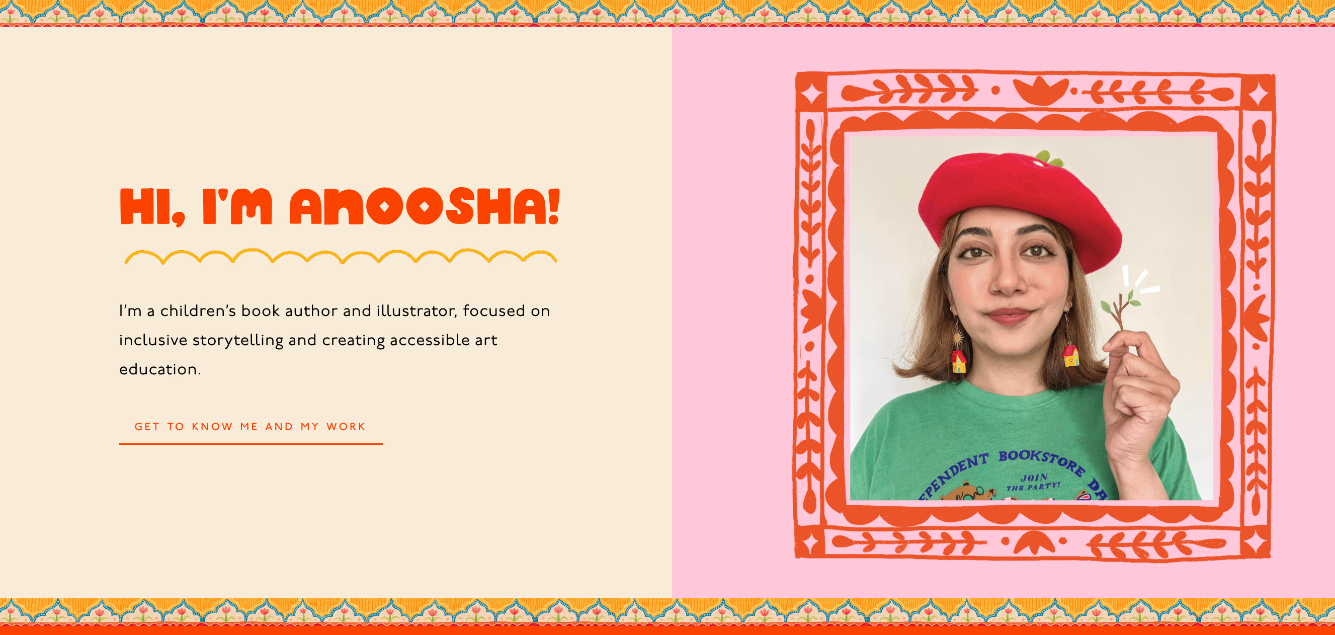
I have a new website!
Last winter, while I was still on maternity leave, I was in the stirs of newborn survival mode and unable to paint or create. But the workaholic in me had the nagging need to do something in those empty hours of contact naps and nursing.
So, in the small pockets of time I could find, I decided to catch up on some admin tasks. All of the boring, unglamorous work that you always put off and never have time for, but are so oh critical to your business.
Apart from bookkeeping and renaming all my files, one of the things I really wanted to do was refresh my website.
At first, I thought it would just be a few simple updates; tidy up a few pages, add some new pieces, maybe get it ready to offer some new services like consulting calls or online courses that I had been itching to work on.
I figured I could handle it myself. I have been a working illustrator for years, so how hard could it be?!
It was very hard.
I was ready to pull my hair out when I came across
’s Substack post about her new website redesign. Her site looked stunning, and made me realize something important.
Even though I am a professional in my field, I am not a professional website designer. If I’m already outsourcing parts of my business to an accountant and an agent, why not hire someone who knows what they are doing???
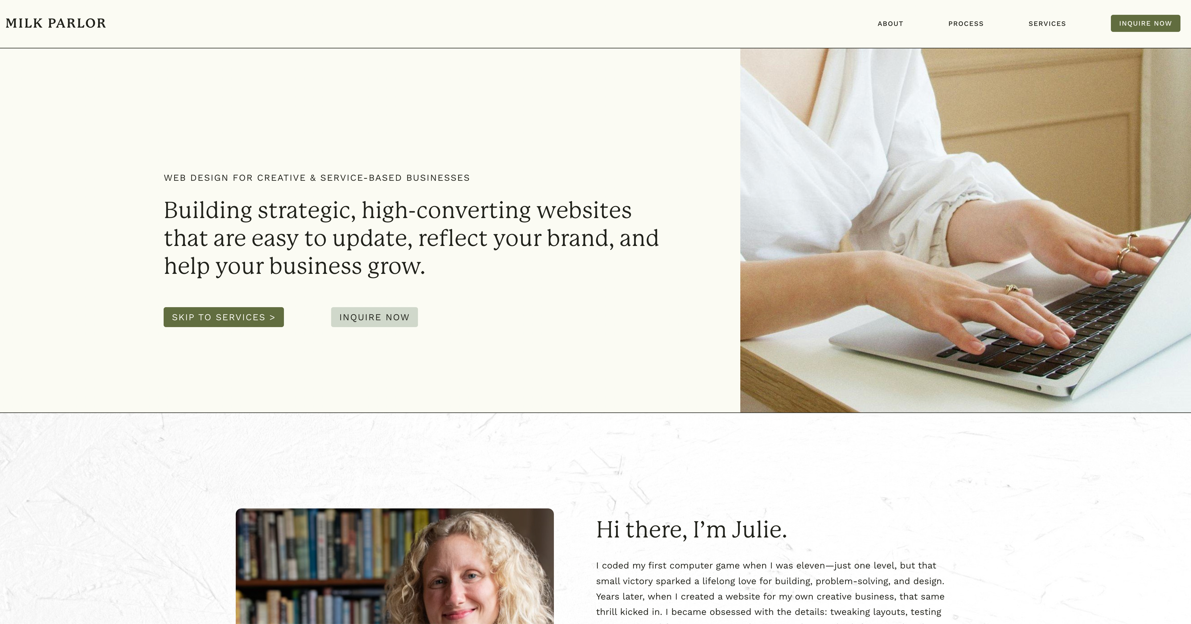
That’s how I found Julie at Milk Parlor Design.
I set up a consult with her and right away, I knew she was the perfect fit for me.
(Side note: if you hire Julie, let her know I sent you so I can get a sweet referral bonus hehe)
At the time, Julie had two options available. Either start immediately in October or wait until her next opening in January.
I was in the middle of moving houses, plus the eepy baby, and even though I was impatient to get started, I knew it would be better to wait until we were settled.
So, I signed on to start in January and she sent me her brand questionnaire and Website Content to fill out in the meantime.
And honestly, I am so glad I waited. I thought this would be a quick one month project, but it ended up being a five month overhaul.

✸ Website Glow Up
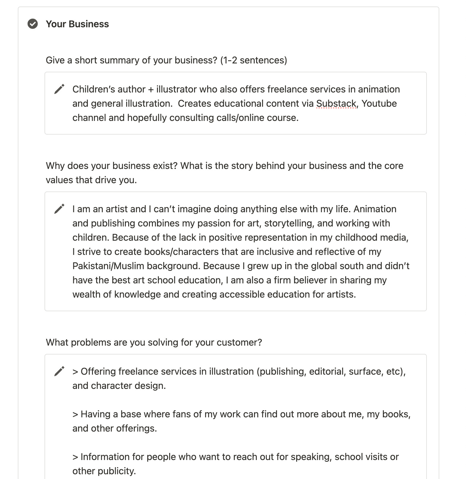
Julie’s questionnaire asked some super insightful questions that I had never really thought to ask myself before. It felt like business therapy!
Things like:
Why does my business even exist?
What makes my offerings different from anyone else's?
What are my core values?
What problems am I solving for my clients?
Who is my audience and what do they like about me?
There were even deeper questions about who my inspirations were, who my competitors might be, what I offer that they don’t, and what my long-term goals looked like.
When I first read through her questionnaire, I thought, "This all seems so stuffy and serious! I’m not really one of her fancy entrepreneur clients, I’m just a silly little artist. Do I really need all this? I’m only making a cute portfolio for my art!”
But going through all of this made me realize that I had grown so much since I first built my website a decade ago. I was no longer just an illustrator; I had become a multi-hyphenated creative with lots of different hats and I wanted my website to reflect that.
It also made me think a lot about the artists I admire. So many of my favorite creatives had these incredible, thoughtful websites. Their branding, their visuals, their tone... everything about their sites felt intentional.
It made me realize I didn’t just want a portfolio anymore, I wanted a hub for all things Anoosha. (like Disney World, but for art haha)
A place that felt like me, that shared my work, my thoughts, my services, and my journey; all in one space.
It became clear that this wasn’t going to be a simple refresh. This was going to be a full reimagining of my online presence. A glow up, if you will.
While answering all of her questions, I realized that if I was redoing the website... I might as well redo my branding too!
I talk a lot more about this in my brand refresh post below, but in short:

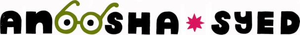
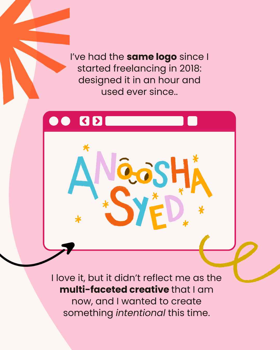
My old logo had served me well, but it had been thrown together pretty quickly when I was just starting out.
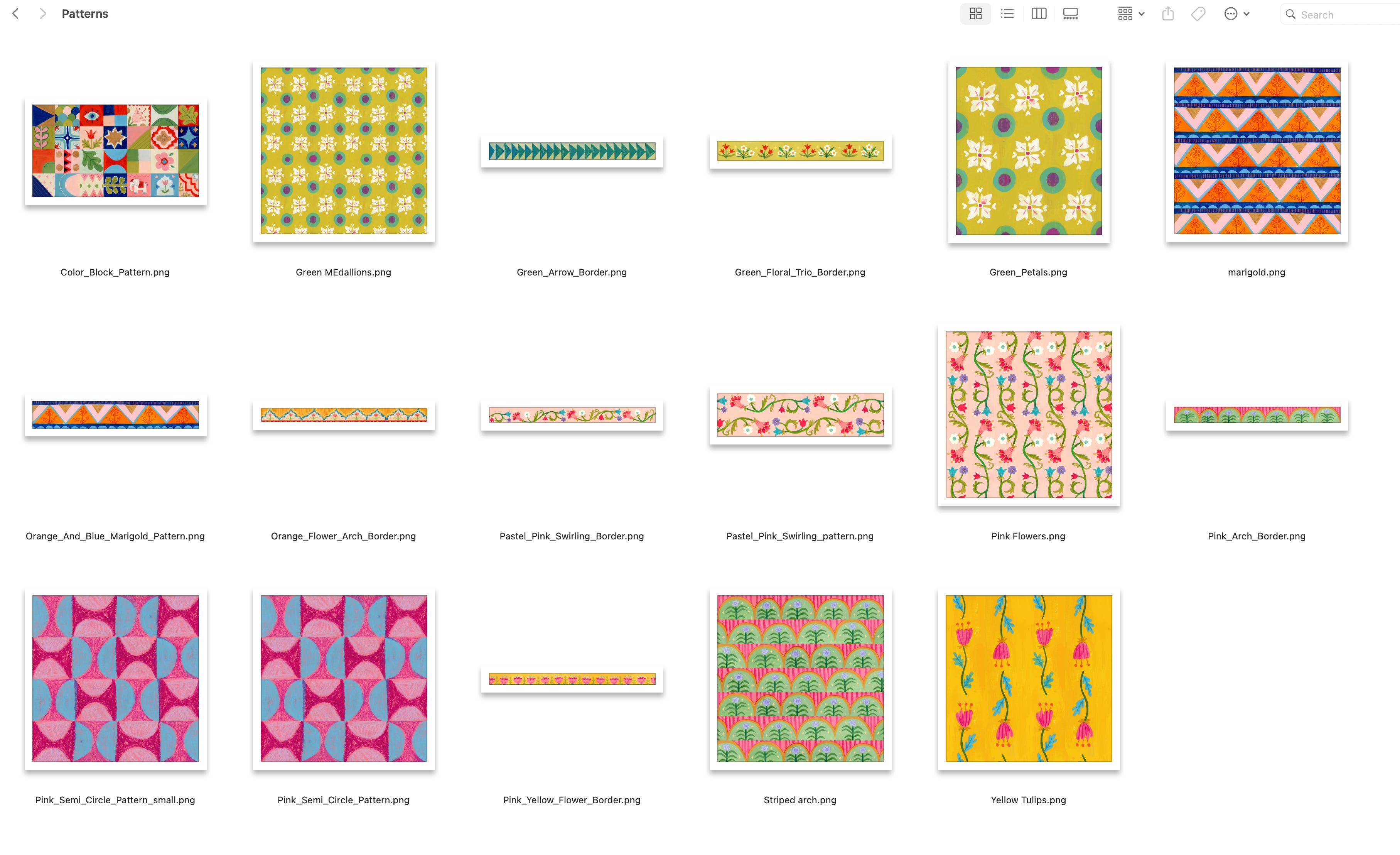
This time, I wanted every piece of the site, every pattern, every color, every little decorative element, to feel true to me.

✸ Who am I???
Ahh, the age old question.
Filling out all the copy for the website, I found myself wanting to share more about me and my practice.
Again, I had initially planned for this site to be much simpler. But the more I worked on the website copy, the further I got sucked into a spiral of all the different things I could explore and add upon. I was starting from scratch, the world was my oyster!!!
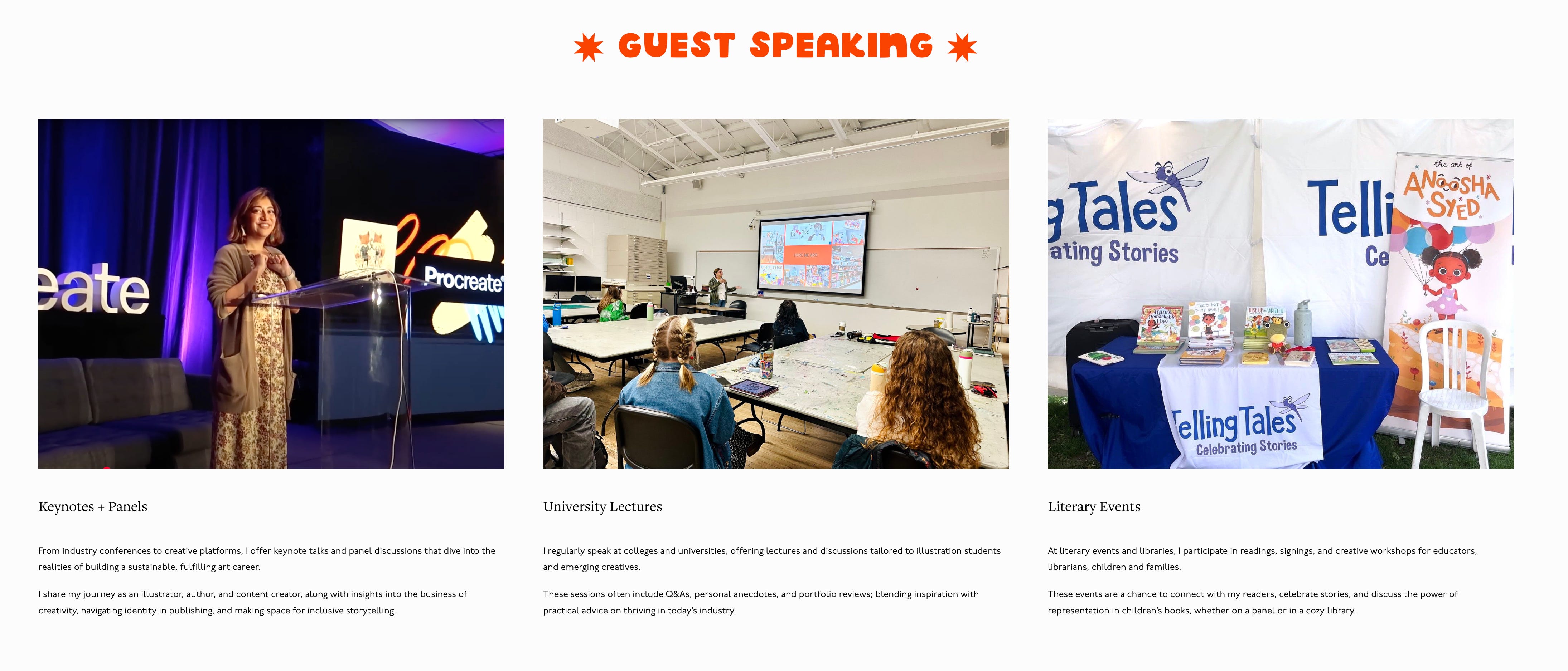
So for example, at first, I had a tiny line tucked away mentioning that I offered guest speaking.
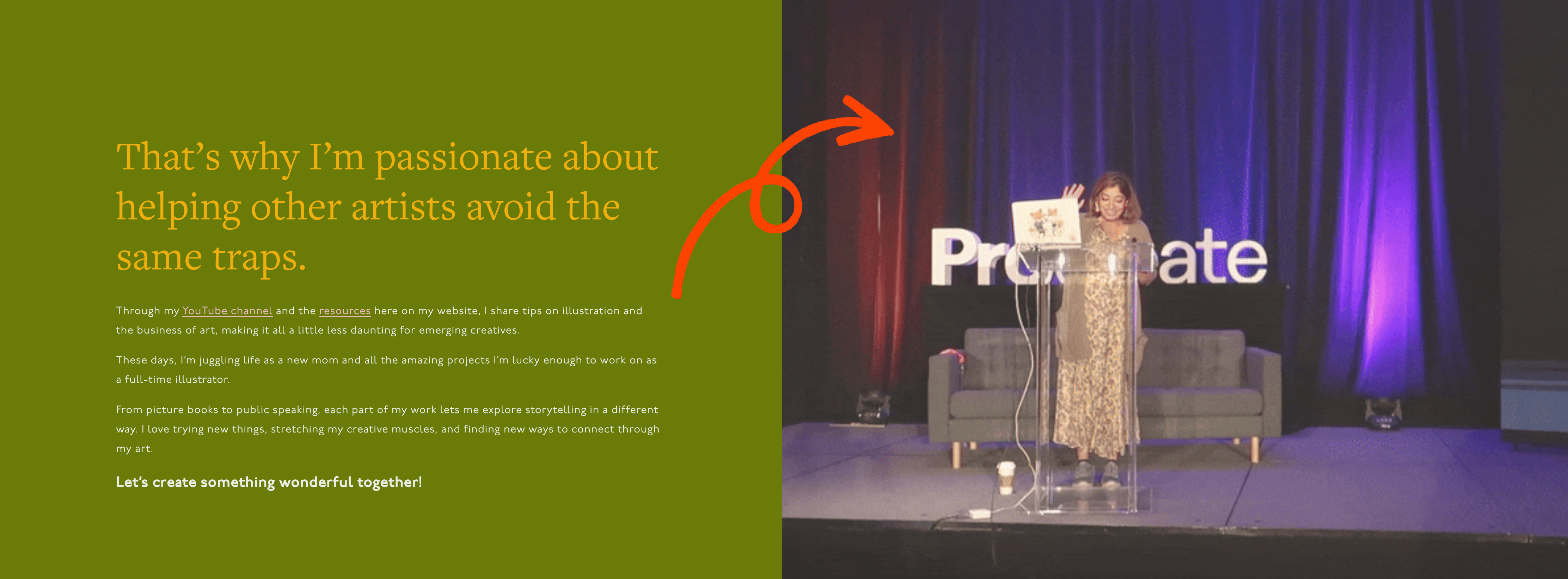
But the more I thought about it, the more I realized that speaking, doing school visits, connecting with people, and sharing my story had become a huge part of my creative work. It deserved a full page of its own!
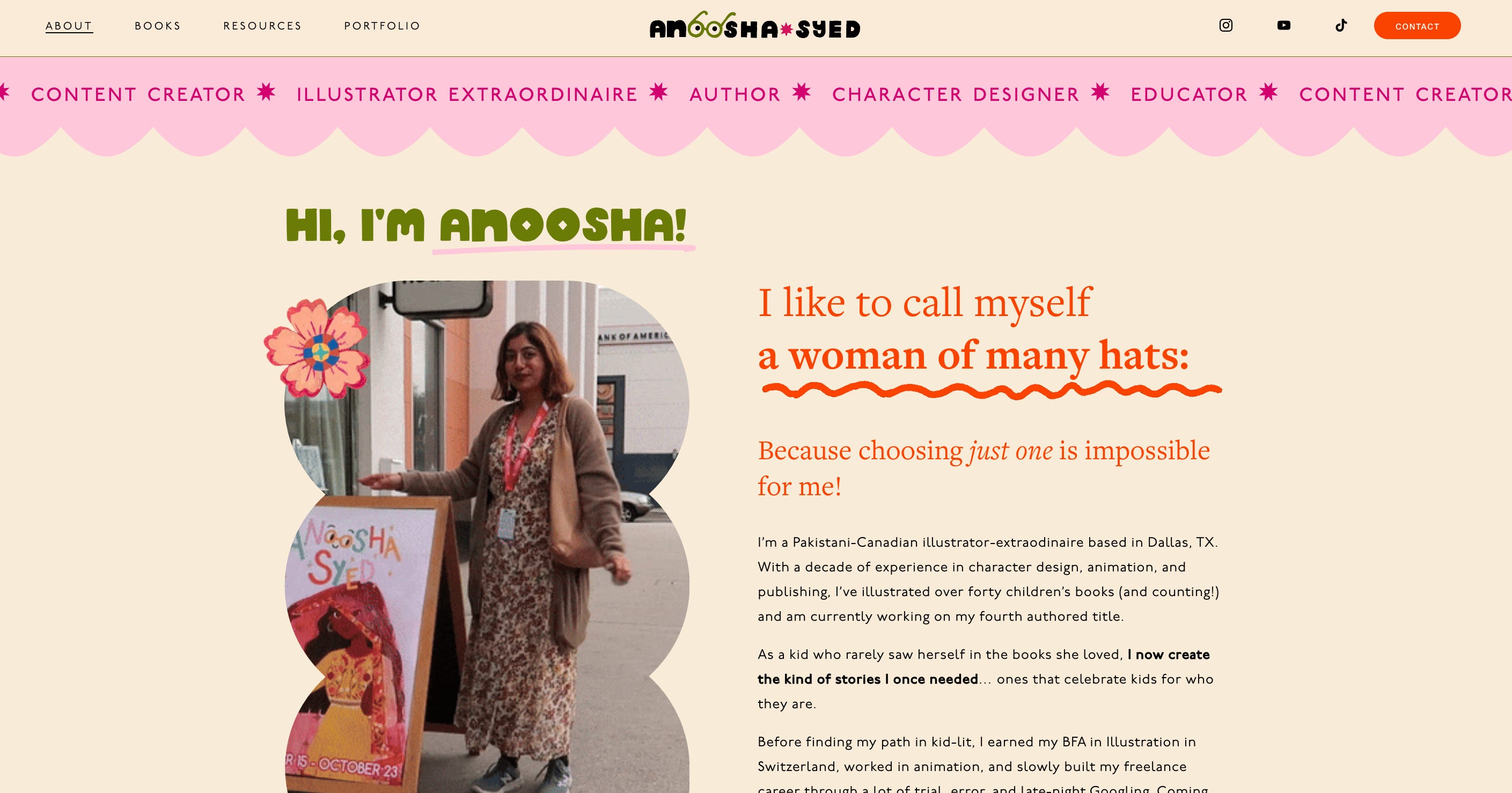
Initially, I wrote a short, in-third-person biography. Your typical website bio with the usual hometown, achievements, and mention of a grey cat.
But through Julie’s suggestions, I realized that my audience might not only want to see a polished résume, they wanted to hear my story!
They wanted to know who I was, how I got here, and what shaped the work they were connecting with, and what sets me apart from other artists.
So for the next two months, piece by piece, the new website started to take shape. And since I had a lot of different avenues of my creative practice to cover, this took a while to complete.

✸ First Draft
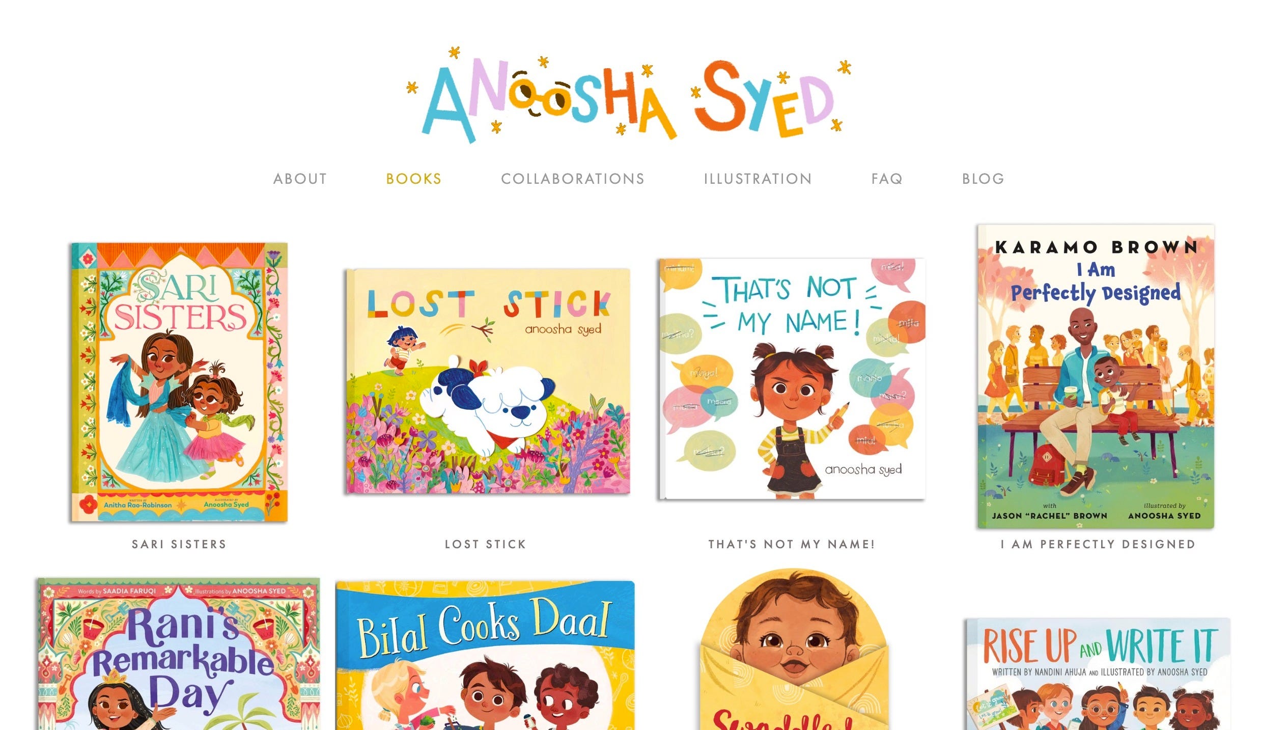
In January, once all the foundational work was done, Julie started creating the sitemap, essentially the blueprint for how the website would be structured.
This was the most complicated part for me because I wanted to showcase A LOT OF STUFF.
Not just my general illustration and books, but my client collaborations, my public speaking/school visits, my various free resources for artists, and hopefully future offerings like consulting and online courses.
One of the biggest things I struggled with when I tried doing it myself was organization and a pleasant user experience.
It is so easy for a creative website to turn into a confusing rabbit-hole mess of links, dropdowns, and tabs that would make any art director hit Command+W on my tab in a second.
I wanted mine to feel clean, simple, and intuitive, despite the avalanche of information.
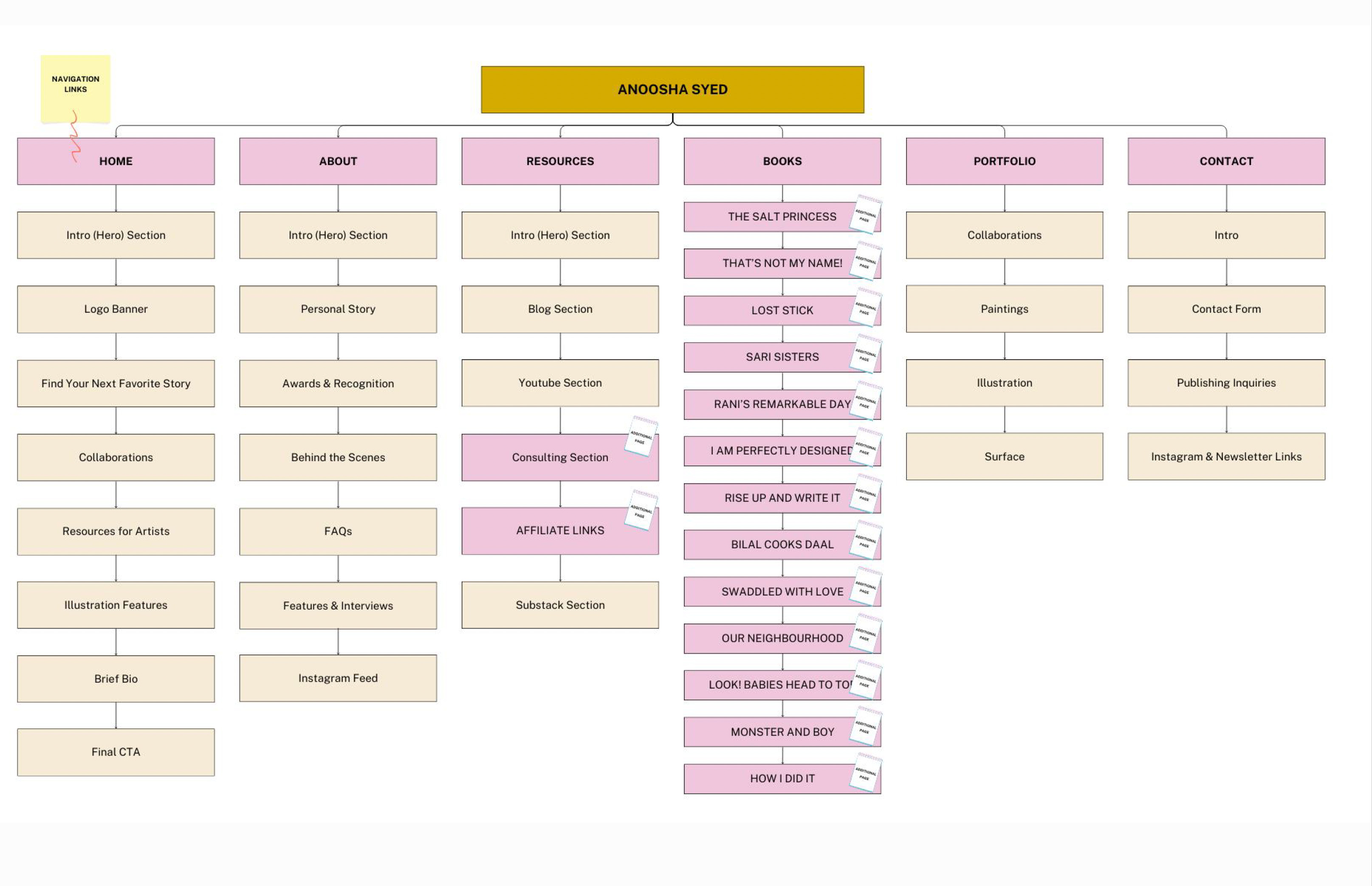
Julie’s sitemap helped everything feel clear from the start, and set a perfect foundation for the rest of my site to build off of.

✸ A Little Touch of Magic
When Julie sent me the first draft of the site, I screamed!!! She is so big-brained and creative and totally understood what I was trying to achieve… but I am a very hands-on person.
I wanted the site to feel like you were stepping into one of my paintings.
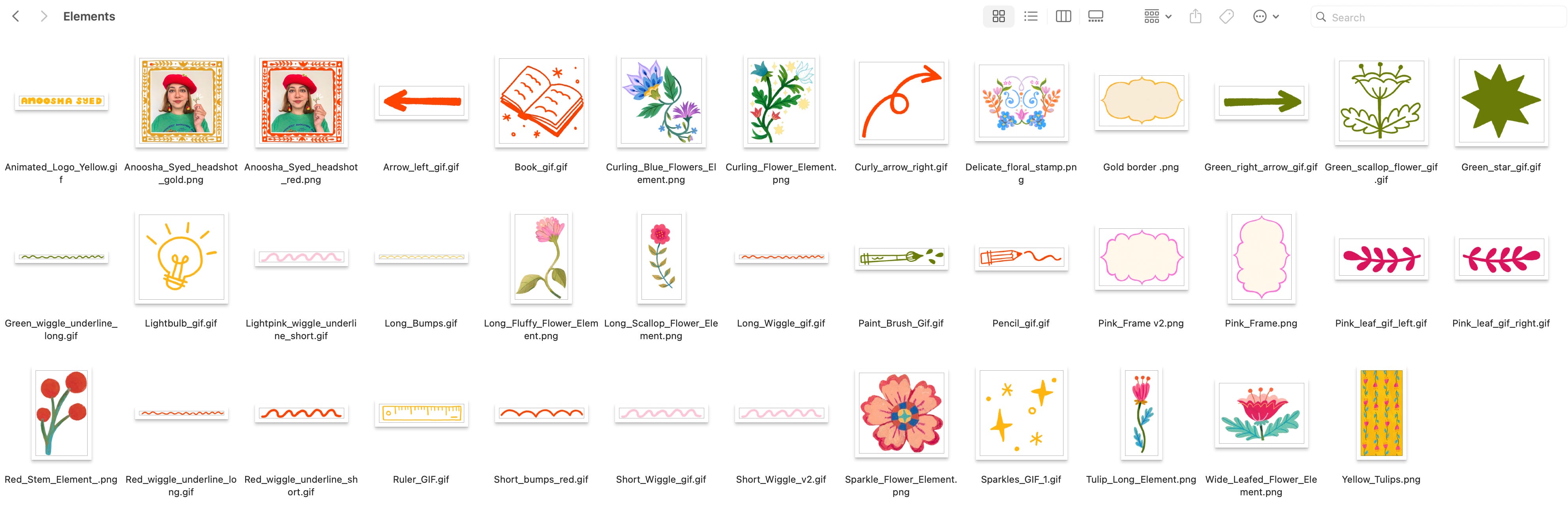
Julie was cooking, and I was providing the ingredients. I created a batch of extra illustrated elements for her to use: patterns, animated GIFs, little decorative touches. Some were made for specific places, while most were just "sprinkle wherever you want."
After several rounds of revisions, I had my final website from Julie!
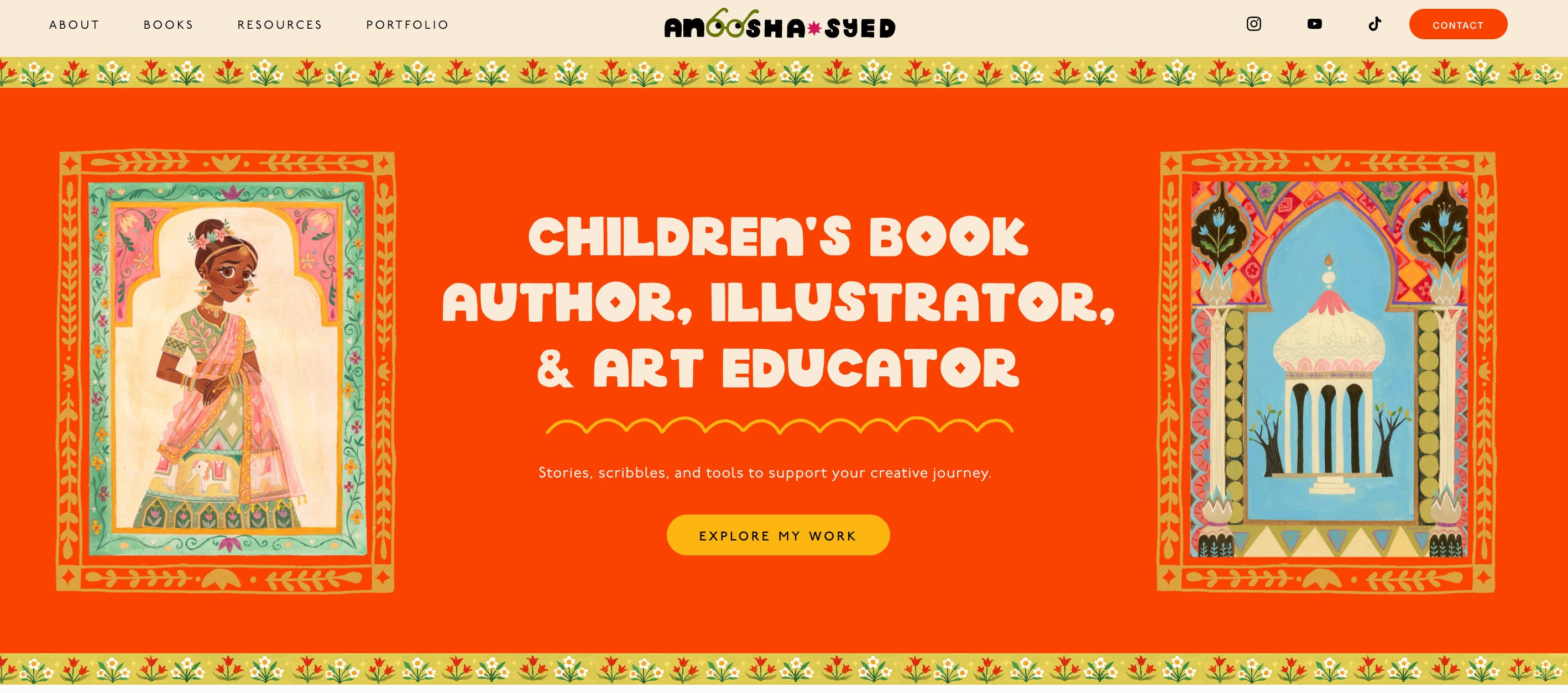
But again, since I’m super hands on, my work wasn’t complete yet. I used this site as a base to build more pages and have a lot of fun playing around with the new site.
A big thing that changed during this process was learning how much more Squarespace, my chosen website builder, could do now.
For almost nine years, I had been using the same old Avenue template on Squarespace, which honestly was beautiful but extremely limited. I used to get so frustrated with how little I could customize.


I was vaguely aware that Squarespace had updated to version 7.1, but I didn’t know what that actually meant and I never really looked into it. I assumed that whatever it was, it wasn’t anything special.
When Julie handed over the reigns and guided me through 7.1, I was mind BLOWN by how much you could do with Squarespace now!!! Suddenly, I could actually move things around, create custom layouts, and design sections the way I had always wanted. The possibilities were endless.
Of course, it also meant I went crazy with edits (to the point that I almost accidentally destroyed the whole site with a misplaced piece of code the morning of the launch lol) because every time I thought I was finished with a page, I would get a new idea and want to tweak just a little more.
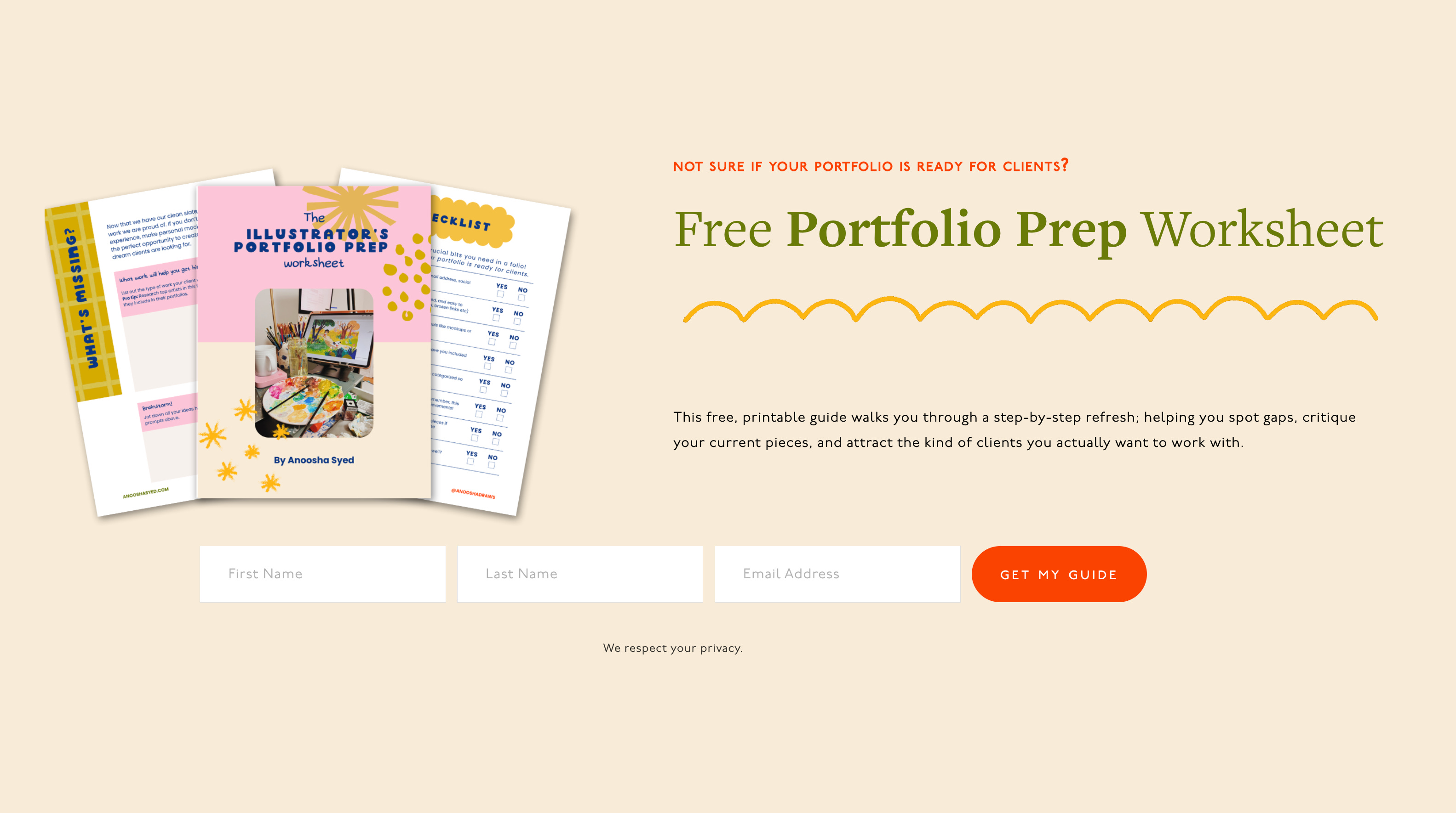
Then, A DAY BEFORE LAUNCH, despite having a Substack, I decided I wanted to have an old-school mailing list as well. Why??? Because I like to make life hard for myself. Also, everyone always tells me that social media is fleeting, but email is forever. So I set that up and also made a little newsletter incentive:
But finally, after a month of additional tinkering, the website was complete and I launched it last week!!! HURRAH!

✸ GO CHECK IT OUT
»MY WEBSITE IS HERE, GO LOOK AT IT HEHE«
Let me know what you think!!! Like I said, I had done a bunch of new edits after Julie handed over the reigns and so there might be a few bugs around I missed. If you catch something, please let me know. Also, share your favourite part of the site!
It’s hard to choose, but one of my favorite features is the Resources section on my homepage.
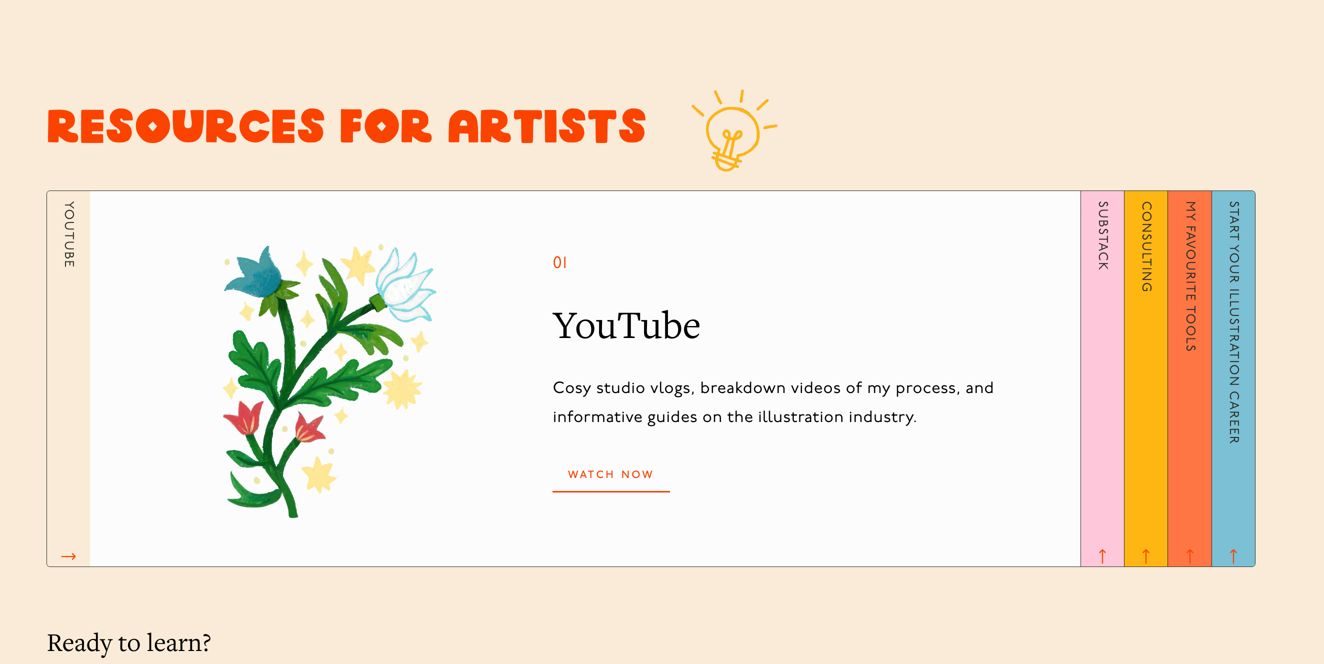
I had so many things I wanted to share (my YouTube channel, artist guides, consulting services, my favorite tools) and Julie came up with the most creative way to display it.
She made a beautiful collapsible accordion menu that is not only functional but super unique genuinely fun to explore.
Another favorite part of the site is the Tools page that I developed myself.
It is a full list of all my favorite things:
✸ The art supplies I use for my books
✸ My go-to tech and creative software
✸ My favorite educational books
✸ Even my studio furniture like my standing desk and office chair
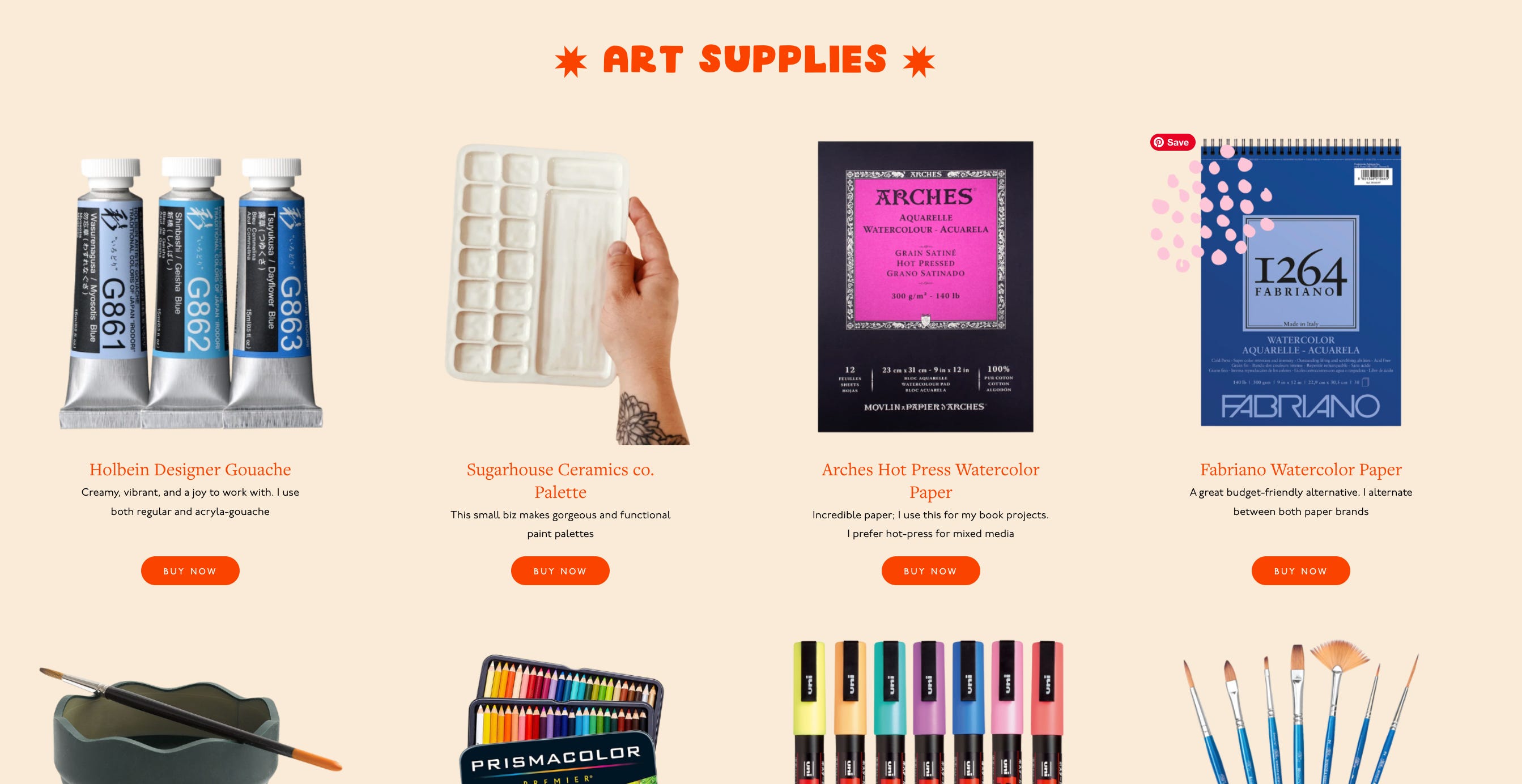
Because I am always getting questions about this stuff, and I wanted to finally have a place where I could send people and say, "Here’s everything I genuinely love and use."
If I have one regret, it is that I wish I had taken updated professional photos.
Right now, I am still using a headshot from 2023 , plus shots of my old studio back in Canada. (I would love to get new photos one day, when my current studio is not overrun by an enormous baby ball pit.)
Another really fun thing we created was the career journey timeline! Because of the longer bio, we initially ended up with a long block of text that I knew a lot of people might not want to read through. So instead, we changed the format into a fun, easy to digest timeline!

✸ Advice if You Want to Refresh Your Site
Now that the new site is live, I feel so proud of all the work I’ve done and so relieved that it’s out in the world!!!
I doubted my decisions at every step of the process. I agonized over tiny decisions like colors and layouts, and whether I should move an image one pixel to the left, and wondered if I was even doing the right thing and if I should’ve hired a graphic designer on top of a web designer.
And honestly, I’m still wondering if I should go back and completely change my colors and font and… everything???
But since launching the site, I have been so happy with everyone’s response, so I’ll hold off on the reset… for now.
I know I’ve inspired some artists to do a redesign of their own, so if you are thinking about refreshing your website, here is what I would say:
✸ Start from the ground up.
Ask yourself the big questions about who you are, what you want to put into the world, who your audience is, and what you hope to achieve from the site. Is it to share your favourite art with the world? A place for fans to find more about you? A place to share your wares? A placeholder for your mailing list? To entice art directors to hire you? All of these answers will determine what your site is going to look like and what you’ll need to create it.
✸ Be patient.
It takes time to build something as huge as this, and although you don’t want to get caught nitpicking for ages like I did, you do need to set some time for this project.
✸ It might need an investment…
Just like how a website in itself is an investment towards your career (with all the fees of a domain name and a website builder subscription), it might be worth seeking out a professional to handle the parts that you can’t manage (Whether it’s a web designer, a graphic designer, a photographer, a digitizer, an animator, a copy editor, etc).
✸ or spit and grit!
On the other hand, you’re an artist and the internet is free! If you have the time, Youtube is an ocean of information and you can fish for the education you need haha. I am not a graphic designer at all, but I tried my best at creating my font, logo and animations. It might not be perfect, but it’s definitely my own heart and soul.
✸ Prioritize!
If you are a multi-hyphenated creative like myself, I would suggest to figure out what goals you'd like your website to achieve (finding work? Building Mailing list? Shop sales?), as well as who your audience is (as this will likely differ for each 'hyphen'), then number by importance.
This kind of reflection will help you immensely by understanding what to prioritize and how to structure your site.
You might say that you want to prioritize all your hyphens equally. I would argue against it. You might end up with a folio that is scattered, disorganized, and directionless. If you REALLY want to give equal importance, I'd suggest creating a totally separate site so I can devote full attention to both.

ANYWAY, I really hope you guys like the new site!!! Let me know what you think, and what your favourite page is.
OK BYE!!!
Your new site is GORGEOUS!!! ✨ The home page is a delight—all the colors, patterns, images convey a strong, unique personality. I’m loving those creative resource cards and the resources/tools pages! This clearly took a lot of effort, rethinking, designing etc and it really pays off! Thanks for sharing with us. 😍
Love this thought process so much! The site is so beautiful and really fun to interact with. My personal fav part being your art supplies section 🎨🖍️✂️